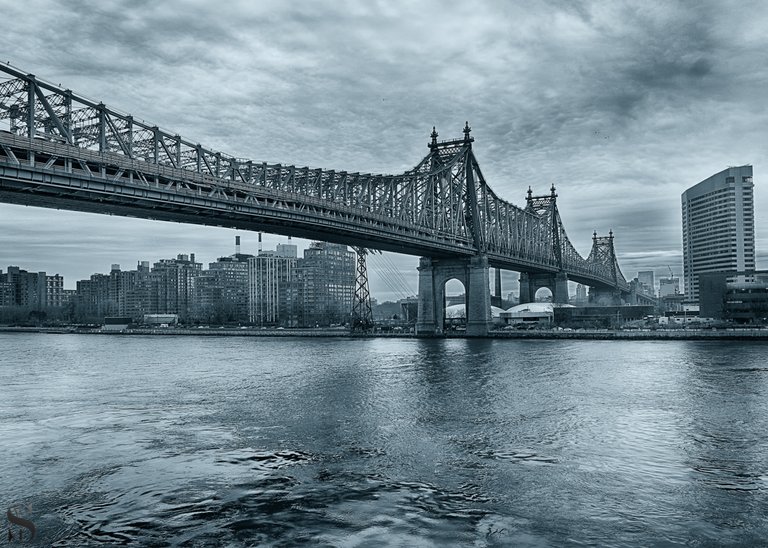
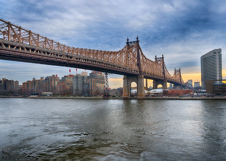
Feeling Groovy by the 59th Street Bridge B&W or color?
My favorite bridge in NYC is without a doubt the 59th Street Bridge, ever since I heard the Feeling Groovy Song by Simon and Garfunkel I dreamed of visiting NYC and seeing the bridge.
I was 6 when the song came out and probably heard it about that age and remember reading or being told about the 59th Street Bridge and saying to myself i would visit and see it one day.
I never expected at that age or even in my early 20’s that I would ever make it to visit NYC, but its funny how life can give you turns good or bad and you can never know what will happen.
Not only did I visit NYC and have worked here for over 15 Years now, and i am still fascinated by this bridge.
##But now I have a dilemma

Sony A6500 18mm F8 1/60 ISO 125
Click here to view larger
When I edited this shot I ended up doing two versions the one above in B&W and the one below in color, and I have to be honest I like them both and cannot choose one over the other so I will have to ...

Sony A6500 18mm F8 1/60 ISO 125
Click here to view larger
What do you think of these shots and if you had to pick one over the other which would you choose?
Unless stated otherwise all photos used in my posts are taken and owned by myself, if you wish to use any of my images please contact me.
steemusa is a growing Community for and supporting those from of in the United States,check out the latest post or join us on Discord
If your interested in thealliance Check out the latest posts


!steemitworldmap 40.758410 lat -73.958769 long NYC d3scr
Twist my arm and I'll go for the B & W this time. Like others have said, it seems quite timeless and classic!
Thanks for your visit and thoughts
Wonderful shots, I love them both
Thanks for your visit and support it is truly appreciated
I think both shots are great as they communicate different emotion and mood.
Thanks kindly I do feel the same most shots I prefer one or the other but not in this case
Congratulations, Your Post Has Been Added To The Steemit Worldmap!
Author link: http://steemitworldmap.com?author=tattoodjay
Post link: http://steemitworldmap.com?post=feeling-groovy-b-and-w-or-color
Want to have your post on the map too?
I agree with you That both are nice in their own way, but....Im a sucker for black and white and therefore i choose That one. Beside it is more dramatical in many ways.✨👌🏼
Thanks for your feedback I do agree B&W brings out the drama
good
Thanks kindly
I really like the black and white one, it just looks epic!
Thanks kindly for your feedback 😎👍😎
Hey my friend, I much prefer the B&W version - it looks a bit like a doomsday scenery. Great one!
thanks I do agree the B&W is more dramatic
On this one I have to say colour Jay. The B+W makes the bridge look cold, which i know it is! I just think the colour brings a warmth to it.
Thanks kindly and yes the B&W is more dramatic and cold thanks for your thoughts
The black and white photo is timeless but I would have to say that the mood I am in this morning, the colour takes my fancy.
Thanks for your feedback and I agree ones mood can be a big factor in which one they prefer
The first one has a tinge of blue to It in my eyes. If it were a stark B&W I would have chosen it. Don't matter I think steemitworldmap likes it.
Lol I do tend to do blue and white for most of my B&W 😎
I'd definitely go for the black and white!
Thanks for your visit and thoughts
Yeah, great shots @tattoodjay. To me, the B&W captures of what I always thought NYC represented . Kind of gray and mysterious full of adventure and interesting Lives/Souls
Thanks for your visit and thoughts and I do agree
I would love to visit, the first one I like more, it seems more mysterious
Happy Friday
Thanks and yes that is very true
I prefer the color one but if you rework and go more drastic on the monochrome I bet it could look a lot more dramatic ! would also make for a cool night shot too with all the city lights in the background
Thanks for your feedback and I do agree but I am seldom in the city at dark and normally on my commute back to CT
It is very difficult to choose, I also like them both...it would depend on what atmosphere you want to focus on : the first one is more dramatic...so maybe I would prefer the second one with the color lightness ;-)
Thanks for your visit and thoughts I do agree depending on the mood could affect ones preference indeed
I have to say I like the color much better. It looks more alive to me. Beautiful archetecture without a doubt. Glad you fulfilled your dream.
Thanks for your feedback and depending on my mood I may prefer one over the other
They are both great , but I do like the feel of the first one! Isn't it something when you think back to your childhood? I could never have imagined I would be living in the USA!
Thanks
Same for us both just goes to show
I love em both!!
Thanks I still flip glo between which one I prefer
Good luck choosing..lol
It all depends on my mood d which one I prefer lol 😂