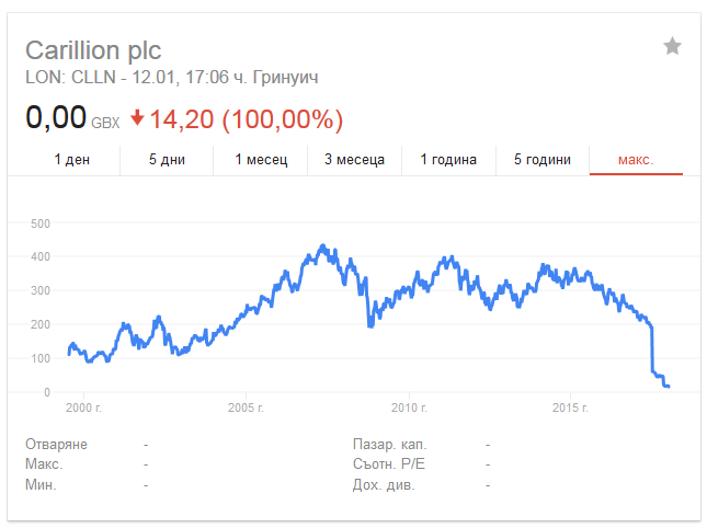
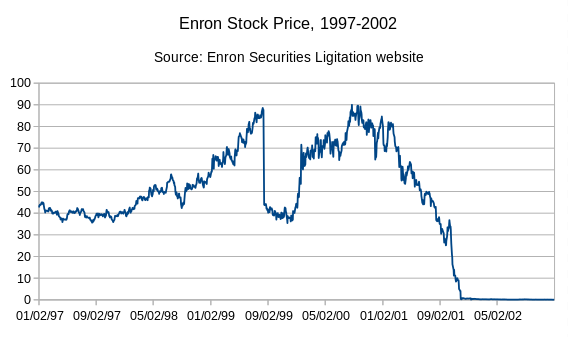
Lol, Carillion's price chart looks alot like Enron's, before declaring bancrupcy. Although they don't have anything in common ( except that they pay themselves the big bonuses and it's - no money, honey)
and
I've read a bit about Carillion - without the government contracts - they are gone - and now they are. Well, as usual - the taxpayer will pay the bill.


It also looks like the chart for bitcoin of late.
Hopefully not ! Steemit will be a very silent place, if this happens