A great electric vehicle sidelined by an in-car interface that complicates simple tasks.
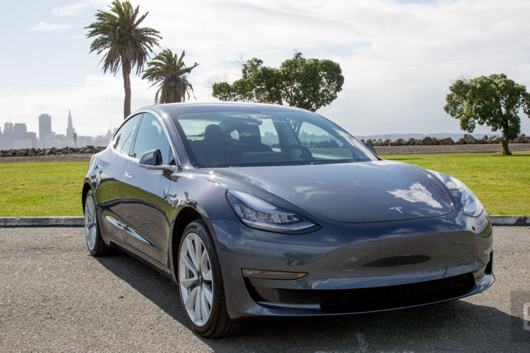
To say the $35,000 Model 3 is important to Tesla would be an understatement. Judging by its pre-orders (the highest the industry has seen), it's already the most anticipated car ever. It's the culmination of CEO Elon Musk's nearly 12-year-old "master plan" to bring an affordable EV to market. Now that the Model 3 is here I can positively say it's a joy to drive, but it's also frustrating to do some of the simplest things in the cockpit. During a single trip I went from having an electric-motor-fueled grin on my face to throwing my hands up in exasperation while trying to adjust the cruise control follow distance. So yeah, it's complicated. . More pictures https://www.engadget.com/2018/03/01/tesla-model-3-review/#gallery=840967&slide=7258829&index=1
The relationship (and if you follow any Tesla forums or even hang out at a Supercharger station, you know the owners are in a relationship with their cars) starts out like all new affairs: filled with excitement. Behind the wheel, the Model 3 is the best Tesla. I prefer it to the Model S (yes, even the P100D) as well as the Model X. It's quick but more importantly nimble. It handles corners and is far lighter on its tires than the S or X. It doesn't have the neck-snapping speed of Ludicrous mode, but the Long Range version's 307 pounds of torque coupled with 271 horsepower make for a car that's just asking the driver to punch the accelerator and hit a few curves.
The Model 3 also has a very smooth and nearly silent ride. It's quieter than most other EVs, and it glides almost as well as a mid-tier luxury sedan. With a range of 220 miles for the base model and 310 for the Long Range edition, you're going to be spending a good amount of time behind the wheel instead of sitting at a Supercharger.
Yet no matter how engrossed you are in the act of driving, the interior of the Model 3 will probably manage to confound you at some point. Some things are just too complex.
The act of driving is more than just pressing the accelerator and pointing a car toward its destination. While you're on the road you turn things on and off and adjust various settings. At any given moment, I was changing the temperature or the volume of the radio, adjusting mirrors, using navigation, fine-tuning cruise control and sometimes even adjusting my chair. It's a dynamic experience. As you'll quickly find out, Tesla has moved some of these controls to submenus on the Model 3's giant 15-inch display.
To be clear, there are hardware controls in the car, including two buttons on the steering wheel and two stalks on the steering column. The right stalk controls the transmission and turns autopilot on and off. The left stalk is the blinker control and is used for a single wipe and cleaning the windshield. The buttons are programmable by Tesla, but the left one is mostly for controlling your media. But that's it, and the hardware situation (or lack thereof) creates a bunch of issues pertaining to usability.
The first time I noticed this I was using Tesla's semiautonomous Autopilot feature. The controls for adjusting the top speed and follow distance of adaptive cruise control are on the wheel and steering stalk on the Model S and X. They're easy to adjust without looking. On the Model 3 you have to tap the display to adjust the cruise control speed. Even worse, you have to go into a submenu to adjust the adaptive cruise control follow distance. First you tap on the car icon, then find and tap on Autopilot in the screen that pops up. Finally, you adjust the follow distance by tapping plus or minus. That's not even close to a better experience, and it's potentially dangerous, because instead of using muscle memory to find and adjust a physical item, you're reaching and tapping while looking to the right.
Plus, a few times instead of tapping Autopilot, I hit something else because of a bump. That's an ongoing issue with in-car touchscreens that every automaker should be aware of. But it didn't stop Tesla from making that display the car's primary input device.
Adjusting the mirrors also requires a few taps before they become adjustable via the two steering wheel buttons. Typically these are fixed before you start driving, so it's not that bad. But the wipers, that's a different story.
As noted earlier, you can enable a single swipe or a cleaning of the windshield via the left stalk. But anything beyond that requires using the touchscreen. The Model 3 does have automatic wipers, which work well most of the time. During a rainstorm, however, it took longer than I was comfortable with to engage and didn't wipe fast enough for my liking. To speed them up, I had to reach over and tap the speed I wanted.
If this were any other car or automaker, that would be it. I'd tell you that these usability issues make an otherwise amazing car a pain to drive. But Tesla's cars evolve while sitting in your driveway, and apparently, it's already working on these issues.
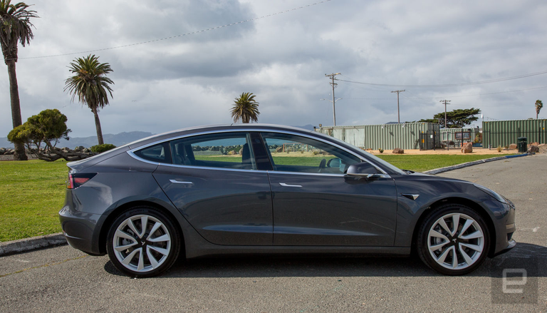
The ability to adjust the adaptive cruise control speed is coming to the right hardware button on the steering wheel. The wipers are also getting an update that puts a shortcut to start them on the left stalk. Both of these will arrive in the form of over-the-air updates. No word on whether the adaptive cruise control follow distance will also receive hardware-button support.
This is where the company shines: the ability to take feedback from owners and reviewers like myself and fix things with a software update. But I can't review a car based on what it'll do in the future. I have to make my assessment based on what's available now. And right now, I'm bewildered as to why these decisions were made in the first place.
I'm also annoyed by the lack of a dash cluster behind the steering wheel. The display that was in front of the driver on the Model S and X has been relocated to the left side of the touchscreen display. So you're looking to the right not only to see your speed but also what gear you're in and what the sensors see (which is especially important while parking) as well as to check on blinkers. It's weird for the left blinker to be flashing in your right eye.
The lack of a display ahead of the driver is even more noticeable at night. After decades of having something glowing behind the steering wheel, complete darkness from that part of the car is eerie.
Tesla isn't the first automaker to move the speedometer to the center of the dash. Mini did it decades ago. In fact, I own a Mini with the speedo in the middle of dash. I hate it. I'm not a fan. It wasn't enough to dissuade me from buying and enjoying my car. But it's something to keep in mind when you're thinking about the Model 3.
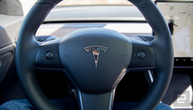
These are dramatic changes from the Model S and X. Thankfully, though, some things do carry over from those two vehicles. Even though this is the affordable Tesla (its starting price is less than half the price of the base model Model S), if you plunk down $5,000 for the Autopilot option, you're getting the same experience as the other models. Tesla continues to refine its semiautonomous system, which is one of the best in the industry. The Model 3 had very few problems staying centered in its lane and tracking cars. The auto-lane-change option felt a bit more aggressive than the last time I drove a Tesla. Most of the time it was fine, but in one instance it quickly changed lanes, then immediately started braking enough to catch everyone in the car and the vehicle behind me off guard. It's a reminder that none of these systems are ready to be left on their own.
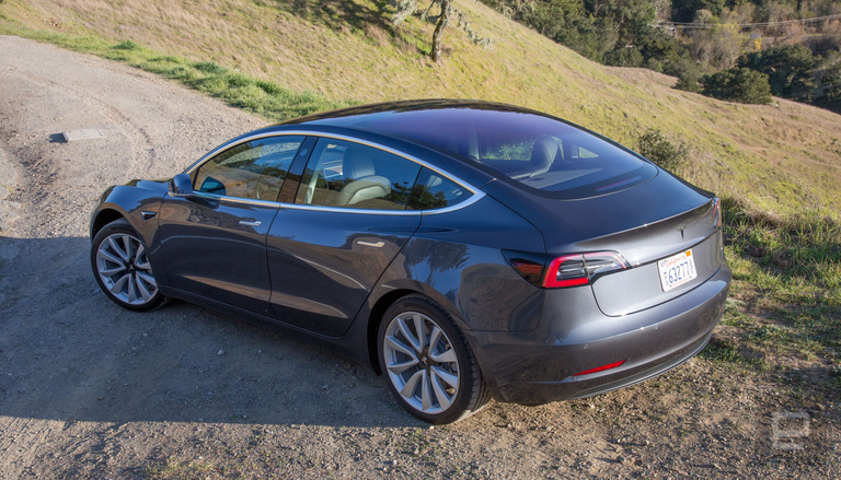
Another place where the Tesla excels is its voice control. Even when I flubbed the names of locations, it figured out what I was trying to say. "Umpire State Building" was quickly changed to "Empire State Building" based on context. It did an outstanding job handling building numbers and parsing the names of friends I wanted to call. Currently, the feature controls navigation, the phone and media playback. But Musk said on Twitter that in the future, voice control would be integrated more into the vehicle's control, which is great news. But it'll be better when that actually happens.
Definitely. You will be able to do pretty much anything via voice command. Software team is focused on core Model 3 functionality right now, but that will be done soon, then we will add a lot more features.
— Elon Musk (@elonmusk) Jan. 15th, 2018
In short, there's a lot coming to the Model 3 -- eventually.
That's what's so infuriating, because being behind the wheel of the Model 3 puts a smile on my face. It delivers on so many levels, and yet when I have to do things that would be simple in any other car, here it involves tapping and swiping when I should be looking at the road. That's frustrating. If this were a horrible car, it would be fine: You chalk it up to an overall failure of the automaker. A bad vehicle is a bad vehicle. But it's not. It's a great car held back by weird decisions. Tesla says it's working on these issues. That's great, but I can't judge a car I haven't driven yet.
It's great on the road and the tech is top notch, but using some of the most important features are a pain and potentially dangerous to operate. The plus side (but not really) is that if you order the car today it'll be 12 to 18 months before it's delivered. By then, hopefully, Tesla will have a user interface that's worthy of a car as great as the Model 3. Because right now, it's complicated.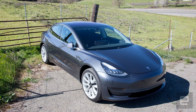
It's a beauty! #wantone
I am agree!
Hi! I am a robot. I just upvoted you! I found similar content that readers might be interested in:
http://porscheautoworld.com/tesla-model-3-review-the-fast-and-infuriating/
Congratulations @somnu! You received a personal award!
Click here to view your Board
Do not miss the last post from @steemitboard:
Vote for @Steemitboard as a witness and get one more award and increased upvotes!
Congratulations @somnu! You received a personal award!
You can view your badges on your Steem Board and compare to others on the Steem Ranking
Do not miss the last post from @steemitboard:
Vote for @Steemitboard as a witness to get one more award and increased upvotes!