I just wanted to get this blog out real quick, did you see the new Steemit Structure? It's looks so awesome, and it's runs more smoothly than before 😲😎
Check out the images below: 👨🏼💻
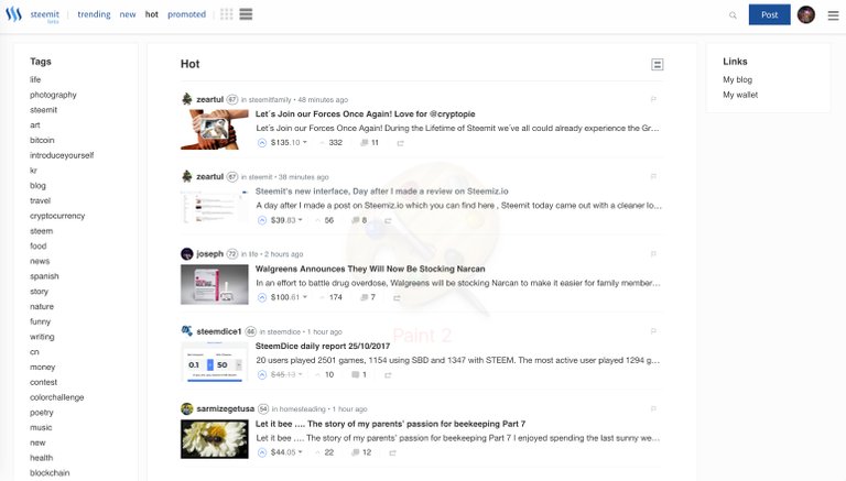
Tell me what you guys think? I know Steemit has lots of work ahead of them but this is a great new update for us Steemians. 📝
I'm so excited in the future of Steemit, there were several negative comments from a few bloggers the last few weeks about the speed. However guys, we are still in beta!
More fantastic things are coming down the road, get ready guys! 💞


So far pretty slick and load times seem a little better but still far from being optimal. Steemfest is coming up!
I owe you a big upvote for being a loyal Steemit bad ass :)
Nice.. Coll.
It was really annoying to wait 1-2 minutes for a reply or comment :p It looks cool man
Yeah Man, It's looking way better! :)
I hate it. It's too white and makes it harder for me to view. That's just my opinion I may get used to it but right now..nope not an improvement. Also I tried to upvote this and it's still circling so it seems between this and the new logo the boys just putting lipstick on a pig. We need them to focus on fixing all the issues the site's been plagued with for almost a month @stackin
A dark version would be great for this patform.
Dark version would be sick, kind like Steemnow's dark theme. Would be a great setting for nighttime use.
It's not you. It's not the you hate the new design. It's simply that the new design is badly thought out.
It has some bad design to but it's much better than the current steemit design. I will try to send my recommendation to both and also to all other designer looking to build a Steem front end. I now use https://stage.steemiz.io
Thanks, @teamsteem for Stage.Steemiz wasn't aware of it. Liked and bookmarked.
Update: I'm getting more used to it already haha I hate change maybe?
Quite possibly. I love he clean and bright, but certainly noticed it on the first refresh that it appeared on. I can understand how others prefer an off-white background to make things easier to read for them. Would be nice to have some customisation ability so we could personalise how we see our own feed
Quite possibly. I love he clean and bright, but certainly noticed it on the first refresh that it appeared on. I can understand how others prefer an off-white background to make things easier to read for them. Would be nice to have some customisation ability so we could personalise how we see our own feed
Yeah, it's still slow still... took me 3 minutes to comment haha
Meh its okay... could of been better done really.
Good catch @stackin caught me and my two hot posts!
Opps my bad, friendly steemit competition haha jk
It definately proves that they are working on the interface now! I bet more upgrades are coming especially after the 2x fork
Yep, it is cool, but i hope it will stop to be so slowly!
Yep, it is cool, but i hope it will stop to be so slowly!
re arranged the deck chairs...new paint..
still sinking?
Only time will tell....
It's looking good, I was surprised to see the new look and feel! Good to see the productivity of the team!
im diggin' it! 😎👍 🔥
I'm really digging it! :)
@stackin I just got home and looked at the changes of the website. Like anything else we just need to give it some time to get used to.
Seriously does look better and sleeker!
Glad to see you're doing well friend, now to catch up :)
I am now experiency the new update of steemit and it looks so nice, I know that there still a lot for improvement and I know also that they are also a lot of great thinkers who will transform steemit to a better one.
YEAH. just did this same post 4 minutes before yours lol not with the same response obviously lol
I will take a look :)
Cool man :D eheheh I also had to do it just before go to sleep eheheh
Looks pretty sweet to me. Looking forward to seeing if it runs smoother than before lol
Yeah, we all do. Let me upvote this :) haha
Awesome so far..seems alot more stable :) Have a great night!
I think it's pretty awesome, especially since everything feels a lot faster now! Can't wait until the sub-communities update too.. hoping that this is a pre-cursor to it!
It actually happened right as I was surfing Steemit... right as I clicked on a link, the whole interface changed! It scared me at first!
Yep, it is cool, but i hope it will stop to be so slowly!
I am happy they are improving, they should, but:
Already commented this on a @steemitblog post, but something is wrong on how the space is used in the design, and the problems with speed and failing posts/upvotes are the same for me.
It was honestly just a nice sensation to see something different lol. Lets us know there is constant development going on. Obviously there's tons of work to be done, but as long as I keep seeing change I count it as a positive!
Yeah it seems like I haven't been having the hanging problem as much. We will keep testing and earning!!!!!
I hope this new layout brings a bit more stability and stops the lag but im trying to upvote this and i still got the circle
Agreed, it’s slow.
This new interface is a lot more cleaner and not as cluttered up. Great work, finally.
Its fan-friggin-tastic. cane back from work and was like what?? Way more mainstream looking. between this, Zappl, and Dtube. Its only a matter of time. before FB,YT, go the way of Myspace. GONE!
Great job guys!!
So far I like it. It's still clean but it's got a more professional feel to it.
Pretty sweet looking..But always trouble to reply.
Cool as ice
Looks great still some minor delays but way better than the last week here
Looks Clean :)
Thanks for sharing. While aesthetics are nice to improve on, and we're in beta, the backend functionality is what's more pressing for further development by their team. It's great to improve everything, but I hope their priorities are more on site performance and new user support for now.
I hope they also update profil pages because it looks very prototypish
It looks fine, but I wish they would concentrate on getting the very basics of the site to work right first!
I think it looks terrible and very amateur. Very bad decision.
Yeah I can’t complain, better than before lol
@stackin I would say or call it "Smoother" than before with a slightly more modern look. Way to Go STEEMIT.COM!!
Full Steem Ahead!!
It’s looking good but still that darn delay, taking me forever to comment 😂
Initial reaction: Sexy as hell.
I was at work today, and I opened Steemit to find a new Steemit. Pretty cool, bodes well for value of STEEM.
Initial reaction: Sexy as hell.
I was at work today, and I opened Steemit to find a new Steemit. Pretty cool, bodes well for value of STEEM.
And here I wrote a post earlier this afternoon about why I am super bullish on STEEM and steemit. Ironic that people get negative so easily.
Maybe the new update will help to settle the masses down.
Hold steem long...it is strong.
I think the new interface is quite nice, but to be honest, I have not sure is it because of the recently unstable of the website or other reasons, I got some CSS error sometimes.
It's looking a bit more mature to me too.
Had only used the one before for 2 1-2 weeks, I'm still pretty new here. But was really wondering if is makes sense at all to stay around with having all that technical issues posting, commenting or Upvoting.
Especially for newbies it's hard to catch attention so what is the point to make a post every day that won't be seen because the other users are having the same problems using this platform
However, I am not gonna leave here for sure.
Looks like are you bringing some nice helpful content out, gonna follow you from now!
Have a great Thursday, it's already noon around here.
Greetings from Japan 👺
It looks very cool and nagging works;)))
looks cool but still lots of bugs are there the comments are going twice
The new look is definitely an improvement. Unfortunately, I'm still having problems but the future looks bright once we get past this!
It was really annoying to wait 1-2 minutes for a reply or comment :p It looks cool man
I like too new look and it seems faster. Thank you :))
It looks good but it takes me a whole lot longer to post. Keep getting errors and when I finally can see it, it's there 3 times lol
Its nice but the site is in greater need of functionality to filter through all of the posted content.
Totally agree with you on this.... it's currently to noisy.
It looks awesome, only the pictures and letters seem slight smaller
I noticed the change. I liked it better when things go faster though.
Looks awesome as! Very user friendly and greater options!
hahaha really ours comments does not appear, and we try and try and next appear twice but using busy.org is normal is it not necesary make click and click for comment busy.org, work fenomenal
@eileenbeach has voted on behalf of @minnowpond. If you would like to recieve upvotes from minnowponds team on all your posts, simply FOLLOW @minnowpond.
            To receive an upvote send 0.25 SBD to @minnowpond with your posts url as the memo
            To receive an reSteem send 0.75 SBD to @minnowpond with your posts url as the memo
            To receive an upvote and a reSteem send 1.00SBD to @minnowpond with your posts url as the memo