Hello my dear Steemians,
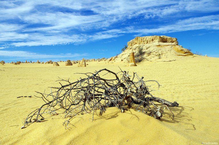
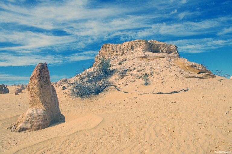
my todays contribution to the #colorchallenge: This photo was also taken in Western Australia in Nambung National Park! Same as yesterdays photo, but slightly different... It was taken at almost the exact same spot, only difference is the color. One is more yellowish and the other one orangeish.
Which photo of the Pinnacles do you like more? Which one do you think is closer to reality? Comparison photo is down below. Please leave a comment.
Cheers for dropping by and maybe see you around!
Steem on,

Nun zu meiner deutschen Community :)
Hallöchen zusammen,
mein Beitrag zur heutigen #colorchallenge: Dieses Foto wurde in West Australien im Nambung Nationalpark aufgenommen. Wie bereits das gestrige Foto, nur ein wenig anders... Welches glaubt ihr kommt der Realität näher? Die Perspektivev ist leicht verändert, nur die Farben sind verschieden. Eines mehr Gelb das andere mehr Orange.
Welches Foto der Pinnacles gefällt euch besser? Und welche Farbe hat es tatsächlich? Scrollt einfach runter für das Vergleichsfoto! Ich würde mich über euer Kommentar freuen.
Danke fürs vorbeischauen, vielleicht sieht man sich wieder!
Steem on,

I thank all of you for your support towards my blog. If you enjoy reading my blog and my photos, feel free to share my posts and follow me. If you enjoyed it so much, that you want to keep on having a look at my posts, here are my most recent ones:
Great pictures!
Thanks a lot :)
Interesting.... :) I think the second photo is too faded and that's why it looks less real. What's the right answer???
You are right unpackfrance :)
Nice! I find the higher contrast in the first picture makes it more engaging/immersive.
I prefer the second one, don't ask me why maybe it's just the color...
The poor colour quality of my laptop screen probably has an impact :) I do think the second one would make a superior print