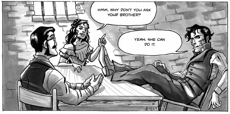
Last post I took you through the historical event that inspired What Happens In The Dark. This post I'll take you through the steps it took to create the comic, focusing on a single panel.
Reference Photo
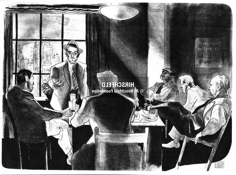
Before I start any comic project, I always try to collect as many reference photos as I can. Most of the times, especially when it comes to finding references for character poses, I end up using a lot of stock images. However, sometimes my references come from other artists.
The photo that inspired the panel you'll see below was from famous caricaturist Al Hirschfeld. His linework is super fluid and expressive and he is most famous for his portraits of celebrities. I believe in one of the documentaries I saw about him in art school, it was said that he inspired the look of the genie from Disney's Aladin.
I not only turned to this piece for the poses but also for mood and atmosphere.
Pencil
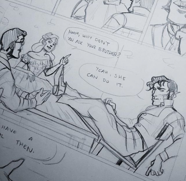
This was a picture I posted of the pencils on Instagram which is why it's cropped as such. I used a filter to make the linework darker but in reality, most of my pencils done for this project were done in a Primsacolor Col-Erase Erasable Colored Pencil. I used a couple of different shades of blue, using lighter colors for a base sketch and a darker blue to tighten up the linework. I would sometimes go over images with a normal lead pencil but that was on rare occasions. I used to work this way for two reasons:
- Lighter shades of blue are easy to take out in Photoshop, the program I would use to clean-up & add finishing touches on my pages.
- Working with lead pencils was always too messy for me. I always managed to smudge the heck out of my pages and after erasing and re-drawing panels a few times, the page became just a grey mess.
Ink
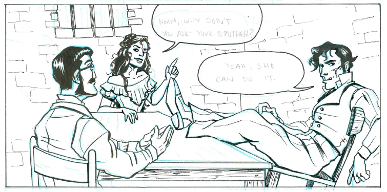
Prior to my senior year in college, I had been inking my projects with ink and nib but for this project (which was my final portfolio project), I was in a bit of a crunch for time. So my tools of choice were, drum roll please...gel pens! That's right, these bad boys. When I first set out to ink this project, I originally intended to use brushes to ink it. I had done other projects, such as the History of The Ouija Board Comic Poster, with a brush before but for some reason my linework was very stiff and shaky when I attempted to ink the first page this way. I think this had to do with the pressure of finishing my 22-page project (when everyone else was doing 16) and the additional fear of messing up with an unforgiving tool. So I decided to switch to a less intimidating art supply: the gel pen. And it served me well, also proving that you don't need fancy supplies to create good work.
The gel pen was really great for furniture, buildings, and other background details, subject matter that needed consistent-looking lines. When I wanted greater line-variation or was blocking in large sections of black I used my favorite brush pen, the Pilot Pocket Brush Pen. You can get the look of inking with an actual brush with much greater ease; the ink also dries relatively quick and it doesn't erase away as easily as other brush pens.
Clean Up On Aisle 2
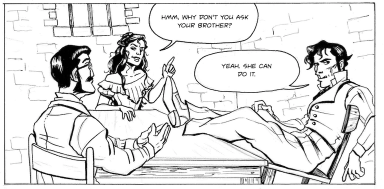
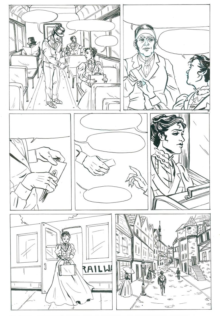
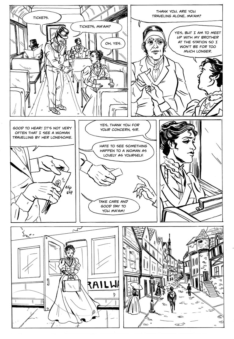
After I finished inking all the pages by hand I scanned and brought all of the pages into Photoshop. There you can mess around with the adjustment levels and the contrast until you get a crisp, black & white image. This is also the stage I get rid of any inking mishaps, any lint or dust that infiltrated the scanning process, and add in the dialogue. I normally leave dialogue to the last steps, though I always have a general idea of what characters are saying in the various panels. A lot of this has to do with the fact that comics are a visual medium and the picture should be the strongest part of the storytelling; the dialogue serves as a compliment to the artwork. For the most part and with few exceptions, the reader should be able to remove the dialogue away from the panels and still have a general sense of what is going on.
Finishing Touches

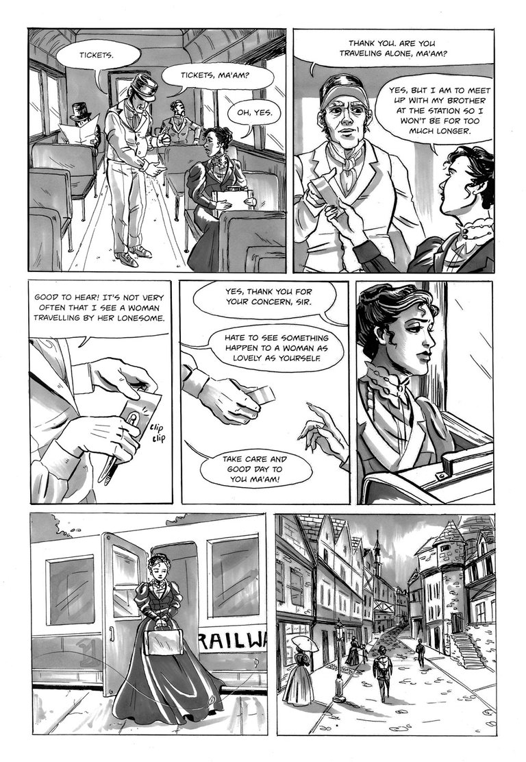
Cue the mood! I originally wanted to use an ink wash to color this comic, as I did with the Ouija Board comic, but as I mentioned before was in a crunch for time and. So I used a combo of Copic and Prismacolor markers. These markers are pretty expensive but will serve you well if you can invest in them. They give a similar look to ink wash/watercolor with the convenience of a Crayola marker. You can see in this final stage the influence of the mood and lighting from the Al Hirshfeld photo.
I'm not going to post the page this panel is from because that particular page shows pretty big spoilers to the story. Instead, here is another page from start to finish (minus the pencils...)!
Thanks for Reading!
If you'd like to read about the other posts I made about my horror anthology you can check them out here:
Under The Bed
The Graveyard Shift
Creating Characters
The Story Behind The Story
If you'd like to keep up with more of my work you can check me out at the following:
Instagram: @la.fumettista
Tumblr: http://la-fumettista.tumblr.com/tagged/art
Twitter: @TheresaChiechi
Website: https://www.theresachiechi.com/
Great process summary, I love seeing the steps and your choice of tools. I've seen plenty of veteran artists get posed the question of what tools to use for inking, and the best of them reply "anything that makes a black line." I'm often in awe of some artists mastery of the simple ball point pen.
Thank you. I love that! I used to always be in search for the perfect inking tool and I used to tell myself that if I found the right pen, then I'd be amazing. But it's really just how you use the tool. I've had cartooning professors ink their professional work with a pen on scraps of paper on the subway because that's worked for them in that point in their life. It's just whatever get's the job done
It's always funny to see how other comic-artists are working. I really like the dress in the last frame. I work digitally and moves between Inkscape where I add the dialogue and then back and forth with the painting app. that way I slowly cut as much text out as possible.
P.S. What is the font you use called?
I believe it's called Unmasked. A lot of the fonts I use for my comics are from Dafont.com , they have a lot of good cartooning fonts. You just have to be careful to make sure the one you like is free to use.
It is quite funky! I bought a font called Comic Pro JY. It was needed so the French and German translators could have all the accents and special letters they needed and my own Danish translation also had to have the ÆØÅ-letters. I only bought it for web use though, and I guess that I will have to buy it for print too when I hopefully gets money enough for printing the album.
I also consider learning hand texting, but that wouldn't help the translators of course.
Yeah, I didn't even think of that. Unfortunately, Dafont font's are missing special characters so it might not be the best bet for those purposes. But that's what you get for free fronts
Yes, I used a free font at first, but @vcelier, the French translator, couldn't use it. I have also considered making my own, but FontForge is a bit complicated and I have so many projects right now.
Hello, @la-fumettista 😊
Here is Anna, from the team at @bizarreart
We are a new project on steemit and our main purpose is to show some of the most bizarre art works that challenge traditional perceptions of art. 🎨
If you have original content that you think fits our project, we would be happy if you could support us by following and using the tag #bizarreart on your original content related with bizarre art.
We are still preparing some guidelines for our project related to projects that we will resteem on our account and also the ones we will publish but soon it will be ready.
Hope we will have your support and if you have any feedback or ideas please let us know on our first post at @bizarreart,
Thank you 👨🎨
Anna
Hey @la-fumettista... this is amazing, I really like it... I've always loved comics and your art-style is super clean... so good!
Could you do us a favour though? Steem has so much plagiarized work, it makes it really hard for people to verify that this is legit (which it definitely seems to be). Could you add a link to your website that links back to your Steem account? That way art competitions, curation, followers, etc will all know that it's your work.
Hope that makes sense!
Thanks!!
Thank you for the feedback! Just updated my website to include a link to my steemit: https://www.theresachiechi.com/
Perfect! Good luck with your future posts... I'll definitely be keeping an eye out for you, you work is incredible!
(ノ゚0゚)ノ~AWESOME! I used to draw traditional pencil and pen comics way back in high school but it's nothing compared to this! You are amazing * o*
Awww thank you! Just checked out your stuff; looks like you're pretty talented :)
so do you do everything in pencil until you scan it or do you also use a drawing tablet? really cool content btw :D
Also I wanted to invite you to a Discord Server I'm running called Steemit Webcomics It's a place specially for people who like to write or read comics, webcomics, comicstrips, etc. It's just starting out so not many people is there yet, but the idea is to grow the community so people can start sharing and collaborating on the creation of comics. I will share you comic as well so people who join the group can also see your blog.
This project, I penciled and inked everything by hand. Then took it to Photoshop to edit and clean-up the inks. Nowadays I use a tablet for everything.
Thanks for the invite, I loved to join :)
I bet the tablet helps a lot :) but really cool what you can do the old fashioned way.
Thanks for joining the community :D!