I came across @Spirits4You by accident and saw his post about his logo contest. For some reason I instantly had a picture of a logo in my head so I decided to join his contest - hopefully he’ll like my result as much as I do :)
Reason why my logo should be picked:
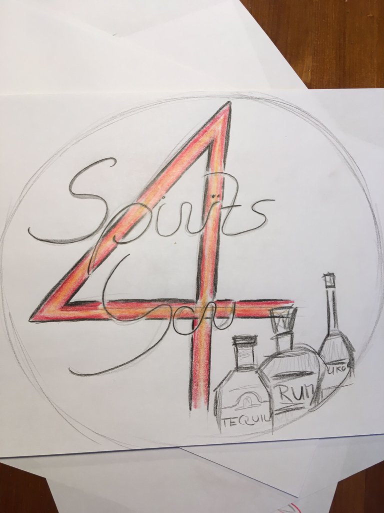
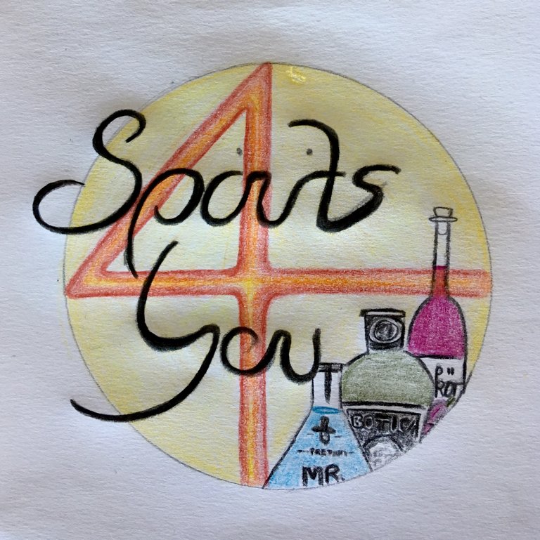
The logo is unique, the circle with the 4 in it and the overlaying writing looks like a perfect company logo to me. It has a high recognition value. Also the colors I used create a warm and positive atmosphere (the yellow circle might relate to the sun - sun makes me think of delicious cocktails on the beach).
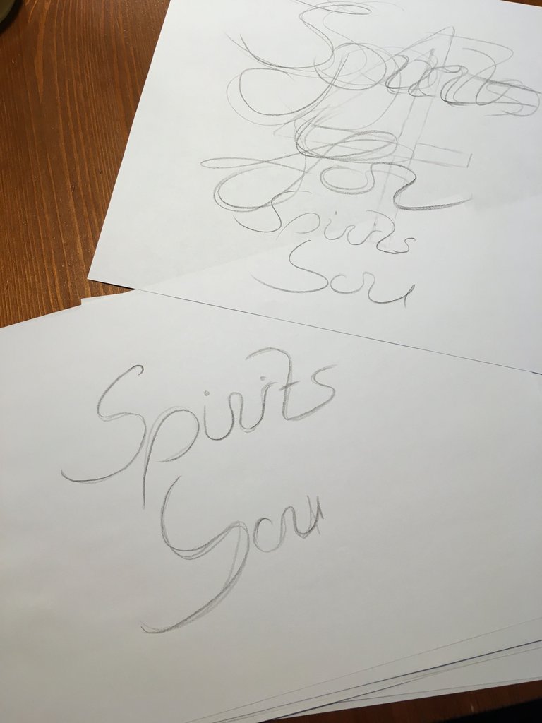
I started off by finding the right writing:
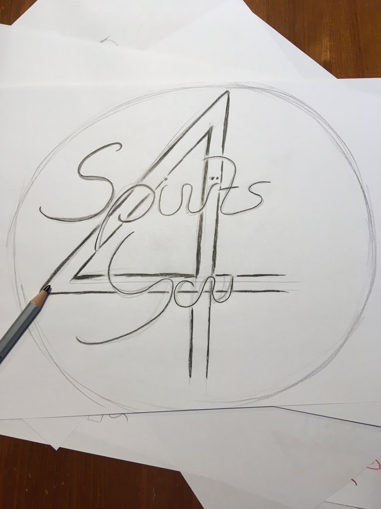
Then I tried to bring the idea in my head to the paper:
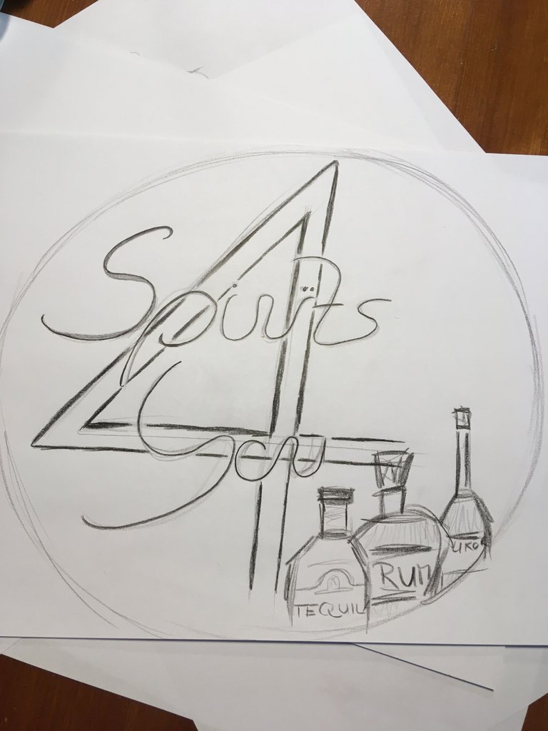
I was quite happy with the first draft. I finished on a new piece of paper:
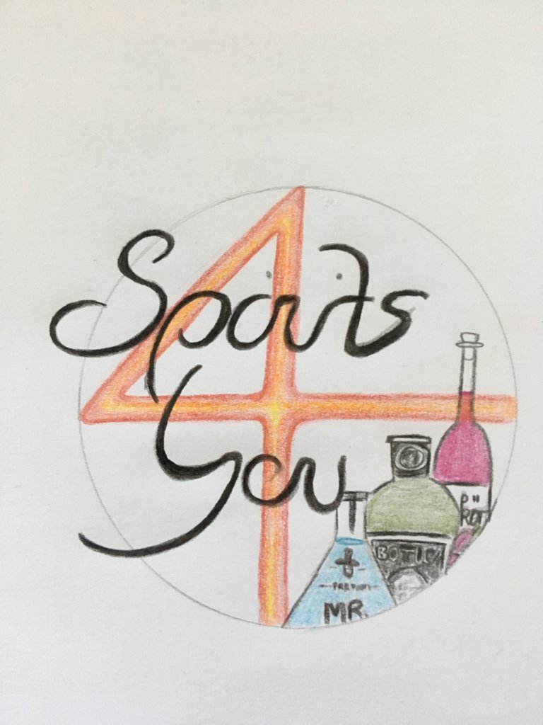
Some more color for the circle - and here is my final logo:
Cheers
auminda
Hey auminda,
you did a really good job here and have stucked to what I want to see to participate, hence the evolvment of the logo process. Thank you for that.
Warm regards
Thank you :)
Great logo, just a small advice if you don't mind, maybe yo sould highlight the dots of the letters "i" a little bit more... it kinda reads Sports instead of Spirits. But other than that is amazing, I really like the yellow circle...
I will make sure to make them more visible when I create it on the computer.Thanks @davvas you are absolutely right! When I work on something for a long time I sometimes don’t see the tiny things anymore.