"...they said 622 x 480"
For future reference (i.e. for when you re-create your logo because you won't be satisfied with the small size of this one ;) the significant thing (only when it comes to Steemit posts, and particularly for the "original http://steemit.com interface,") is the RATIO between the width and the height.
Here's what I suspect is a much better article to guide you in the future:
It explains the ratio thing as well as providing the "622x480" and an explanation about that being the optimum height for mobile display, but Steemit makes that reduction for you.
On a desktop or laptop, you really want a much wider original to present good detail in the image. As you'll see, that article actually recommends a wider image than I asked for.
Nooooooooooo No more logos!!
@dreemsteem has already hacked half my computer with the amount of code she has written for her image lol
I am sure its a trojan and everytime she sends me the “updated” version she is tacking on more code :D
Good luck with that. @dreemsteem is very devious.
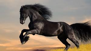
@robmenzies and @creatr - you brats!!!!! LOLOLOL the only horses that i like are Friesians... and there is not a devious bone in my body! hahahahaha
when i want something - i'll just straight out tell you. boldly. and then i'll just start begging and whining. hahahahaha
if there is anything that comes as a surprise to my innocent victims... it's that you never knew how you got along without me for so long, and you are so happy that I'm now a HUUUUUGE part of your life and you'll never let the friendship go.
EVERRRRRRRRRRRRRRRRRRRRR.
hahahahahaha
That's YUUUGE, dear... ;)
hahahahaha i'll just have you know that my dad said YUUUUUGE way before Trump said it. hahahahaha
i had no idea that Trump even said that until @countrygirl told me LOL
this is what happens when you don't have tv. it's a good thing :)
Who the heck is this Trump character?
I was talkin' about your dad!
seee????? LOLOL you dont' know either! hahahahahaha
And here was me thinking you were talking about the cow!! Very stubborn but good milkers
no no no! look!!!!
No no no no look here
no. look at mine. yours is a pitiful horse
hahahahahahahaha
ahhhhhhhhhhh ok :)
I tucked mine into the right hand corner of this post..... but when I don't right justify it - it looks pretty large hahahahaha
can you go look at this post - and tell me if that one is large enough to see detail?
I appreciate all your help on this! hehehehe i want this to be as clear as possible for everyone! :)
(and logos need to be clear too hehehehe)
Rob is actually going to have it on the bottom right of his post tomorrow - but he's already asleep and this is how it appears when it's just right in the top center of the post.
(without the right justify)
give me your thoughts please!!! :)
https://steemit.com/contest/@robmenzies/coinbase-opens-paypal-competitor
I'm sure no one but me will complain... ;)
Rob's post looks fine.
The only problem is that when you start with a small image and then blow it up, you see the irregular lack of detail. And, as you're requesting that it be the first image in the contest posts, many will do what Rob did and "leave it large" at the top of the post.
yes - i'm fine with it being large like Robs.... it's not too bad that size. and i thought i was preventing that problem by seeing what size to make the image at first hehehehe
but i was soooo tired - and i looked too quickly i guess. I dont mind the smaller image though - it's kinda neat how its tucked away ;)
and i've definitely changed my mind about the first image thing. I mean - it doesn't need to be at the top. yes - first image - but it can be lower in the post so that the flow of the article makes sense. I have edited Rob's for him so that the picture is tucked at the bottom - so that people aren't confused by a picture that doesn't have anything to do with what he's saying! hehehehe he did that by my request - but i'm changing my request for the flow of the posts :)