Hi there @(ilv)stranger Thanks for your suggestions. all very life affirming !
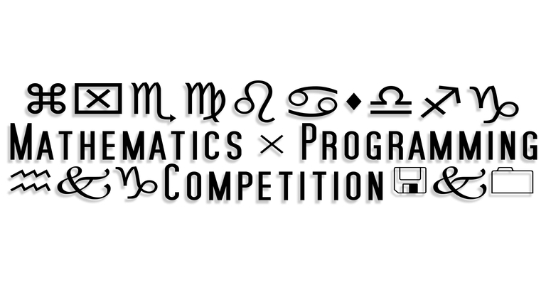
I had, as you can see below already gone through a process of simplification using a drop shadow, strokes and various colours / configurations..
However the contest will be won on most votes.. I posted them all then realised that if the votes were split between them, I'd wouldn't have a chance, so I took them all down and left the first one. If it does win and I hope it does... I will give them all to choose from !! your input is appreciated and I welcome your support with many thanks :)


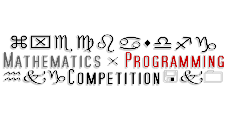
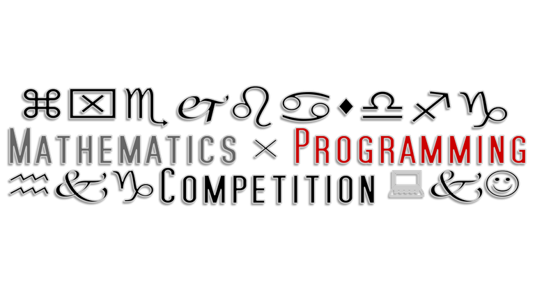
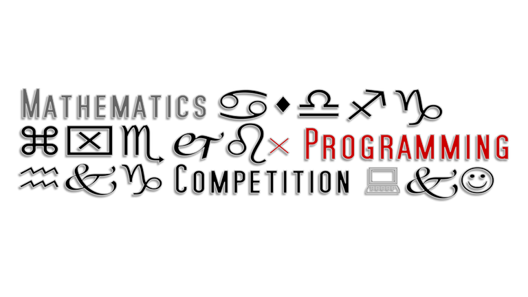
Well i can't hold it and played around a bit with your design here:
logo proposals
You can take all from there and use them or just modify your own (unfortunately i used photoshop because the source was a png). I don't mind and have no pretension.
Hmm... V.3 and V.4 are too crowded... but i made them in 20-30 min. :-)
I haven't play around with logos from a long time and just want some fun now.
very kind @ilvstranger. I had a look. I quite like what you did with the lines. Unfortunately I've submitted and the logo has votes already so it has to stay as it is. Appreciated though ! respect :)
Well you have them as new ideas if they choose yours :-)
Loved when was on crowd logo freelancers.
Maybe we'll find common interests in this area.
Yes, lines should help make a difference. But made them before going to sleep... at the end didn't liked as much as i saw them in my mind.
Even if i draw them... usually todays trend is to go as simple as possible and make a stand in viewer mind. Also, there are times when need something crowded from where to stand out the meaning of that thing... uhm, interminable speech here :-)))
Also, in the near future i will move them to another area, now i placed them quickly. If you would like to see them or place your own there tell me.
Cheers