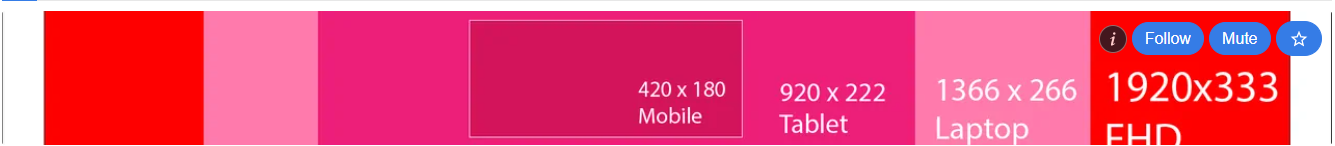
When managing different device widths, screen resolutions and HIVE Front-ends its not a straight answer.
What is the correct cover size to use?
Below we've cropped the cover from common device resolutions,
the HIVE scroll bar on the right hand size is around 15px wide.
Cover image = device width - scrollbar
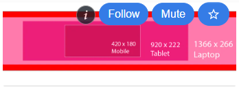
Narrow Cover
Actual Image Rectangle (1900 x 275)

Rendered size: 599 × 83 px
Rendered aspect ratio: 599∶83
Intrinsic size: 1900 × 265 px
Intrinsic aspect ratio: 380∶53
1920x1080 / FHD

Rendered size: 599 × 59 px
Rendered aspect ratio: 599∶59
Intrinsic size: 1903 × 189 px
1366 x 768 / HD LAPTOP

Rendered size: 599 × 82 px
Rendered aspect ratio: 599∶82
Intrinsic size: 1350 × 186 px
Intrinsic aspect ratio: 225∶31
1280 x 720 / HD

Rendered size: 599 × 90 px
Rendered aspect ratio: 599∶90
Intrinsic size: 1265 × 190 px
Intrinsic aspect ratio: 253∶38
360 x 740 / Samsung Galaxy S8

Rendered size: 358 × 259 px
Rendered aspect ratio: 358∶259
@ecency - 1920x1080 / FHD

Rendered size: 599 × 62 px
Rendered aspect ratio: 599∶62
Intrinsic size: 1334 × 139 px
Intrinsic aspect ratio: 1334∶139
@ecency - 360 x 740 / Samsung Galaxy S8

Rendered size: 342 × 138 px
Rendered aspect ratio: 57∶23
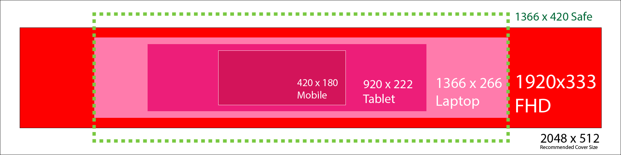
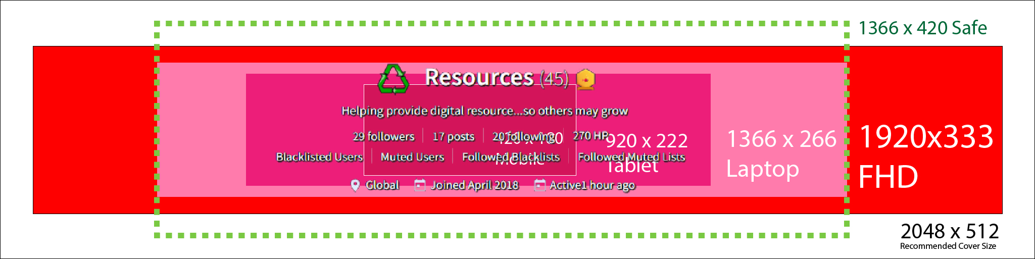
We've updated our cover to 2048 x 512 pixels as recommended under cover size under settings

1920x1080 / FHD

1366 x 768 / HD LAPTOP
1280 x 720 / HD
360 x 740 / Samsung Galaxy S8

@ecency - 1920x1080 / FHD
@ecency - 360 x 740 / Samsung Galaxy S8
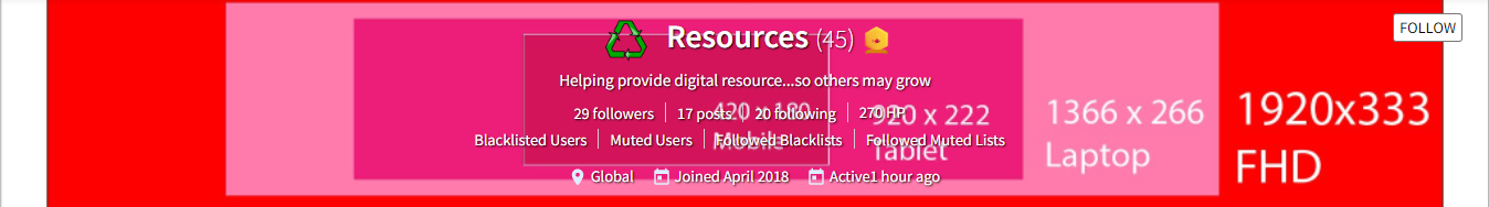
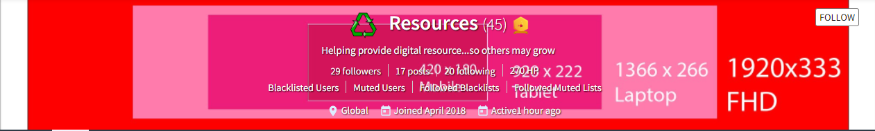
We've Drawn the average surface area out all displays, recommend to keep all visual elements within the hit area with 2 template files below for cover size:
Without Profile Info
With Profile Info
Hope everyone finds this useful, cheers.