
While many states may be able to keep COVID-19 under control through a phased reopening and testing program, huge sections of the country have, at best, a dismal medical and economic prognosis. Dismal, at the very best.
Let's start with where we are. All these graphs are adjusted for population size.
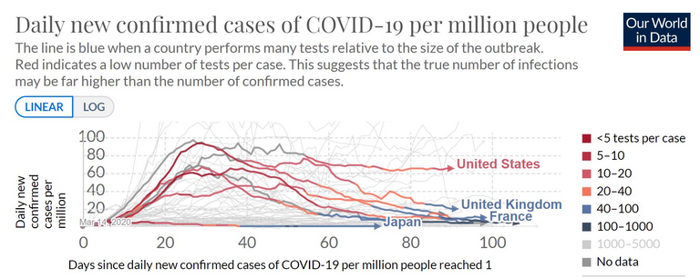
This chart compares the US with other large, rich democracies. All had reasonably high peaks, all are now below those peaks. But the US stands out in three ways.
First, most of these countries have infection rates that are 90% below the peak or better, while the US is down only 30%.
Second, most are trending down, even with the very low numbers. The US has been essentially flat for a month.
Third, check the color, which represents how thoroughly each country was testing at the time. It's number of tests given per case found, which is mathematically the inverse of case positive rate. Deep red means overwhelmed, you really have no idea what your true rate is. Red means you're testing only severe cases. Orange means you're getting close to testing on demand, and you have a reasonably accurate count of cases with significant symptoms. Blue means you're getting the upper hand, and may be ready to start testing contacts.
Look at how the other countries went from deep red, through red and orange, ant into the blue zone with test positive rates 2.5% or lower.
The US goes from deep red, through red to orange...and then back to red. Yes, actually going backward in test thoroughness. You may recall our president saying it looks like we have a lot of cases because we're testing so much more? It's exactly the opposite. Our testing has declined so much, that our already bad numbers are understating the scope of our infections.
It's hard to get a scale for how badly the US is comparing. As we go to the next chart, remember that our current "63" is not apples to apples because of our lack of testing, our truly comparable number is much higher.
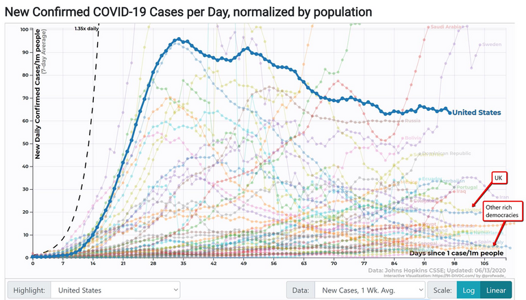
One quick view for scale. Remember, our flat line at 63 should actually be a modest upslope at a somewhat higher number.
The UK has botched their handling very thoroughly, their per capita death count is very high, yet their new case rate is down 70% from the peak and they're making progress. They get a D.
All the other big rich democracies? You really can't see them at this scale. But notice that light blue curve that seems to track the US perfectly on the way up, then comes down 95% to the floor. That's Italy. Our rate per capita is now 12 times higher than Italy.
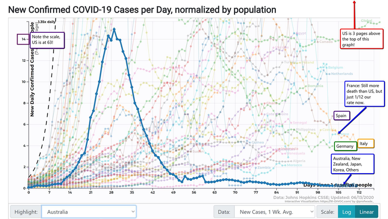
Here's where we zoom in for detail on the other countries. At this scale, you would need to add three more pages above this one, and the US would be at the top margin of that last page.
Spain, Italy and France are all in the 5-6-7 range to our 63. Germany is at 4. Australia, New Zealand, Japan, South Korea and so many others are far, far below 1.
These countries are opening up now, gradually, without a rise in cases, as their public health tracing programs take over from the brute force lockdowns.
Why are we doing 10 to 100 times worse than these countries? Well...it's complicated.
Some parts of the US are doing very well, on par with the European democracies. Other parts are doing far worse than the US as a whole, with cases rising to new highs every week, while they continue to relax restrictions even farther. Let's take a look.
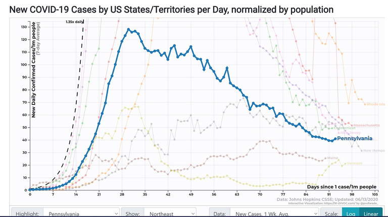
First, the northeast. NY, NJ and PA are all clustered around 40-50 cases/day per 100k population. This puts them below the US average of 63, but above the UK and far above the other European nations.
But most European countries peaked at around 100, Spain at around 160, while NJ reached 500 and NY reached 600, on par with Lombardy and Barcelona. So while their rates are still high compared to most of Europe, they're down 90% or more from some much higher peaks.
Even the laggards in this group, Rhode Island and Massachusetts, are down to the US average from much higher peaks.
All in all, still a ways to go, but impressive recoveries and the trend lines are looking good.
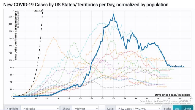
Compared to the northeast, the midwest had later starts, and later, lower peaks. Most are now near or below the US average of 63, and most are showing modest to respectable improvement. Again, still a ways to go, but good progress and good trends.
Congratulations @meepins! You have completed the following achievement on the Hive blockchain and have been rewarded with new badge(s) :
You can view your badges on your board And compare to others on the Ranking
If you no longer want to receive notifications, reply to this comment with the word
STOPSupport the HiveBuzz project. Vote for our proposal!
Good article. We are doing alot better. There are hot spots, and those in warm climates will get hit as they live in air conditioning.