Creativity is the process of having original ideas which have value. - Ken Robinson
Let's prove that, Ken.
I need some creative help!
It's been 15 years now that I studied Computer Science in Media. At that time I was even able to design 3D animations.
But I got out of practice 😏
I want a nice logo for my blog, so I thought the best way to get one might be to advertise a design competition on steemit.
Graphic Designers on steemit, where are you?

The Design Competition
As we learned in the very beginning of this article, creativity is valuable.
That's why I'd like to organize this pitch as a design competition.
The winning logo will be rewarded with 200 SBD and the most popular with 50 SBD 💰💰💰
These are a lot of doughnuts, so a real sacrifice for me!
If one of your blog posts generated a payout of $200 it would currently bring you on steemit's trending page. So I thought rewarding a creative performance like that would be pretty fair.
Are you motivated?
The rules of the game
- The creation needs to include the word surfermarly.
- There are no specific rules regarding coloring, font style or design in general. However, the whole 'world of surfing' should be somehow reflected in the logo. Think about the ocean, the beach, sun, surfboards, etc.
- Bear in mind that the logo will be the basis for a further logo animation I need for my videos. So think about having a version with a transparent background that might be used in my vlogs.
- The format needs to be suitable for the usage in any digital medium. If you could provide even a vector graphic, this might be contributive during the selection process. So: mention it! The logo needs to be scalable (300dpi resulution) in any case.
- The logo needs to be a 100% original creation, NOT including any third party elements (and related copyrights).
- All proposals need to be submitted by publishing them in the comment section of THIS article. If you want to do a separated blog post to promote your entry, do it! But don't forget to drop the logo here anyways. We need them all present on one page!
- Of course, other users can upvote the submissions then. However the logo that receives the most upvotes doesn't need to be necessarily chosen as winning creation.
- If the most popular logo (most upvotes from other users) wasn't the winning logo, I would reward it with 50 SBD. Then the winning logo would receive 200 SBD and the most popular logo 50 SBD. If the winning logo was the most popular, too, the creator would receive the full reward of 250 SBD. So go get your friends voting for you! 😉
- All proposals have to be submitted until next Thursday 17th of August 2017.
- The winner will be announced on Monday 21st of August 2017.
- Once elected the winner, the creator assigns and transfers the full right of use to @surfermarly.
So this might be a nice orientation (not a must) for you regarding style/coloring:EDIT (10th of August, 9:30 pm UTC): Since I've been asked several times in the comment section: the style needs to be 100% surfermarly. What does that mean? @rubenalexander designed a card for me yesterday that perfectly fits in.

EDIT (10th of August, 9pm UTC): In the unexpected event of not receiving any valuable proposal, I reserve my right to not reward any of the participants. Submissions need to meet a professional standard as well as ALL of the above mentioned general rules.
Did I miss something? Do you have any questions? Are you ready?

Well then let's have some fun though!
I'm excitedly looking forward to the results!
Please let me know if you have ANY questions on the contest.
Best of luck to all the participants!
Marly -
Usually I don't ask for resteems, but in this case I'd really appreciate if you shared the article with your friends. The more creatives, the merrier! THANK YOU!!! 😍
This banner was designed by the talented @rvanstel. Contact him for more info.
Original content. Quote found on gambarkatakata.xyz.
OOo I'll have to see if I can come up with something fun for you! Maybe I'll hand draw it :)
Hehe, sure! But for the competition it needs to be a scalable digital format, preferred a vector graphic.
Per your request, the image is a vector file. I hand drew this wave, so it is one of a kind! I thought I would go with a more subtle look and have your name surfing the wave. :) Hope you enjoy my work! Thanks for holding this competition, it has been a lot of fun.
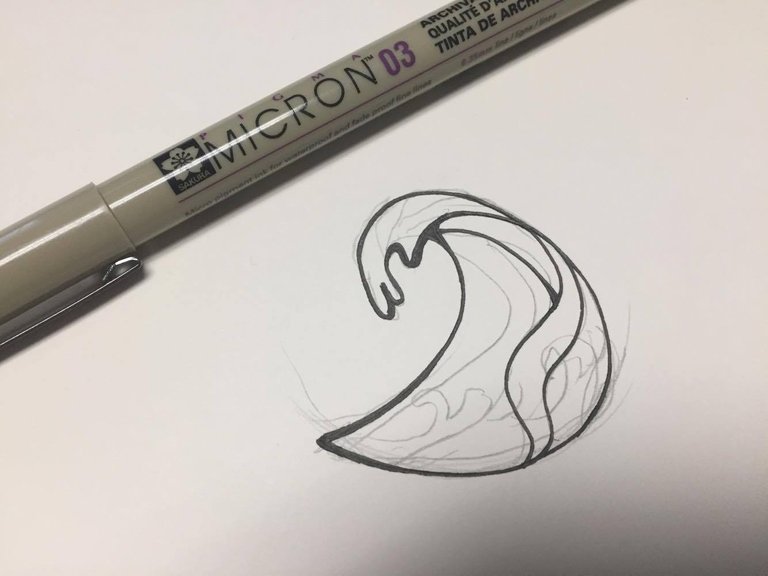


I love the simplicity and power of this design
Wohoooo! So you hand drew this??? Insane!
Every day I get more and more surprised about how many talented, creative and inspiring people we've got on this platform. Amazing!
Thanks for the entry, it's realy beautiful! So how did you know that turquoise is my favorite color? :-))
awww heheh That's my favorite color as well :) Glad you liked my work. I put a lot of thought into it! :) Thanks again for the awesome challenge. :)
Simple, sweet and wavy. ;)
That's the beauty. Unveiling the true wealth and depth of the steemit community is ......
hehe just made a blog post about your logo competition :) Hope you enjoy the read.
Thank you alot. Would love to see you join the steemgigs community as well on discord: https://discord.gg/CGuPyyT
Oh... Do you mind explaining to me more on that? I'm not familiar.
hehe for sure! :)
Here's the winners announcement if you are interested in having a look at it:
Thank you very much for your participation, @karensuestudios!!! https://steemit.com/creativity/@surfermarly/proudly-presenting-my-new-surf-brand-announcing-steemit-s-design-contest-winners
Yes! Finally ended up with something I am satisfied with.
It is going to be a tough competition, I have seen some amazing entries here in the comment section.
Here's mine!
After a fight, I turned the Steemit logo into a fancy circular wave (but subtle so this logo can also be used on platform other than Steemit) and managed to place @surfermarly right in it! That's right - she's surfing on Steemit and on waves.
Hope you like it!
The best one by far!
Good luck @sjennon!
agree!
Wow thank you so much guys <3
Hehe, you just did something really amazing :-)
<3 yay!
Best detail in your own post:
Haha, yeah! :-D
Thank you knircky for supporting #steemgigs. Tips make the whole #steemgigs experience top-notch
You are right. But you just killed it :-)
Can't make any decisions so far since the competition will run a few more days. However, I can tell that this one will be at least close to no. 1.
Love it!!!
Thank you so much.
Have a great start into the weekend @sjennon! :)
Ah thank you! I am really glad you like it :D
I would like to thank @firepower for his luv which inspired me :') I was stuck with it for awhile but then I ended up with this!
Well it seems that he did a really good job :-))
Yes apparently xd
I really like this one. Great job.
Looking at the letters of the font, almost every letter leans forward like a wave just about to break.
Thanks for noticing! I actually tried out a couple of fonts. Some more square than the others, but I found this playful one the most fitting with both the logo and the ambience of the surfing scene :)
I said I will participate, but I only participate if Im able to win and this @sjennon girt just hit it out of the park. Cant compete, sorry.
I would only love to see how it works in one color (darker blue perhaps).
Gosh please join the steemgigs community. Thank you for this. We on discord: https://discord.gg/CGuPyyT
I joined! Thanks :D
I really like this one! Love the steemit waves :)
And a black and white version!

Post: https://steemit.com/art/@juliakponsford/logo-design-for-surfermarly-contest-entry
Oh wow! That's impressive!!!
How did you do the wave? It reminds me of henna paintings.
I will jump over to your post right now and upvote it :-)
THANKS for being part of it!!!
It's a Japanese style wave, it does look like henna!
I realized that I didn't answer your question, for the waves I traced over bits of a creative commons wave I found (and modified and duplicated bits) that is in the Japanese style then I painted all the colors in. I use an app called infinite painter for most of my art!
Awesome!!! It's amazing to see people creative in that way.
Thanks for the insight! It's much appreciated 😉
Have a great day!
I think the crests look like animals... I think I see birds and deer and horses within their depths!
I like the imagery in the logo. A nice way to capture the global nature along with the surfing motif. I think this would make a pretty nice logo attached to her blog.
Thanks dbz! I appreciate the comments!
Congratulations on receiving such a great feedback! It was a hard decision for me. In the end your logo didn't win, but I hope you appreciated the challenge anyways 😊
https://steemit.com/creativity/@surfermarly/proudly-presenting-my-new-surf-brand-announcing-steemit-s-design-contest-winners
I did thank you very much, the one you chose is great!
This is awesome! Love these kind of things.
I don't like putting any labels on things.. So I'm not going to call myself a 'designer' haha but I do sometimes make some things in PowerPoint lol.
Let's do this. Wishing everyone a fun time! By the way, what's your favorite color?
And honestly.. I think 200 SBD is so much for a logo.. I would be stoked with 20 SBD as first prize!
Shout out to this one I am voting for
Hehe, good to have you on board!
Try to use a graphic program instead of Power Point, since the logo would have to be scalable.
I LOVE turquoise! Good question :-)
That's full PNG so completely transparent on the edges :) Click on the image to see a slightly bigger version uploaded to the site :)
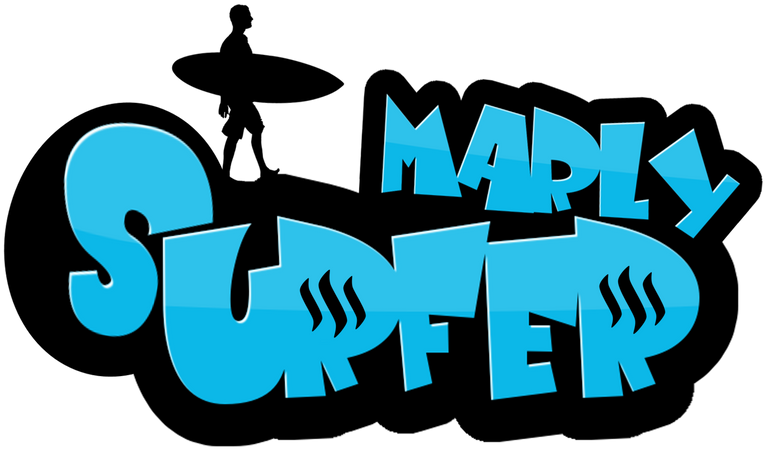
OMG I LOVE THIS ONE! it is so gorgeous!
Thanks!
Agreed :)
Woa,this is fabulous,distinct,a lovely design to beat @enazwahsdarb, I give you a 5 star rating..all the best bro
I like your logo @enazwahsdarb! Achieving a well designed logo requires really hard work. Surfermarly should definitely be happy with entries like this! Goodluck! ;)
don't feel this fits here very well. I mean the server is a dude that barely moves. Needs to be more energetic.
I fixed it :) put ladies hair on. Check a little further down in my comment thread :) let me know what you think now
The stereo type behind surfers are to be laid back and relaxed people. Not normally the energetic kind. Also the steemit logos are a nice touch you only see at a second glance.
Yeah, the relaxed move is OK; but it needs to be a girl :-)
Awesome!!! I love how you incorporated the SteemIt logo. Very cool
I agree with @longfield98, this is the winning logo. I like your idea, too, @surfermarly :)
Cool! same as Sticky bumps!, did you do the girl vector too?
Yeah sticky bumps, right!
Vector would be important...
This one for sure. But a woman silhouette of course.
This is fabulous,fantastic design to beat,a superflous standard set,would be hard to topple, @enaswahsdarb
Competition closed! This has got to be the winner!!! No doubt! Amazing work.
Hehe, it's a really good one - I agree! Benchmark's set high though :-)
However, the person on the top should be a girl (to be me), hehe
Very true! Kind of a obvious overlook! Hopefully he can fix this :D
click here!This post received a 3.6% upvote from @randowhale thanks to @longfield98! For more information,
Wohooo! Nice one!!! 👌
Would be even cooler if the person was a girl... can't you add some long hair and shorter pants? 😃
Also, I thought I would add this colorful girly-flower for some spice :P What you think? All PNG. So you will be able to use with any background :) Even your vlogs.
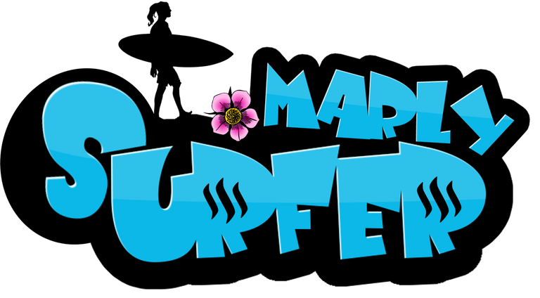
Now? :P
Haha thanks :D Let me see!
Yeeeeah! That's MUCH better!!! Now only the pants need to be shorter, because girls don't wear these long pants in the water, hehe. I wouldn't even need the flower 😉 Good that you did one with it. I won't upvote the article to give everybody the same chances here, but I really like it 😊
Do you have a vector graphic of it?
Legs changed :) Let me know your thoughts :) I took out the flower too.
I thought I would add a shorter hair styled one, since your hair is shorter :)

Glad you guys like it :)
I have seen all the logos submitted for the contest!
Putting contest aside, the first thing a logo must have is the Class, definitely logo must speak up about the thing it is created for. I found all these fine qualities in this logo! It is charming, classy and eye catcher. I don't know about the final result but if I have been appointed as a judge, I would choose this one!
Great efforts and good art! Loved it. I Rest My Case @surfermarly :)
Wow such kind words! Thank you my man :)
You are Welcome but it was not to flatter you but my true suggestion.
wow so good!
I love this logo 😊 love the way they stand on the letters ready to go surfing on the ocean 💕

My favorite. Great job.
Didn't know you were so great at this.. Lol
A man of many talents 😉
Haha, nice animation 😆 And yes, it's a very good entry!
Thank you 😊 Im a Jim Carrey fan😄lol
Wow!!! You have some serious talent!! I'm voting for you @enazwahsdarb !! Good luck!
NYCE! love the different surfer versions, incorporating @surfermarly's suggestions! Excellent job, @enazwahsdarb. I hope you win. Even to be in the top 3 is great. Most of all, I like that you are participating in this and sharing with the SteemIt community.
Thanks my friend :) I am not a designer, I just enjoy being creative sometimes haha.
Yeah it had the perfect combination.. Some constructive criticism, mixed with a challenge. My favorite :D
Thanks for that! Talk soon my friend.
My vote is definitely for @enazwahsdarb. His design is my favorite for your theme @surfermarly! Love the turquoise color too. He's also an awesome guy :)
This one is really great. Simple but conveying the spirit of surfer Marly and incorporating Steemit in a cool way! Well done
click here!This post received a 2.2% upvote from @randowhale thanks to @photobomb! For more information,
Wow thanks guys! Love it :)
Thank you so much for supporting Marly and #steemgigs in the process. We have steemgigs community on discord. Please join us!
Please dear @enazwahsdarb can you tell me how can i upload pictures on my comment
Hey man, sure. All you do is drag the image into the text box. It will automatically upload.
Thanks a lot for your help
No problem :) Did you come right?
yup
This comment has received a 13.76 % upvote from @bellyrub thanks to: @photobomb.
Hi Again, here introducing a new entry to the Logo contest for @SurferMarly
When She said that is will be for an Apparel brands use maybe the twist came because is a real different thing to start thinking the logo according to the final public,
By the way, just wanted to do something very femenine again but not too much. Strong, and Chill
Here are some applications of the logo independently from colors, 'cause was made to be used in any color over any bakcground without loosing force or concept.
Please consider this Post itself
Buenas Olas para todos!
OH WOOOW! This one is amazing!!! I love the black and white version.
Actually I didn't imagine that a b&w entry would fit here (surfing is very colorful), but this one totally killed it.
I like the surfboard as underline, that's so sophisticated. "Life is a wave" oh yessss! Haha!
Amazing job, Leo! Muuuuuuuuuuuuy bien!
Una pena que no voto las entradas, jaja
This one will be definitely among my favourites! Oh dear, who's going to decide here?!?! Haha, this will be a hard choice.
Thanks for your efforts, time and dedication!!!
Love you are in liove with them. This one is my favourite. And yes the Black should Suit. In the moment you talked about a Brand for Apparel or you mentioned it was clear for me because I work for apparel hahaha. And the logo SHOULD firt everything! and more if you think in it a s a part of the apparel itself. That what a logo should do,,, get inside the soul of the Brand, and that[s the important. Colors are just a complement. Que tengas un excelente dia y si vas a surfar tira una foto y dedicala por acá que con eso basta! jaja... Gran abrazo para vos.
Absolutely. Color is just an add-on.
I was actually just preparing my next post about yesterday´s surf session. But I won't publish it before Monday, because on the weekends people vote less on steemit :-)
Un abrazo y disfruta del finde!
Oh I see... !
Enhorabuena por haber recibido unos votos bastante grandes!
Al final no me he decidido por tu logo, pero te digo que ha sido una decisión bastante difícil... El tuyo era mi número 2 porque es perfecto para ropa... Igual eso te alegrará un poco el día...😊
Aquí está el post donde anuncio la ganadora por si le quieres echar un vistazo:
https://steemit.com/creativity/@surfermarly/proudly-presenting-my-new-surf-brand-announcing-steemit-s-design-contest-winners
Que suerteee!
nice one @leotrap, easily my favourite here so far
Glad you like it! Yes... it's my favourite by far. Hope can have chances to win. :) Steemfest you know! hahaha
Hi!! @SurferMarly ^ ^
Wohooooo!!! Niiiiceee one!
Can't believe we have so many amazing entries only after 12 hours, that's impressive!
I like it - and I like the fact that it's me included in the design 😉
Muy bien hecho! Ahora ya sé quien eres aquí en steemit! Te sigo.
La verdad que por mí de momento no hace falta modificar nada. Primero estaba dudando de los colores, pero cada vez que lo miro me gusta más, jeje. Lo que buscaba es un logotipo que podría hasta servir de "surf brand" - o sea imaginándose que en un futuro lejano fuese una marca conocida, dejándola competir con marcas establecidas. Entonces necesitarías un logo que pudiese permitirte eso... El tuyo seguro que podría. El vector es importantísimo, porque ya tengo a alguien que me va a hacer un intro animado para mis videos. Ahí necesitaremos el logo vectorizado.
Jeje, a mi el surfing me trasmite paz cuando haya salido del agua - dentro es más bien un gran flash de adrenalina 😄
Buen día, we keep in touch!
Absolutamente! Pero surf para mi sobre todo es adrenalina :-)
Cuando bajo a la playa ya mi corazón empieza a latir como loco, jaja
I love the green-yellow version! Would you mind doing one with these colors, too? Perhaps that would fit even better with my style then? Because these green pants have become like my best friends during the past weeks, haha
This is so much fun! When I launched the challenge I had no idea how entertaining this would become. Love it!
:D Okey tonight I will modify the colors <3 <3
Uuuu @yusaymon que lindo trabajo! coincido con @surfermarly en las acotaciones las cuales son vitales, pero debo felicitarte porque se nota le pusiste empeño. Bravooo!
Gracias @leotrap me gusta bastante tu propuesta aprecio bastante tu opinión !! ^ ^
i like it. I would have chosen a pic where she is actually riding the surfboard
Gosh please join the steemgigs community: https://discord.gg/CGuPyyT
Your effort in supporting Marly is special!
Okey I will do it :)
Are you threatening me!?
Awesome contest @surfermarly. And so many MANY great entries already. WOW, I almost passed on this because of them. BUT I decided I still wanted to give my vision on a logo for you that can be used as branding as well.
The main idea is you standing in front of your surfboard (notice the single line down the center) The negative space is made up by you and the color reflects your favorite color (or so I read) and with that also the color of your surfshorts.
More (intial paper sketch concept and progress) in my post HERE
And the logo in use on imagery


and apparel (branding)
Clicking the images will open a larger version.
I hope you like it.
NICE one!!! I like it very much! The white version on the image looks absolutely amazing!!!
I really appreciate your efforts and time. Thank you!!!
Now inform your friends that they need to upvote your entry to get at least 50 SBD for the community winner :-)
You guys are making my decision really hard!!!
Have good day :-)
I hope you don't mind I used photo from your website for it. But I agree, the solid white one has this certain je ne sais quoi
It wouldn't be much fun (or useful) if we didn't make it hard for you. That would mean there were only bad entries. Luckily though there are SO MANY good ones.
Thank you very much for your efforts!
Your logo was a really nice entry, and I was happy having you among the participants.
If you wanna have a look at the winners announcement, here we go:
https://steemit.com/creativity/@surfermarly/proudly-presenting-my-new-surf-brand-announcing-steemit-s-design-contest-winners
Again, thanks for your dedication!
Absolutely stunning, creativity 100% but maybe you should consider the font.
Overall i think this is the best entry for me. Good luck mate!
Thanks man. Appreciated. What do you think is off about the font ?
I like this one a lot too, simple but effective
Thank you. That was the main idea ... keeping it simple.
From a marketing perspective, this is the best option.
This is how logos are meant to be designed!
Nice adding, fully agreed :)
Hello, I present you my design for your logo! And here is the post about it :)
NICE coloring! And the pose on the board is brilliant. Looks almost like me, hehe. Surfing towards the sun, hoping that this big wave won't break right over my head... and life is good! Yeah!
Cool entry, and thanks for doing a post about it. I already upvoted it :-)
BEST OF LUCK for the competition!
Thanks! The pose was the hardest part hehe and I'm glad you like it :)
Yeah, that's obvious :-) Well done!!
Your logo was a really good one and I'm happy you received a bunch of powerful upvotes here.
In the end the winning logo is from somebody else, but I hope you've enjoyed your time during the challenge anyways. There will be more to come for sure!
Thanks for your participation, @oceansoul13. https://steemit.com/creativity/@surfermarly/proudly-presenting-my-new-surf-brand-announcing-steemit-s-design-contest-winners
Yes, the winning logo is really cool! Still following you, I like what you do :)
WOW!!! That reminds me of these stickers people put on their cars. Very cool!!!
Her pose is really nice, I wish I'd stand on the board like her all the time, but I usually do some strange things with my arms, haha
THANKS for taking the time and participating!!!
Only one day has passed and there are already soooo many nice entries, exciting!!!
Have a great weekend :-)
glad you like it... it is actually you, I used one from your website and drawed it to be like this kind of art style, was pretty in a creative mood so I was happy to release it on this. finished it now. Would be cool if you really made stickers from these :P also good contest, worth it ! how can I get it bigger btw ?
You mean you picked it from surfermarly.com? I didn't know I was able to do such cool moves in the water, hahaha! Awesome :-)
Yeah right, stickers would be awesome. Then I could hand them out at the beach and do some promo :-)
Getting it bigger? You mean here in the comments? Or in general?
Did you use a vector graphic program like Illustrator by the way?
Yeah I have it bigger on my screen! It's definetly your stance I used the photo from that site yes ;) when I googled you to get a picture. shall I add the url of your site or steemit also into it ? May be a bit messy bit if it fits you have excellent promo stickers indeed
It's not necessary to add an URL at the moment, since I'd like to use the logo on different sites.
But thanks for asking and thinking about it! Great point.
used photoshop on this ;)
In the end your logo didn't win, but I really enjoyed having you among the entries. Great job and you can be proud anyways :-)
Thanks for your great efforts @seveaux! https://steemit.com/creativity/@surfermarly/proudly-presenting-my-new-surf-brand-announcing-steemit-s-design-contest-winners
Not sure if the coloring is totally my thing to be honest, but I highly appreciate your efforts!!! You might animate your friends to vote for you then your entry would get up and might compete for the 50 SBD pot :-)
Again, thanks for your time and dedication!!!That one looks much more like me, @steemsoccer! Cool!
I don't need your 50 sbd!
I thought you wanted to win them and that was the reason for competing here :-)
Haha 😆
I tried an 80's inspired retrowave design. Was mostly just for fun but I do hope you like it. I made it with Inkscape which is an open source vector graphics program kind of like Illustrator.
Edit #1

Edit #2
Possible change to the "M", this is Alt #1.
WOW!!! That's fancy!!!
I like shape of the waves and these lines in the son, that's very cool!
Probably the coloring might be less intense. Neon is not exactly what I'd relate with surfing...
Well since you used a vector graphic program, colorings could be changed easily, just in case.
Thanks for your time and dedication!!! It's highly appreciated.
Good luck :-))
Hey thanks for the feedback, I can totally redo the colors. I also developed it some more and took it in a bit of a different direction. I made it so the "S" is the surfers wake and the "M" resembles waves.
The circular one is simplified and more "logo" like. It works large and small and in black and white.
Oh WOW! So you did it again?! Haha. NICE!!!
I love the second one! The composition and coloring is totally my thing!!!
Coooooooool
Hope you will receive a bunch of upvotes for them :-)
Glad I'm working in the right direction! When you say you love "the second one" do you mean the recolored & redone oval one or the simplified circular one? Thanks
I meant this one:

:-)
Cool, yes that's the one I was hoping you liked. I went ahead and made a post about it
https://steemit.com/creativity/@ckurtish/my-entry-make-a-new-logo-for-surfermarly
It was brought to my attention that the "M" could maybe use a little work to fit in better with the rest of the word "Marly" so I made another alteration. In this one the "M" has a line value equal to the font.
Thanks for holding this contest and I hope you get a good logo out of it. :)
My participation in this competition
Prototype 1Prototype 2Post: https://steemit.com/contest/@rojassartorio/contest-logo-for-surfermarly-surf-an-adorable-sport-let-s-go
Ah cool, you did even an article about it!
Wow, that's very colorful and definitely 100% beach. It reminds me of family vacation. Cute :-)
Thanks for taking the time to participate!!!
Best of luck for your entries :-)
Sii!!! Gracias!!!
wow, I feel bad for the judge in this contest, so many awesome designs, but I love these two the best. very nice ... @MrsRay
It's going to be hard, yep!
Muchas gracias por tu participación!!! Creo que has sido la persona con el mayor número de entradas :-)
Al final me decidí por un logotipo de otra persona, pero me alegra ver que has recibido unos cuantos buenos votos en el tuyo...
Aquí es el post anunciando la ganadora por si le quieres echar un vistazo:
https://steemit.com/creativity/@surfermarly/proudly-presenting-my-new-surf-brand-announcing-steemit-s-design-contest-winners
Nuevamente, muchas gracias por tu dedicación!
Great post! I love it :D
Thank you!!! Are you going to participate? :-)
I'm thinking about :)
Don't think too long, there are already some really nice entries here :-) But no pressure, haha!
What a great contest I had to participate, I hope it's not too late. Thank you Surfermarly. Good luck to everyone!!! Here is my proposal
Thank you very much for your paticipation!!!
In the end I decided on a logo from somebody else, but yours was a really good one, too.
If you wanna know who won: https://steemit.com/creativity/@surfermarly/proudly-presenting-my-new-surf-brand-announcing-steemit-s-design-contest-winners
Again, thanks for your efforts and time!!
It was very fun, thanks again. I appreciate your comments. Good luck with your cool new surf brand!
The competition is running until tomorrow 17th of August.Coooooooool one, @wonderwheel! Of course, you're not too late :-)
I really like the composition and its variety. It has everything a cool surf brand would need I guess.
Thanks for making the election even more complicated for me, hahaha! :-)
Naaa really I appreciate your efforts. It's a good one!!!
click here!This post received a 3.2% upvote from @randowhale thanks to @andren! For more information,
Interesting! Nice! I upvoted you!
PD: join me in this world of steemit looking my posts, rare content about this world, maybe you like it, maybe not, anyways, We can grow up toghether follow me and I follow you bro! :D
Please see my attempt below, Hope it came out okay.I think this is a very interesting challenge @surfermarly, as I have not designed a logo on Steemit before and would like to give it a try.
I have also created a post on the drawing/designing process and would really appreciate your comment.
Thanks and have a great day! https://steemit.com/art/@apprentice001/first-experiment-on-design-a-logo-for-surfermarly-s-blog-challenge
Oh wow so you drew this?!? That's amazing!!!!!!!!!!!!!!!!
I've just openend your article and am sitting paralized in front of my computer.
This one is definitely the no. 1 when it comes to creativity! No doubt.
I really hope that a lot of people will upvote your entry here. You'd deserve that!!!
Thanks a lot for being part of this, you're a great artist no matter how this contest will end.
No matter what the outcome of the contest is, I am glad that I participated in this contest. I enjoyed designing this logo and learnt a lot and it was great to see all the amazing artwork created by other artists. Thanks again for creating this contest. Have a great day!Thanks @surfermarly for your kind and generous words! I am really happy that you like this logo and had a look at my article.
Again THANK YOU infinitely for your participation. I'm happy to see that your post received some nice upvotes. That was totally deserved.
In the end I decided on a logo from somebody else, but please always remember that yours totally flashed me! You're a great artist, and I'm glad having found your blog.
Here's the winners announcement if you wanna have a look at it :-)
https://steemit.com/creativity/@surfermarly/proudly-presenting-my-new-surf-brand-announcing-steemit-s-design-contest-winners
Great job, @apprentice001!
Thanks @surfermarly for your kind words and support! I did enjoy designing the logo and learnt a lot. I did look at the winners announcement post, and even though someone else has won (it was an amazing design from @sjennon and @enazwahsdarb's design was also great), I am really glad that I took the time to participate in this Contest. I am still relatively new to Steemit, and I enjoy participating in art contests such as logo design, pencil and color pencil drawings and many others, as I feel that it is a great way to interact with the Steemit Community. I am happy that you like my design and hope that you have a awesome day!
My entry with more details
 Thank you very much for this contest! I was really nice to spend my day on this logo, as I like to design and I love water sports too! I hope you will find what you search for! Have a nice day @surfermarly :)
nice, I like this one too, very eighties look
I am so happy to see people like my designs:) very appreciated!
You did a good job, that's it :-)
Now that's a nice one, too!!! Very dynamic!
Love the coloring, it's 100% #surfing! :-)
This is a really good entry, which will make my decision even harder.Thank you very much for taking the time to participate @neibone!!!
I have to thank you @surfermarly, for your so lovely comments, and for the opportunity to participate in an interesting contest like this one! its @veibone by the way :D Have a wonderful day!
That's been a REALLY nice entry, and it was hard to decide...
In the end I chose a logo from somebody else, but yours was definitely among my favorites. Great job!!!
Here's the winners announcement if you wanna congratulate her :-)
https://steemit.com/creativity/@surfermarly/proudly-presenting-my-new-surf-brand-announcing-steemit-s-design-contest-winners
I wish I can help, I have the photoshop skills of a novice haha :)
Haha, me too! We could do an internal challenge between both of us, like a lucky loser round 😆
Try! Try! Join the steemgigs community too. Soon we will arrange having experts teach these things: https://discord.gg/CGuPyyT
I think my new friend @design-guy will be interested in this contest? Come on participate @design-guy, I hope you win!
I love it. I think you should have also made clear when you do not intent to pay, so not anyone can just win by putting some simple pic together via ppt.
THANK YOU 😍 Yeah, that's right. I will add one more point to the list. Thanks for the hint! I love that you always see the big picture while I'm diving deep in my impulsive, creative think tank, haha!
We are a good team, much love!
Absolutely 😉
I guess my point was irrelevant!
Which one??
That u need a cop out in case the submissions are not crappy :-) they are in fact quite nice!
Sounds interesting, I see what i can do.
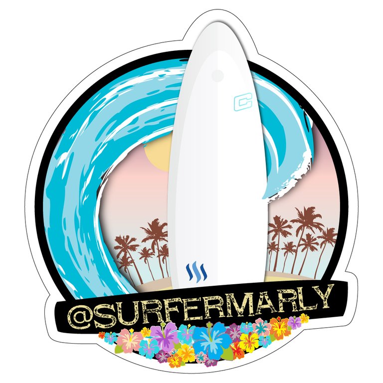
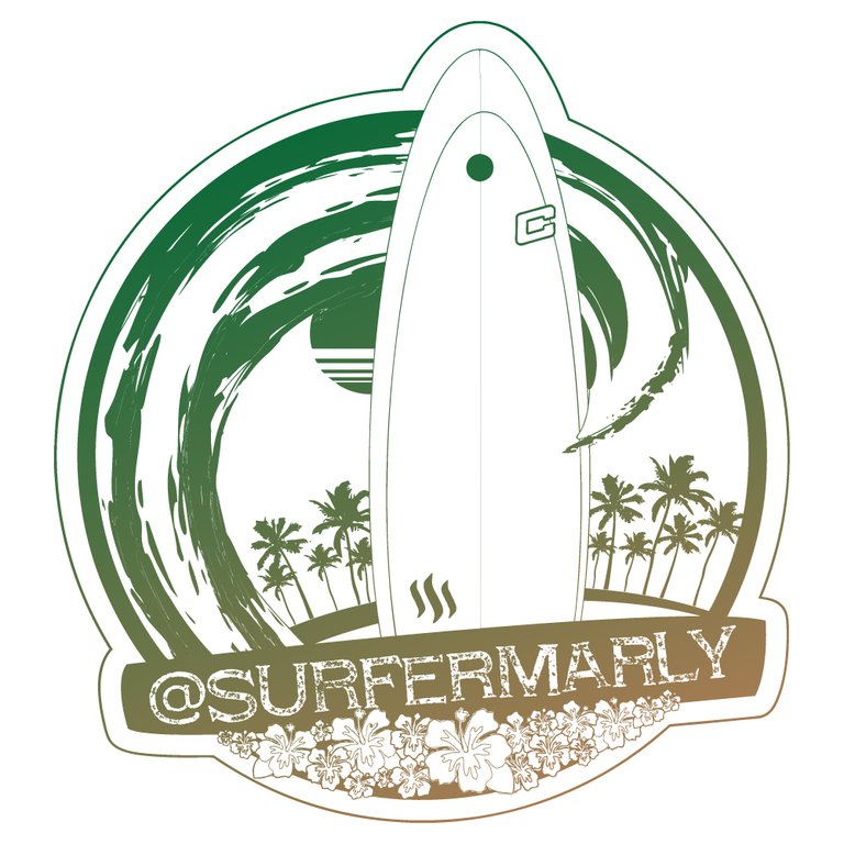
So i modify the logo for use it with one ink or in gradients. And i make a post of this entry here.
Brilliant!
Otro participante de Mexico, qué bueno! 😃
Por que solo le halagas a los Mexicanos!! me pondré triste!! :( deberías seguirme y no te decepcionaras!!
Easy y nada de celos please 😉
Le hice un update al diseño por si lo veías muy complicado, espero te agrade. Lo puse arriba de este comentario o lo puedes ver en el siguiente link.
Wow you're unstoppable! Amazing!! Thank you :-)
Ha sido un MAXI placer tenerte con nosotros, gracias por tu dedicación!!!
😜
Great!
I want to participate. I'm ready!! :)
Excellent!
Me alegra especialmente que haya un participante de la comunidad mexicana :-)
Yeah!... Me encanta que escribas español!! :)
Jeje, hasta canto en español a veces, sobre todo en el coche y en la ducha cuando no hay nadie cerca 😄
Wow! Sería fabuloso escucharte cantar... Tengo un proyecto en manos, que quiero lanzar en steemit. Aún me faltan algunos detalles de la estructura, pero quiero reunir a la comunidad de compositores. :)
Compositores en sentido de música?
Has escuchado del proyecto Steemsongs? https://steemit.com/growth-proposals/@thisisbenbrick/steemsongs-growth-proposal
Exacto! Conozco el proyecto y es por lo que quiero traerme a una gran comunidad de compositores de varios países que formamos parte de un gran proyecto desde hace nueve años. llevamos a cabo colecta de fondos para programas educativos ayuda humanitaria y festivales. No he encontrado mucho eco en la comunidad sobre el tema. También conozco el proyecto @Openmic pero está más enfocado a la comunidad de habla inglesa. Ya te mantendré informada cuando lance el proyecto. :) Por ahora a participar en tu challenge. Saludos!!!
Please do! Thank you. I would like you to join the steemgigs community to: https://discord.gg/CGuPyyT
Que buen contest, soy diseñador y me encantaría participar, debo subir mi logo como un post? o debo pegar una imagen en los comentarios? Genial esa iniciativa.
Oh I already find the part where plains that, lol.
Jeje, perfecto que ya lo encontraste!
Just copy the image down here as a comment. Remember that it needs to be high resolution (300dpi) even though this won't be displayed here. I will need it to be high quality for print outs (t-shirts, etc.). THANKS and good luck 😉
YES. Imma get my game on! Stay tuned for a logo submission soon!
tuned............. :-) Cant wait!
Awesome!!! 😃
Posted :D
Interessant interessant :) Ich würde mitmachen, wenn ich das könnte, gute Ideen hätte ich aufjednfall, nur umsetzen ist schwierig :( Hoffe es kommt was schönes dabei raus!
Ja, so geht mir das auch!! Haha! Hab alles verlernt :-)
Es sind ja schon einige super Beiträge dabei, wird also sicher was Tolles dabei herauskommen.
Nice project! I'll join if I find some time... Looking forward to see the winning design!
Yeah, do it! 😉 Me, too!!! There are already some really cool entries after only a few hours, I'm flashed!
Happy Friday (besser als Montag, oder? hihi)
Yeah I've seen them, there are some great ones already! :) (hehe :D vom Gefühl her aufjedenfall, vom Wetter leider nicht... komplett grauer Himmel und Regen seit gestern... bei dir scheint wie immer die Sonne schätze ich mal? :)
Oha... und das im Sommer!
Joa, hier ist keine Wolke am Himmel - Top Video Bedingungen also 😉
lol, inglés y castellano, hasta allí bien. ¡¡Pero alemán ademas!!
Jajaja, alemán es mi lengua materna! Si no fuera así jamás lo aprendería, es horrible :-DD
PD: No es castellano, es canario :-)) jeje
lol
dang you're cute
Thanks for support
Dios! hablas español! que bueno! la verdad me encantaría participar en este concurso, gracias por el post. Va a ser una gran aventura con los otros diseñadores porque siempre hay grandes ideas :)
Jeje, soy media canaria 😉
Me alegro que estés a bordo! Si tienes alguna duda, avisa.
Mucha suerte!!
I will try my best on this Gig. My style is minimalistic logo creation I hope that this is something you want :D
I want something cool that fits with the world of surfing which is very colorful. Minimalistic structure is fine, but it needs to be powerful. I'd recommend you to have a look at my last article about the Steem Surf Community. At the very end of the article you'll find a card designed by @rubenalexander. The style of the card is 100% surfermarly, so that might give you an idea...
Thank you for your direction, I will resteemed this. I have the most PRO collegues on steemit: @andrejcibik & @marty-arts. They probably may want to join this gig, hence I'm inviting you to follow our work we are trying so hard to build a well known Graphics Design and Arts Community :)
Sounds great!!! Following you and the two others now :-)
thank you! hope to keep in touch with you :)
We building! A lot has happened in the past few days really.
I am with you on this one. Thank you! And please join the steemgigs community, let's build together!
just followed the community! thanks!
Awesome. I bet you're gonna have such a cool logo.
How fun. I can't wait to see what comes in. Great idea!
Oh I'd love to get a really cool surfers style logo 😃
Thank you!!! I'm very excited, too. Can't wait to see all the entries!
I am onto it ma'am... Just brace yourself
Haha, yeeeeew! Now I'm a bit scared 😅
I think you have chosen a great way to get your logo. I'm sure you will have a hard time choosing the very best one. 🏅
Haha yeah most likely I will have a really hard time. But that's OK 😃
Always better to have to many great options to choose form! 📝
Awesome entries you've got here @surfermarly. I would love to participate but offline duties are just too much.Anyway, I will see how activities unfolds till 17th.
Yeah, you're right! Some really impressive proposals have entered already. I'm really stoked!
Thanks for stopping by :-)
Im graphic designer ,I think I can help you. 😉
That sounds fantastic! Good to have you on board 😃
Yes steemgigger; thanks for coming around!
Hi @surfermarly this is my creation. It's all vectors, so you can scale it to any size you want. It's made in Illustrator and you can animate by layer, change any color or export in any kind of file. It's all original, made by hand and with a 100% of mexican love, hope you like it!
WOW!!! That's a detailed elaboration. Hand-made is always goooood 😉
It's totally Hawaii style- NICE!
You are making it really hard for me to decide here, oh dear!!! Haha
Hoping I won't have to choose only one................
Mil gracias por participar y por tus esfuerzos!!!
Que tengas un buen día!
I'm glad you like it! Muchas gracias señorrita jaja!
Jeje de nada! Gracias a ti!!!
Looks Awesome!!
Thanks!
wow, I like this one a lot too
Thanks :)
I do mostly painting, however, this looks like an interesting contest where I feel urge to join. Good luck!
Sure! Do it :-) We've had another painter already. Go for it :-)
This is beauty as Sand under my feet! Resteemed of course...
Haha, awesome and thanks for the support!
Good to know you on board 😉
Pura Vida indeed!
Jeje, pura vida a que sí! :-)
I am sorry @surfermarly, I am not an expert GD. You will find the most talented GD on Steemit. Good luck.
Sure, there are already a lot of nice entries 😉
Have a good day!
All the best for you 😉
i will take my time to design your logo
Good! There are 24 hours left :-)
Good job, pal! Go get it!@enazwahsdarb .... All the way!
Would love to do the logo for you (1st class one) for free...because you are my dear one. I , however, will only need one thing: a surf with you and the sharks!!!!!!!!! Always a great idea from you, glad that you are back and stronger. Upped.
Haha, how can I get these sharks out of your head? There are none :-)))
Thanks for your support!
One way my dear one...take up the challenge ..haha. Keep steeming to more success and have a blessed weekend.
Última entrada :)- Logo Minimalista - Modificables las Fuentes y Colores!
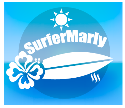
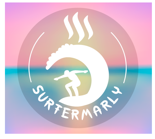
Wow hiciste aún más!!! Thank you very much!
The second one would be my favourite of these three though.
Que tengas un gran día! :-)
@surfermarly Here's the logo that i've submit to you:
Ooooooh I very much like the first one!!! That's very well thought.
Nice!!!!!!!!!!
Is the logo done with a graphic software like Illustrator and do you have a vector graphic of it?Thanks for participating, @orcheva!
yes i have @surfermarly ..i make it from graphic vector
thankyou very much
Your logo was a really nice one. However, in the end I've chosen another one...
If you wanna congratulate the winners, here we go:
Thank you very much for your participation, @orcheva!!! https://steemit.com/creativity/@surfermarly/proudly-presenting-my-new-surf-brand-announcing-steemit-s-design-contest-winners
Again, thanks for your time and efforts!!!
My participation in this competition
Prototype 3Debería verse con el fondo transparente como en el post! https://steemit.com/contest/@rojassartorio/contest-logo-for-surfermarly-surf-an-adorable-sport-let-s-go
Nice that you added your third one here. To me it's your best version 😉
Ya voté tu artículo!
Explicando por qué no lo he compartido tu post: 1) No me gusta que la gente me lo pida, es una decisión que debería tomar yo exclusivamente; si me encanta algo lo puedo compartir pero no es un deber ni quiero sentirme obligada a hacerlo 2) No me gustó ver la animación del chico cayéndose en una escalera como intro, para mi gusto no tenía nada que ver con la competición. Espero que eso aclare todo. Buen día!!
Ahhhh Ok! Sorry! Ya lo edite y deje bien sencillo!!!!
Hola yo quiero participar, soy Paraguayo, tengo un Portfolio en mi Blog!! :)
Genial! Estás bienvenido a participar entonces 😉
Te gustaría que le de un toque femenino? o algo mas genérico?
Bueno, soy un surferGIRL así que si "femenino" no significa que sea todo de color rosa estoy totalmente contigo 😉
I'm going to write this in english to make this available for everybody: in my last post (about the Steemit Surf Project) I published a "card" as signture @rubenalexander designed for me. I LOVE the design of this card. So if you work close to that one, you might be on the right track.
Buena suerte!
Ej. Prototipo 1..
y en otro comentario Prototipo 2...@surfermarly puedo pegar varias opciones en comentarios distintos? :)
Claro! 😉
More clearly see in my post MY BLOG
Hey!!! That's a creative one!!!

That's the version from your blog I like most (making sure that people can vote for it here):
Walking over the steemit logo - VERY COOL!!! However, it's actually not a natural pose, since the surfer wouldn't be holding the surfboard while surfing the wave :-)
THANKS for participating!!! Best of luck for you @foways
Hope you are entertained !!!
Wohoooooo! That was quick!!!
Yeah this one is much closer to reality :-)) Great!!! It's as if she was dancing on the board. Cool!
Thank you very much for participating in my contest!!!
In the end I decided on the logo from somebody else, but yours was a really creative entry. Thank you for your time!!!
https://steemit.com/creativity/@surfermarly/proudly-presenting-my-new-surf-brand-announcing-steemit-s-design-contest-winners
Hello, here is my entry, hope you like it :) I can provide you with a 300dpi photoshop file and vector file if you like.
 https://steemit.com/creativity/@dksart/surfing-logo-design
Yeah!!! That's me when I do everything right, haha! I wish I would look like that surfing the wave :-))
Nice composition! Thank you very much for your time and dedication, it's highly appreciated!!!
Make sure that your friends/followers vote for you here, too.
Best of luck!!! :-)
Thank you very much for your participation!
In the end your logo didn't win, but maybe you want to congratulate the winners:
https://steemit.com/creativity/@surfermarly/proudly-presenting-my-new-surf-brand-announcing-steemit-s-design-contest-winners
Again, thanks for your time and efforts!
Hey dear @surfermarly i designed 2 new logo for you
The first logo
My second logo
Post : https://steemit.com/art/@ahmedezzat/new-contest-logo-design-for-surfermarly
I made for you more than logo dear @surfermarly and here is my post about it : https://steemit.com/art/@ahmedezzat/contest-logo-design-for-surfermarly
The first logo

The second logo is text logo
The last logo is text logo too
What's your opinion ?
They are funny, something completely different from the other entries. Maybe a bit too neon for the surfing area, but let's give it a try. You should call your friends to upvot your entry :-)Hey @ahmedezzat!!! First of all, thanks for participating! I appreciate that a lot!!!
Again, thanks for your time and dedication!!!
You're welcome , you can see my post about your logo
Thanks for being part of this challenge. In the end I decided on a logo from somebody else, but I hope you enjoyed your time anyways.
Hey @ahmedezzat! https://steemit.com/creativity/@surfermarly/proudly-presenting-my-new-surf-brand-announcing-steemit-s-design-contest-winners
Again, thanks for your efforts!
♥