While looking at the Total Market Cap Dominance chart for BTC today, I realised that the chart displayed familiar patterns
I know that BTC dominance has been dropping. I know that the crypto run of 2017 saw a large rise in the market cap of altcoins. I know that after BTC peaked in December 2017, then altcoins surged ahead and murdered it (relatively speaking) in January 2018. I know that BTC had generally lost dominance since then as the altcoin market continued to grow. But I never noticed the pattern before...
Yesterday in my post "BUMP" Analysis, I briefly mentioned pattern recognition. Since most, if not all of Technical Analysis amounts to experienced speculation, guesswork and interpretation; I consider there to be significant value in pattern recognition. The ability to predict future events using similar ones from the past can be very advantageous (which is exactly what my "BUMP" Analysis post attempted to do). Obviously the limitations of this approach must be remembered, as well as the fact that crypto markets are notorious for breaking the laws of normality when it suits them.
Be that as it may; I have found another pattern. The interesting thing about this one is this: I don't really know what it means. Not yet anyway. I aim to watch it closely and to learn from it. The Technical Analyst in me finds this fascinating. I want to figure out what it is, what caused it, what it means and how I can use it to help predict the future. I would like it if you, the reader, could speculate with me as to the possible meaning of this phenomenon.
Potential embarrassing issue: As I am only an amateur trader, I acknowledge that the possibility exists that I am rediscovering something old and well-known. I do not have a massive knowledge of all trading patterns or the history of markets. If this is old news to you, please feel free to burst my bubble and say "no Bit Brain, that's just a simple Euclidean Market Expansion Cone." (or whatever). Until them I shall claim this pattern as my own discovery 😀
All charts in this post are from https://coinmarketcap.com/charts/ and all modifcations are by @bitbrain

What is this?
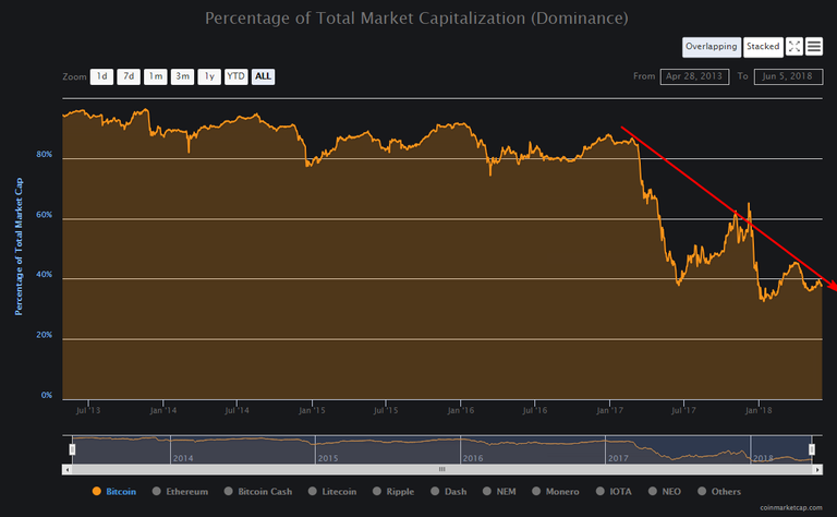
As you can see from the picture (or will see when I point it out), the unusual thing about this pattern is that it occurs not on a normal Market Cap chart, but on the Market Cap Dominance chart. I don't know about you, but I have never seen anyone else do TA on a Market Dominance chart before, so this is a first for me.
Here is what I noticed first:

A downwards sloping line. It appear to connect the peaks of major waves. It has just passed by the fourth such peak. Does this mean that BTC Total Market Dominance is capped in how much it is able to win back ground? Is the gradient of the line an indication of the growth rate of the altcoin market? What stops BTC from breaking through that line? Would it be perceived as overvalued relative to altcoins if it did?
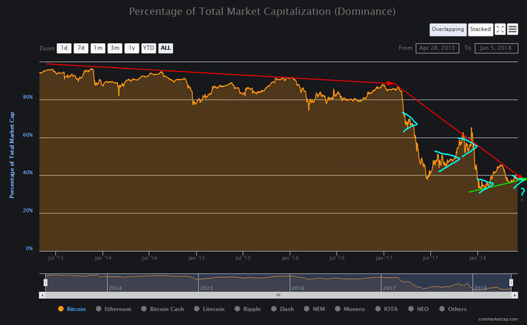
There is more:

It appears as if this is perhaps not a new thing, it was less noticeable in the past because it was not as severe and the cycle was slower. The red line appears to indicate that BTC had a similar limiting line in the past.
If I had to guess, I would say that BTC was previously limited by the line seen here. As it approached the line, BTC would become overvalued relative to altcoins and money would pour into alts instead. As 2017 arrived, cryptocurrencies boomed as blockchain technology moved out of the "Innovators" phase and into the "Early Adopters" phase, altcoins shot up in popularity and the line changed to the new, steeper dropping line seen on the previous chart. See this post for more on the "phases" of blockchain technology adoption (it's very interesting, I promise!): https://steemit.com/cryptocurrency/@bitbrain/bitcoin-price-predictions-chart-display-part-3-the-s-curve-more-good-news
Also visible on this chart is a smaller green line that looks to be acting as some sort of support line. I am guessing that this is the "oversold" line. As BTC approaches this line, it becomes increasingly "cheap" relative to the alts and people choose to buy BTC instead of altcoins.
It is interesting that the large dip before this line does not line up with the other troughs. I am guessing that this may have something to do with it occurring during the initial boom of the altcoins i.e. at the same time that the red line on top suddenly became far steeper.
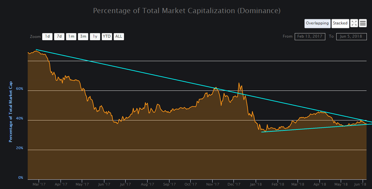
Seen together, the latest lines appear to be forming a triangle:

The triangle is interesting because the chart is getting very close to the tip of that triangle. Unfortunately I can't plot it on charting software, I don't know of any tool to plot market dominance with, but approximation is good enough. To me the tip of that triangle looks to be less than a month away. That raises the (perhaps literal) million dollar question: "What happens to BTC Market Dominance when it reaches the tip of that triangle?"
I really don't know the answer to that. Will it suddenly break upwards? Will it gently curve downwards? Will it start oscillating again and form another triangle? Perhaps it is an equilibrium level where it will settle?
There is one more thing:

As on a regular price chart, there also appear to be mini-triangles. Smaller versions of the larger pattern contained within itself. It is highly unlikely that this is coincidental. Remember: At its core, TA is a just the graphical expression of human trading emotions. These patterns are natural, as natural as the hype and uncertainly of human doubt, fear, elation etc on which they are based. They closely reflect similar patterns and sub-patterns seen on normal price charts. Humans are creatures of habit and therefore creatures of patterns. History does repeat itself, long and short-term. A human being is like a walking Mandelbrot Set generator...
The most interesting thing about the mini-triangles is that they appear to precede a drastic change in BTC market dominance. When a triangle terminates, the market dominance shoots upwards or downwards directly thereafter. Sometimes they occur at the peaks or troughs of the larger waves, but at other times they occur on the steep slopes of the waves. Perhaps they occur during times of unusual outside influence e.g a lot of FUD, before the normal pattern gets a chance to reassert itself. Does this mean that the big triangle will also break sharply upwards or downwards when it terminates? I don't know, once again I'm just guessing.
Here is a look at everything all together:

And here is how it looks zoomed in to the most recent 15 months:

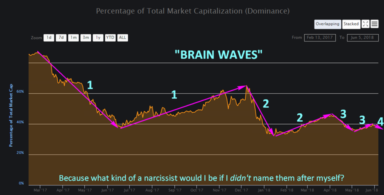
Final observation
In the creation of this triangle I also observed waves (similar in appearance to how Elliott Waves would look on a price chart).

They may or may not be significant. I don't know. What I do know is that for now (unless they already have a name that I am unaware of), I am going to name them after myself. Just because I can! 😄

Summary
I don't know what all of this means, if anything at all. For all I know I'm seeing patterns that aren't there because I spend an unhealthy amount of time each day staring at charts. But I don't really believe that. I'm interested to see where this goes and I'm very interested to see what BTC dominance does when we get to the tip of that large triangle. I would like to think that we're breaking new ground in terms of learning.
If you can help / have questions / have ideas, then please post them here. You may spot something that I have not. You may know a lot more than I do. You may have a new idea that explains things better. Don't be shy. The worst case scenario is that I mock you mercilessly for the next year or so. 😉
Yours in crypto,
Bit Brain

DISCLAIMER:
I am neither a financial advisor nor a professional trader/investor. This is not financial advice, investment advice or trading advice. Unless otherwise stated, all my posts are my opinion and nothing more. Crypto is highly volatile and you can easily lose everything in crypto. You invest at your own risk! Information I post may be erroneous or construed as being misleading. I will not be held responsible for anything which is incorrect, missing, out-of-date or fabricated. Any information you use is done so at your own risk. Always Do Your Own Research (DYOR) and realise that you and you alone are responsible for your crypto portfolio and whatever happens to it.
What is this? A hoax!
Dominance Index is a joke. Ethereum based tokens has distorted and diluted BTC true weight. After the winners of the correction emerge I'd expect bitcoin to break 40%.
But the real story is going to be the rest of the pie graph...
Why would you think that something like BTC dominance would not be governed by the same sort of fluctuations that prices are?
But yes. A little further digging after I wrote this shows that "the rest of the pie graph" seems to be the main force at work here. I'll probably dig a bit more and may revisit this topic tomorrow.
Well Dominance index is a bad metric. Many altcoins need bitcoin and bitcoin is the gold standard for all coins. Bitcoin is the poster boy of the blockchain revolution. The reason why Bitcoin dominance did not fall bc one is well known and the promised tech that bitcoin said it be used came at the end of 2017. Segwit+LN+Sidechains have all finally come. Wether it can be mass used if the question. If so(I believe it can ), Bitcoin will regain many of its former lost shares.
But Bitcoin dominance has fallen, and it's very near its ATL at the moment. Mass market or not, I believe that BTC will continue to lose market share to the rising number of alts.
Did you read what I read?
What you should look for is the volume. Volume=liquidity=more buyer=more power
Again now one day but multiple day average of volume would be a better "dominance metric"
Right now Bitcoin volume is still the largest and most times can't be beat.
The Bitcoin upgrades coming will give bitcoin a greater edge than altcoins will have.
We shall see my friend. I still disagree with you, but it will be interesting to watch, no matter the outcome.
Great post! My thoughts is that BTC dominance is an important short term indicator of the sentiment of investors. Like stocks, when the market is uncertain on the direction, most investors will go to quality names. This will mostly likely be Bitcoin and other bigger names. If sentiment improves then most will go to other altcoins as they believe they have more potential to increase vs BTC. Also, consider that most altcoins do not have fiat options to purchase; most need BTC or ETH to be purchased so when overall market increases, BTC will likely be sold for altcoins.
Thanks for the input. It makes sense to me.
Upvoted ($0.19) and resteemed by @investorsclub
Join the Investors Club if you are interested in investing.
Congratulations @bitbrain! You have completed some achievement on Steemit and have been rewarded with new badge(s) :
Click on the badge to view your Board of Honor.
If you no longer want to receive notifications, reply to this comment with the word
STOPTo support your work, I also upvoted your post!