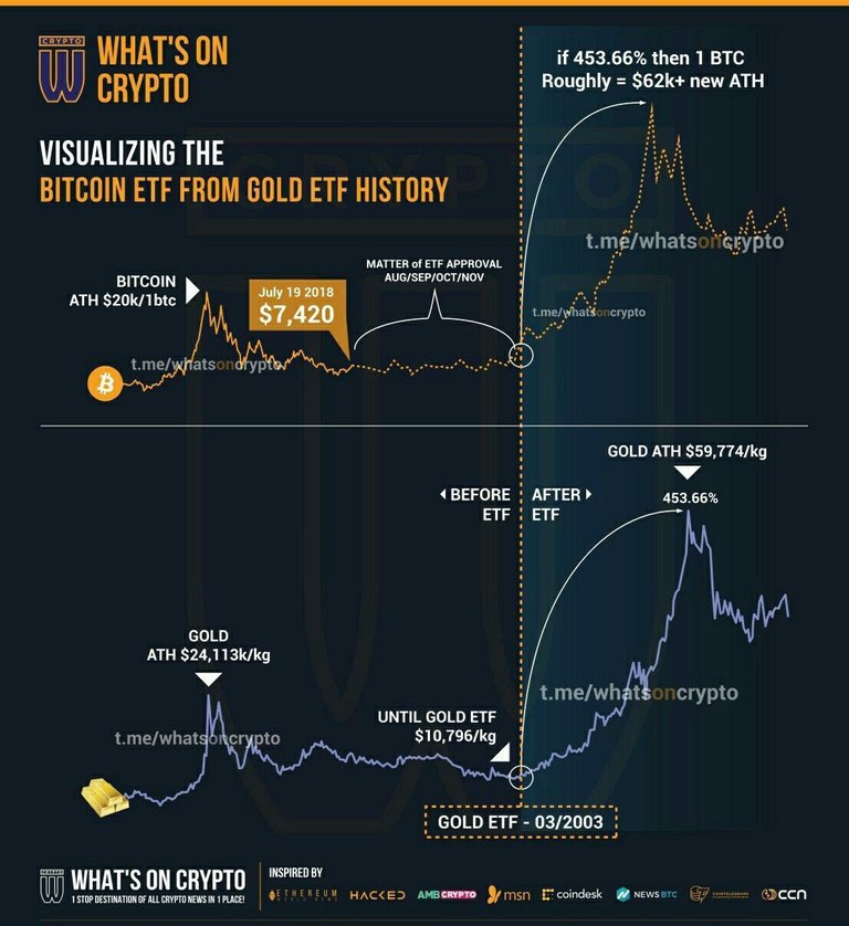
Interesting post and I agree with you that it is definitely not certain that we have seen the bottom. Or we might see a lot of sideways movement still, like when the Gold ETF was introduced:

Interesting post and I agree with you that it is definitely not certain that we have seen the bottom. Or we might see a lot of sideways movement still, like when the Gold ETF was introduced:

I saw this chart come up on REddit too yes and the similarities are scary.
But even though I want to believe charts like this, by now I have seen so many chart comparisons that I am starting to wonder if these are in fact comparable or if we're all just staring at so many charts that it's inevitable we're starting to see similarities. On this one in particular the scale is so off.. in one case it's taken over a 30-40 year timespan, compared to Bitcoin's 8 year.
I sure hope it follows the gold price though.. it would put us at about the figures that most people are expecting. But after this boost everything is uncertain again, because the Bitcoin chart will start to get ahead of the gold chart....!