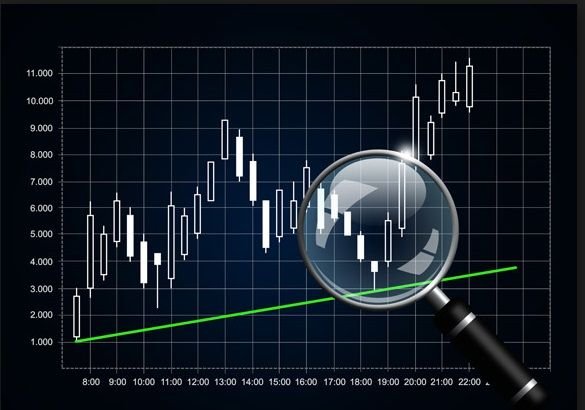
Doing this past weekend I was able to speak to family and friends about STEEMIT and it was no surprise but the main issue talked about was in reference to all social networks going around being STEEMIT one of them. Most had positive comments as this would recognize our efforts in writing. Now another interesting issue that was mentioned was the fact that a large number of posts made reference to cryptocurrencies. As expected a large percentage of the population is not fully aware of the existence of these new way of exchange of value; another percentage knows about these issues but still does not understand the underlying theory and complicated math behind all this new technology. Most were reading articles made by people that use charts and technical analysis while trying to predict the value of a commodity in the future; most could look and understand the graphs, but still didn't know about the story behind each one of the bars in those graphs. I'm talking about candlesticks.

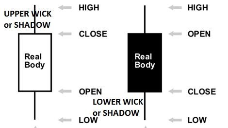
I have seen that the technique of analyzing candlestick graphs and charts is one of the most common around. Still we have to keep in mind that each bar represents a period of time in which there has been a variation in the market forces that dictate the direction of price of commodity in play. Now, back to basics. What does a candlestick represents? As in the picture as follows the bar has 3 main parts such as: the upper wick or shadow, the lower wick or shadow and the body of the bar. Depending on the opening and closing off the commodity in play, the body of the candlestick usually is white, green or light blue for when the price starts out below its last price for the period or closing. For when the price for the period closes below that of the price at the start of the period, the color of the body could be black, red or orange. Again, the colors varies and actually many programs allow for the trader to modify it as per own personal choice.

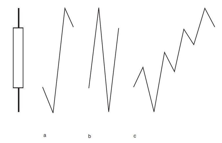
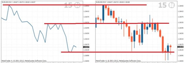
That is the description of the bar of such. Again, we have to keep in mind that each bar represents a period of time and this frame of time could vary from one minute to an hour or hours days weeks or months or years. As such whenever we are analyzing the commodity it is important to try to understand what happens in those periods of time since that will provide better arguments to decide whether to buy, sale or stay out. In the following picture you will see that the bar can represent many curves and changes that occurred within the mentioned period of time. We cannot tell the number of transactions that occurred in this period of time; as such and to reinforce our decision-making process we would need to see the volume that occurred in the same period of time and that will be available in a bar chart usually found below the Candlesticks bar.


These are the bare minimum characteristics of the candlestick bar and what it represents. They can help us understand a little bit more on what is happening between the forces of demand and supply. All of this technical analysis is a game of trying to manage probabilities as it is absolutely impossible to predict the future.
The above notes are only for information purposes as I would like to share what little I know about technical analysis of charts and the use of these in stocks, currencies, commodities such as oil, orange, gold, and these days cryptocurrencies. Will this be the first of a series of notes reference with candlesticks? Can't tell right now but if anyone wants to develop it further let's continue the conversation.
well i always luv to see a good chart some i don't really understand but there are so many out there telling the ppl the real truth just kills me ppl like oh we might be going into recession HAHAHAHA how about we have been in a god damn depression for years and years and years now....like how jim willie talks about how the GDP is at least -4-6% and i would say now its -6-10% getting worse and worse if this isn't the biggest depression we have ever know i dunno what the great depression was....if credit was gone and food stamps welfare AMERIKA IS DONE STICK A FORK IN IT!!
Thank you for the note. Please if there any issues that you wold like to review, I will be more than glad to start a thread on this. As mentioned in my post, I still insist in that many of us think we fully get the full picture for the information that a graph is providing although there is much more to it. In ref. to the economics in the USA, what can I say? Each one of us has to do the best we can; the sum of all will come ahead of all wrongdoing. Rgds. and keep in touch.