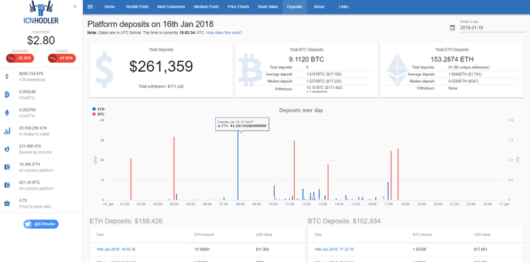
When I created https://icnhodler.com, I created it primarily for my own benefit. I want to keep tabs on what Iconomi were doing, what they were talking about doing, what they were actually delivering, what they were having for breakfast, whether they sleep on their stomachs, sides or backs etc... no information was or is enough information. That's my philosophy.
Backdrop
Of course the more information you have, the more difficult it becomes to present and articulate. Ain't nobody got time for manual number crunching or trawling through tables of data with thousands of rows... what do we want? Pretty graphs and charts nobody else has access to with brief summaries that tell us what to do. When do we want it? Yesterday. If you look at the popularity of pump & dump groups, you'll see how rife this mentality is. Everyone wants to be told what to buy, when to buy it and when to sell it so they can make instant profit... but of course the greater the number of people who are getting the same signals, the less effective the signals become. These scams (that's what they are) end badly for the vast majority yet people keep coming back for more, suckered in by the lure of that sweet, quick money.
Doing old fashioned analysis isn't glamorous but it produces real value. It gives people insight based upon reason, logic, performance, math etc... in short, it increases your chances of success because it's not simply guess work or random choice. If you're trying to cross a busy road, you can run blindly across it with a big group of people and hope you don't get steam-rolled by a 40 foot truck before you reach the other side. Or, you can analyse your surroundings, wait for traffic signals to indicate it's safe for you to cross and then confirm them with your own eyes. Which is the more sensible approach?
New feature: track deposit & withdrawal history
Iconomi as a platform will only succeed if people use it. Success and 'usage' can be measured in a variety of different ways but a couple of metrics worth looking at are the number of incoming deposits (along with their value) along with the number and value of withdrawals. If more money is coming in to the platform than flowing out of it and the volume of deposits is increasingly exponentially over time, that suggests things are going well. It would be logical to categorize that as 'success'.
A couple of weeks ago I launched a new feature on https://icnhodler.com where we tallied up the daily ETH & BTC deposits and gave them an overall dollar value. This feature proved so successful it resulted in us maxing out our database & hosting resources as we struggled to cope with the volume of traffic that followed. But the thing was, this feature was nowhere near the finished version I had in mind... I released it purely for testing & demo purposes (I needed a few days to confirm transactions and figures were updating daily, as expected).
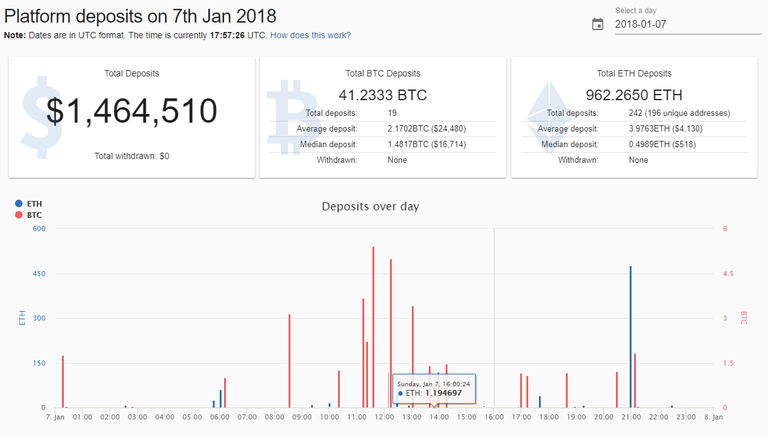
Fast forward to today and I'm happy to announce this feature is now a lot closer to the original vision: https://icnhodler.com/deposits. BTC & ETH deposits are graphed over the day and can be verified on etherscan / blockchain.info. Not only do we have USD totals for everything, but we have average & median deposit figures along with some interesting metrics such as the number of unique addresses that have deposited ETH. Total withdrawals (in ETH, BTC & USD) are also now included. Best of all? You can go back in time and get the same daily statistics and graphs for any day in the past. Almost as soon as we released the first version, we had people asking for this... wishing they could turn back time... so we'll name this update 'Cher'.
This feature has been particularly challenging to implement given the volume of transactions and historical data involved (around 20k transactions and growing) but we're confident it can start to provide real value to ICN hodlers and prospective ICN hodlers.
Future Plans
For this specific feature, creating weekly, monthly, quarterly summaries and allowing comparisons between various dates is the end goal. We also want to retrospectively apply USD values to historical transactions so that we get a more accurate picture of deposits and withdrawals over time. We can then crunch the numbers and show the most popular time of day for deposits, whether deposits increase or drop off at weekends, whether a spike in BTC or ETH price results in more / less deposits etc... there's literally an infinite amount of number crunching that can be done.
Next up on our list however is calculating AUM (assets under management) in real time. Yesterday, Iconomi revealed that they're now displaying the AUM figure in public for each DAA (Digital Asset Array) for the first time. What this means for ICN hodlers is that we can accurately estimate management fees by multiplying each DAA's management fee (or rather Iconomi's collected portion of it) by the DAAs AUM figure. Buybacks for the next quarter will become easier to estimate and we can also project total AUM based on current and past trends and what it could mean for buybacks and the price of ICN etc... watch this space.


That is just awesome @jesusthatsgreat. I am sure someone from the Iconomi team will recognize your effort and knowledge and will approach you with some proposal if they already haven't.
Although it is painful these days to be ICN or any crypto hodler, there is no doubt that this year we will see a proper reward. Iconomi is a working project that brings money on a daily basis, that serves some real-life purposes, and the market price will soon follow.
Thanks for your great work, keep on !!
You're doing great work, I'm loving the deposit tracker.
Congratulations @jesusthatsgreat! You have received a personal award!
Click on the badge to view your own Board of Honor on SteemitBoard.