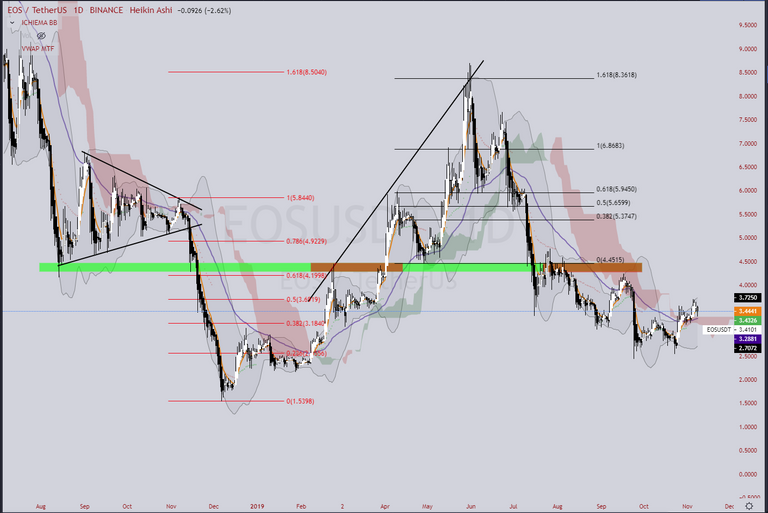
This will be a rather lengthy topic as I will try to cover as much as I can about identifying support and resistance, the different types of S/R, the general rule of alternation, and how to gauge strength and weakness of such.
Lets first start by listing the types of S/R
- Trend lines - Strait/Parabolic
- Price Action Pivots - Pinbars/Reversals
- Moving Averages - EMA/MA
- Fibonacci levels - Retrace/Extension
As we go through these, there is really only basic rule to consider with S/R, and that is the rule/law of 'alternation'. The law of alternation can actually be observed outside of S/R methods as well, but that will be covered in another lesson. Regarding S/R it is simple;
When a support breaks or fails, it becomes resistance - and visa versa.
The above chart demonstrates several different types of S/R, but observing the horizontal Green/Red bar in the middle, you can see this rule of alternation at work.
Trend lines
Generally most traders only use strait trend lines, but I will cover parabolic trend lines as well. Strait trend lines can be extended through the chart indefinitely and can have an effect months or years later on depending on it's significance. Parabolic trend lines however are curved and used only on down trends or up trends where the pattern is observable. Below is an example of the two.
Parabolic Trend line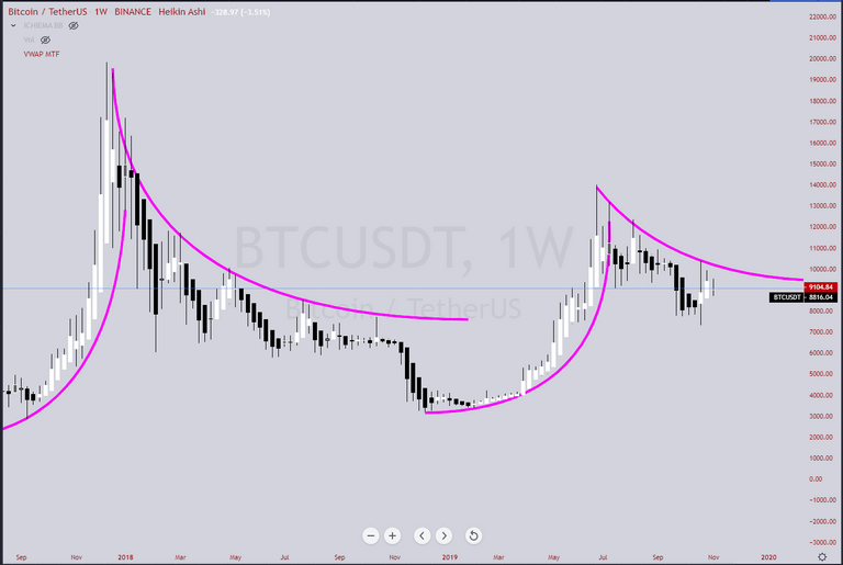
Parabolic trend lines can help identify when a trend might be finished and ready to change direction - indicated by the parabolic line is on or approaching a vertical angle. This does not mean further high's or low's are impossible, but that the parabolic line will break soon due to the market moving along the 'time axis'. They can also help identify when a breakout or breakdown may occur as the parabolic line flattens out horizontally.
Now for typical Trend lines.
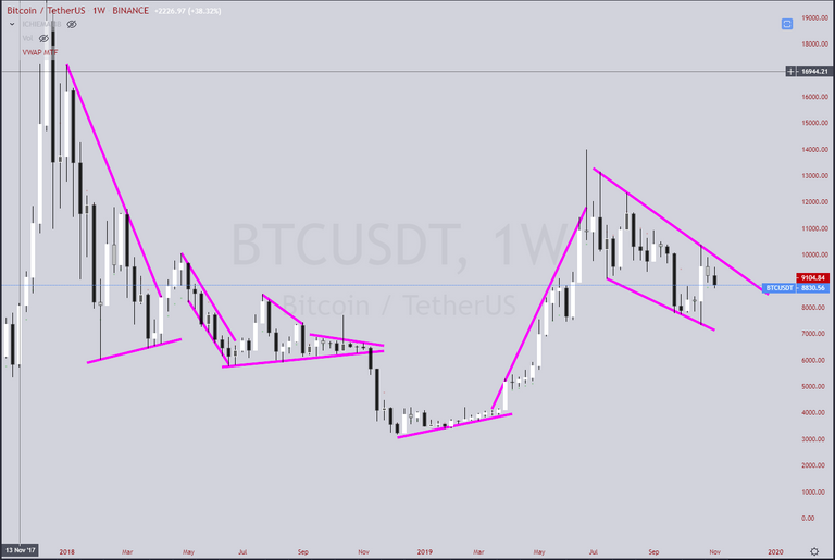
What an ugly mess - try not to fill your chart up with trend lines all over it, and you certainly can if you wish to mark them all. The general rule of thumb with identifying a trend line is that it requires at a minimum 3 points of contact where the price has rejected off it.
One of the most common elements I see done incorrectly is when traders draw trend lines that use both a combination of wicks and bars to account for their three points of contact. What you want to aim for is either 3+ contact of wicks or 3+ contact or bars on the same chart time frame. If however in meeting this criteria you happen to contact a bar when connecting wicks, that's fine - and visa versa.
Now some will debate that Support and Resistance is more of an 'area' than a fine thin line. Well, it is subjective to what you wish to do, but personally I limit using 'area of s/r' over 'line of 's/r' to Horizontal ranges. However for trends, I think it's better to use trend lines that are thin as this can give you additional information or 'clues' as to what might unfold. Here is an example of using Area over Line.
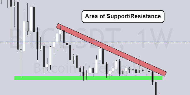
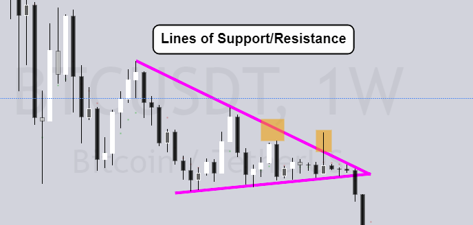
In this example you can produce the difference between a descending triangle or a wedge, and if your area is too large you might not pick up on the signs of weakness I've marked in Orange. The market failed to reach the topline, and price rejected firmly back below it after the fake break out. In terms of a wedge or triangle, wedges carry less bias to what side they will break out from compared to triangles that have a bias to break the horizontal flat line.
To wrap up this section, utilizing trend lines is certainly a useful tool to add structure to the market and confluence to trade entry/exits, but don't over do it. Aim to highlight the more significant trend lines that are well tested and have significant price rejection. Generally try to start with identifying the major trend lines on wider time frames first - these will be much more reliable in terms of rejecting price or initiating volatility when broken.
Price Action Pivots - Pinbars
You might find in your research that some traders will refer to candle-stick patterns, terms like Hammers, Doji's, Harami's, Dragonfly/Gravestone dojo's, Dark cloud cover etc. Most of these are useless and you can simplify all of it by looking for Pinbars.
Personally I flick back and forth between using Heiki Ashi candles and the Default Bar candles. Both give a different perspective at the cost of important information. When trying to analyze price action and identify pinbars, you want to be using the default candle chart, where as the heiki ashi charts are volume weighted and better for identifying start/end of trends and while smoothing out the market noise to a degree.
As of writing I have changed the colors of my charts to a darker theme as the brightness was drying my eyes up a little bit. So first lets look at a candle stick chart, to identify some pinbars.
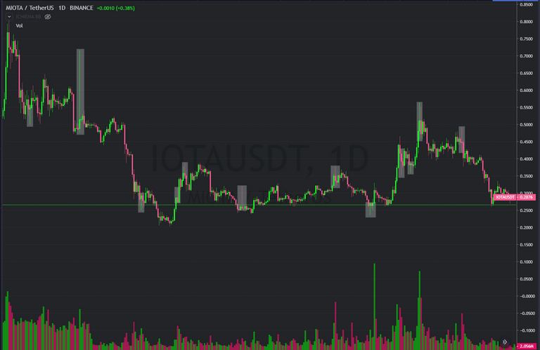
Yes some of these are technically called 'Hammers' and an assortment of other types, but rather than complicating the process, the key element you are looking for is large wicks - larger than the body of the candle. These wicks signify relative volatility on that time frame - as you can lower the time frame and find these pin-bars are just smaller trends.
More often than not, you will find pin-bars on or close to pivot points - they send the message that price was overbought or oversold in a too short of time period, that this triggered traders to enter the market and counter the direction of volatility. Think of the markets as having an 'elastic' rubber-band like characteristic, where the size of the wick is telling you that the market was over-stretched at that price and time.
The larger the wick/price rejection, the more significance and strength you can assume with that price level. But be mindful that you need to wait until that bar has closed before trying to interpret what it suggests. Lets have a look at another example - Bitcoin on a Daily chart.
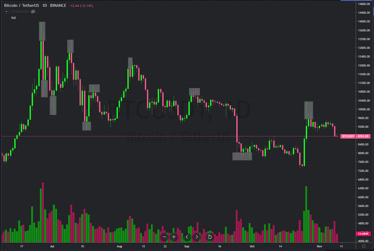
You can see here that large wicks are certainly something to pay attention to - does it always signal a reversal? No, but does it do so more often than not? Yes. That is the essence of trading - find methods that work with high probability, but the reality is none if it works with certainty.
In terms of Price Action methods - it is just as the name suggests, you are paying attention to the what the market is doing at a certain price level. So technically this is a vague term that you can apply to any method, but what it more commonly is use with is moving averages, also known as 'dynamic support and resistance'. Will cover that now.
Moving Averages - EMA/MA
So what are moving averages, what type to use, and at what length periods?
Moving averages are plotted lines of the average price over the previous "X" amount of bars/periods - so the lines are dependent on the timeframe you are viewing and will change accordingly. Does it really matter if you use Simple Moving average or Exponential... Well, not really - because some use EMA's, and others use MA's. Personally I prefer EMA's as these are more 'responsive' to price change. The length periods you want to use are as follows;
9, 50, 100, 200.
I use an EMA for the faster 9, an MA for the 50, and EMA for 100 and 200. It looks like this.
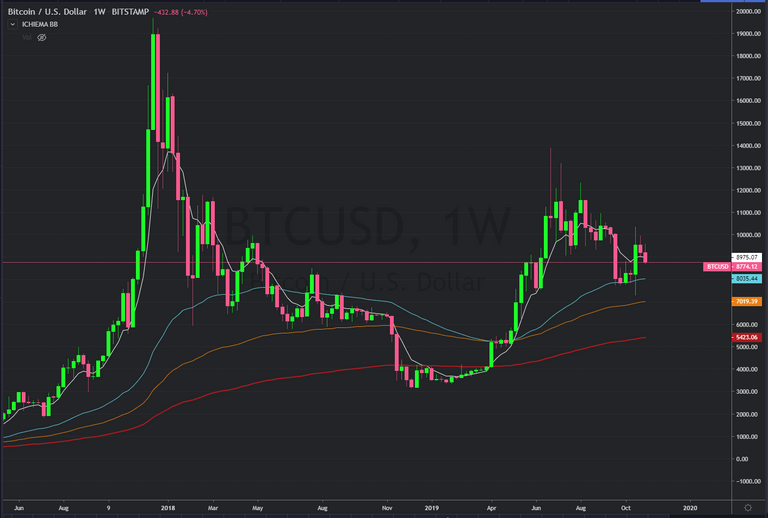
These work as S/R with the same rule of alternation applied. Sometimes they will break and appear not to have any effect at all, only to then appear to have an effect on a different moving average. I'll highlight below where Bitcoin Weekly chart respected these dynamic S/R lines.
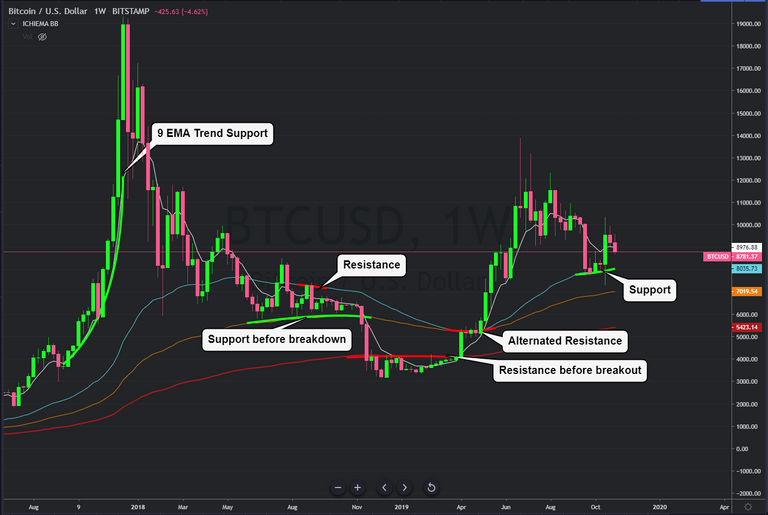
Now combining both pinbars and moving averages - if you see a large wick rejecting from a moving average, this is a higher probability of reversal than either signature absent of their other. Once again this is where confluence is key - when you have multiple signatures in agreement. Now lets look at some other 'signatures' you can add to find greater probability.
Fibonacci Levels
Have you heard of the Golden ratio? 1.618 - this ratio you can find in flowers, the turns in rivers, galaxies, even the ratio of your finger to your knuckles, and wrist to your forearms. Yes the world has this rather profound ratio embedded in it - and traders figured this would be a cool thing to create as a self-fulfilling prophecy with markets. It works because so many believe it works, and they believe it works because so many use it.
Fibonacci is a core tool also used in Elliot-Wave theory, and for those more advanced with applying this tool I recommend you view this video lecture on 'The F.E.W.L Method' - which stands for Fibonacci Elliot Wave Levels. As a quick copyright disclaimer - this video is not my content.
You can find confirmation of Fib levels all over the place and on any time frame. What confuses some people is how to correctly mark the high or low when there are periods of consolidation in between, or when breaking out of a range. Some start with the bottom or top of the bar that breaks out of the range, and others start with the very bottom or high of the range previous to breaking out. This is where using a Heiki Ashi chart over a standard bar chart will help you identify starting and end points.
First some examples of Fibonacci Retrace -that is, trying to predict a 'pull-back' before continuation of the trend.
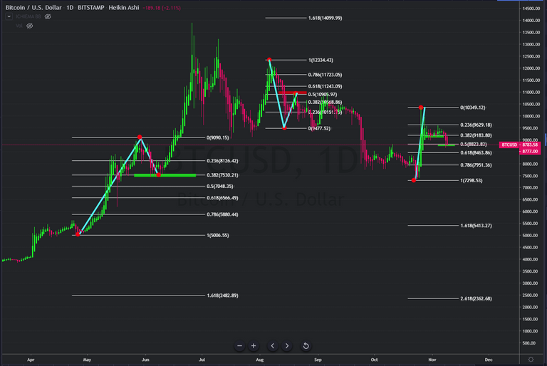
These produce a series of ratio lines of the measurement between the two points High/Low. The 0.78 and 0.23 levels are weaker than the 0.61, 0.38, and 0.50 levels. When these levels converge on moving averages listed above, that is a strong likelihood that the market will respect that level and at very least take a pause in momentum.
Now to move on to the less use Fibonacci tool - the extension. This is a 3-point measurement, first taking the initial impulse move, and it's corrective leg, to then project levels of trend continuation. It looks like this.
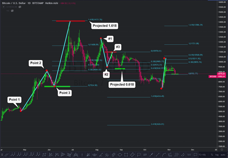
With Extensions, the strongest level is the 1.618, 2.618 and 0.618. Using the extension tool allows you to find potential pivot points well in advance where there is no other reference point to give an indication of when a trend or impulse wave may meet resistance. Plotting from a High, to Low, to a lower high projects the targets down, and visa versa. This is a great tool to use, and mark the levels while looking back further on the chart to see if you can find confluence with previous horizontal S/R.
Now if you find a pinbar, on a moving average, on a Fibonacci level and previous S/R pivot... this makes for a very high probability of price rejection. Also, this allows you to create entries and exits with high reward range, and low risk range. So far what I have shown you is enough for any trader to work with and learn no more. But why stop there, why not do all you can to increase probability by supplementing with more confluence? Try out VWAP, Kumo Cloud, and BBands as well to further add to identifying S/R and signs of strength/weakness.
Just before I wrap it up a quick disclaimer; I am not a financial adviser and the information I present here is of my own opinion - not to be taken as financial advice or instruction.
Thanks for your time, and I hope this lesson has been rewarding and educational for you :)
Congratulations @mickbit! You have completed the following achievement on the Steem blockchain and have been rewarded with new badge(s) :
You can view your badges on your Steem Board and compare to others on the Steem Ranking
If you no longer want to receive notifications, reply to this comment with the word
STOPDo not miss the last post from @steemitboard:
Vote for @Steemitboard as a witness to get one more award and increased upvotes!