I found this on Reddit and thought it was cool. You may have seenn other comparisons and visualizations, but this type is the first for me!
So in this picture below by the Money Project you can see all of the world's markets and how they compare to eachother. Bitcoin is at the top, just one 'dot' in size. As you scroll down it shows you other market sizes by comparison. These charts are great at showing the upside potential of crypto, and to illustrate how the bubble hasn't even started yet when you look at the big picture.
When people tell you a 100K bitcoin is insane, look again at this graph and imagine if Bitcoin were only able to grab part of some of the other markets..!
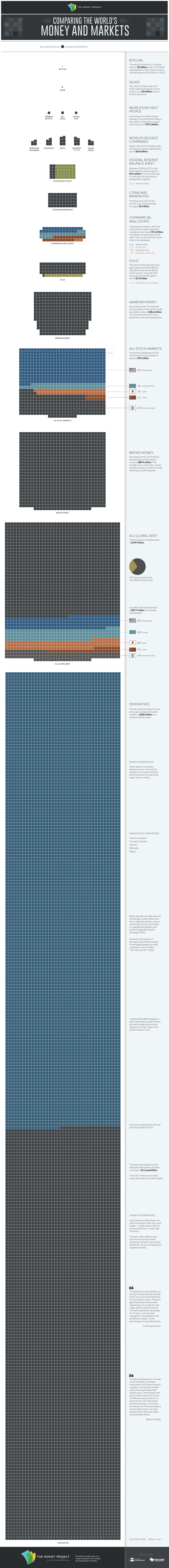
a little out of date - cryptos now sitting between world's richest people and biggest companies. they definitely have the potential to overtake gold
Yep, I noticed that the Bitcoin market cap was small on this pic too compared to today. But still, impressive chart!
A cat uses its whiskers for measuring distances. The whiskers of a cat are capable of registering very small changes in air pressure..gif)
Thank you for your upvotes. Click The Cat Join The SteemThat Movement!
Cats dislike citrus scent..gif)
Thank you for your upvotes. Click The Cat Join The SteemThat Movement!
Please Upvote This Comment To Help Me Grow!
@randowhale 101 - Everything You Need to Know!This post received a 2.62% upvote from @randowhale thanks to @pandorasbox! To learn more, check out