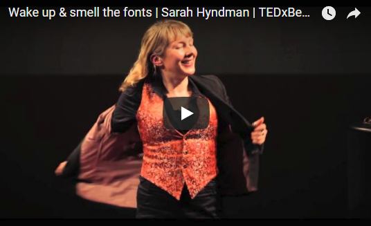
Sarah Hyndman, an expert in multi-sensory typography, gave a TED Talk titled, "Wake up and smell the fonts."
She shows us that fonts affect more than just a reader's sense of sight. People also tend to associate fonts with specific tastes and smells.
Watch her TED Talk at
So what does your website content smell and taste like?
Thanks for sharing Glen, I loved the presentation. When I was working for the New Zealand Government, we were introduced to the power of fonts in the 1990's. We had a corporate identity manual that stipulated the fonts to be used on all official documentation and external correspondence. We had to conform to uniformity. Our acceptable font back then changed from Courier New to Arial then to Times New Roman. These days, I personally use Verdana.
Thank you for commenting. I find it interesting that a government entity would consider fonts a part of their "branding" efforts. That's something I never would have thought given my experience working in private industry as well as the U.S. federal government.
Hi Glen, yes indeed all rather strange. This uniformity was perhaps a message directed to us than externals, a subconscious attempt - and very much unconstitutional - by the Executive to influence and undermine the role and the purpose of the Public Service. We knew that of course, so we fonted how we wanted whenever we could get away with it!