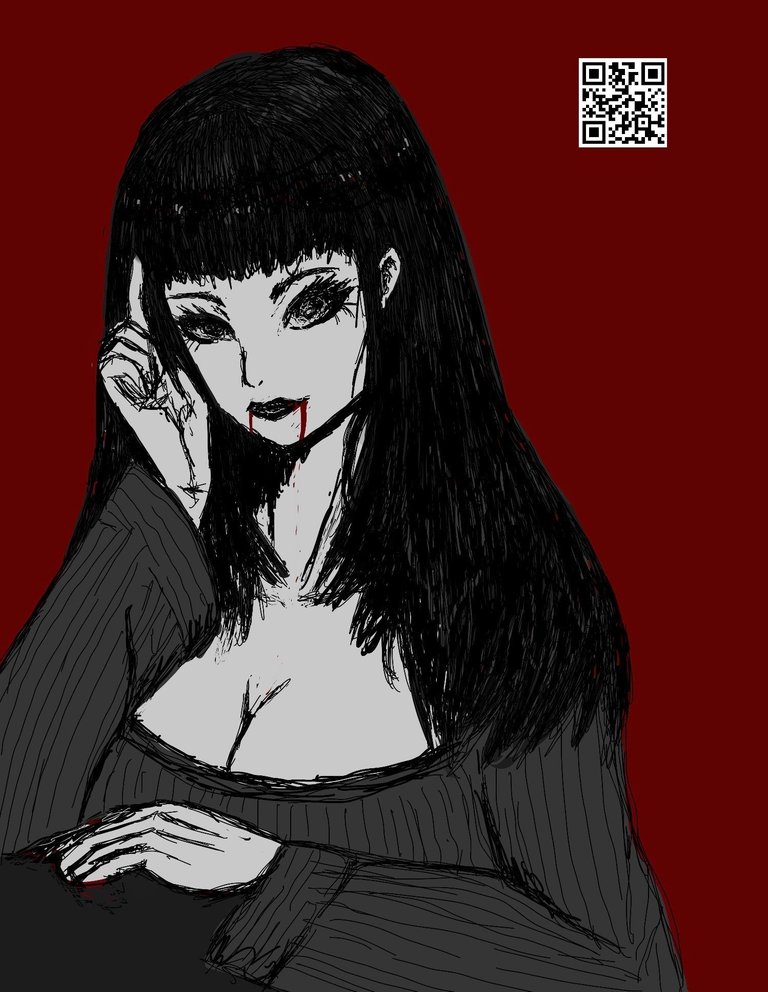
I wanted to try coloring in scribbles while using values and contrast. It's pieces like these that are challenging because the effect tends to look cluttered which is something I try to stop myself from cleaning up.
It's far from the imagined image / visual effect I have but this is due to the inconsistent line work. I've been following a lot of artists on twitter and trying to capture some of their techniques to incorporate to my own personal style.
It's been rough on morale trying to get something going on other platforms like building a small following. You know those algorithms are just stacked up against the small accounts and make more visibility towards the established ones. I know subscribing to a blue check mark gives me more edge on impression count but I doubt it's going to get me any ROI. After all, this is just a hobby until I get good enough to take on commissions for kicks.

I'm just extending the number of words on this post to make it look like I've put effort into the blog and this sentence is just fluff.
The QR code I use as a watermark leads to my @artofadamada account on Hive as a landing page whenever I share my work across other social media. I doubt I'd get a significant reach as I am now but if I can get more people curious about where that QR code leads, hopefully it converts to more sign ups on the platform.
My other social media pages: DeviantArt, Instagram, X