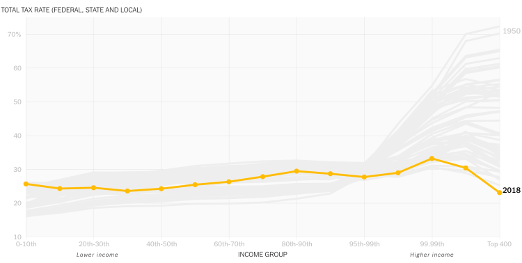
I'm writing about the tax visualization published at https://www.nytimes.com/interactive/2019/10/06/opinion/income-tax-rate-wealthy.html. Not only is this an excellent example of data visualization, it is so because of the story it tells. Up until the Reagan tax cuts, the average tax rate was very progressive: the rate rose with income. Then, rates fell across the board, especially for the 400 taxpayers with the highest incomes. By 2011, the Clinton tax increases create an effectively flat tax. The Bush tax cuts again favored the wealthiest taxpayers. Then, the Trump tax cuts dramatically favored the wealthiest.
My only qualm is that the data show only gross taxes: money paid to the government. They don't account for transfers: payments from the government to taxpayers. These include welfare payments and government health care expenditures. Including these would show the more accurate net tax rates. The poorest may actually have negative net tax rates, showing that they receive money from the government (really, other taxpayers)!

Posted using Partiko Android
Thank you so much for being an awesome Partiko user! We have just given you a free upvote!
The more Partiko Points you have, the more likely you will get a free upvote from us! You can earn 30 Partiko Points for each post made using Partiko, and you can make 10 Points per comment.
One easy way to earn Partiko Point fast is to look at posts under the #introduceyourself tag and welcome new Steem users by commenting under their posts using Partiko!
If you have questions, don't feel hesitant to reach out to us by sending us a Partiko Message, or leaving a comment under our post!
Congratulations @rufusfirefly! You have completed the following achievement on the Steem blockchain and have been rewarded with new badge(s) :
You can view your badges on your Steem Board and compare to others on the Steem Ranking
If you no longer want to receive notifications, reply to this comment with the word
STOP