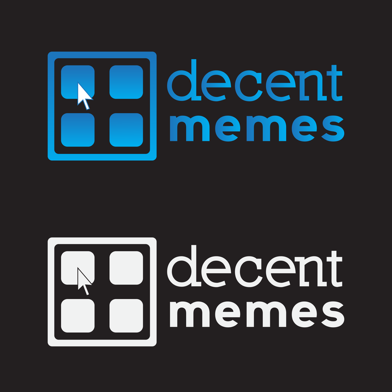
Hello steemit people. Today I'm going to post my proposal for the Decent Memes logo, hosted by @acidyo.

Try to make the logo fun but at the same time do not lose good taste and stop being a true logo.
As for the base of the logo, I relied on its website, which works as a choice of elements. We tried to make it as similar as possible without the identifier being too loaded and knowing how to take advantage of the space. A mouse cursor was added to give the similarity of the page when choosing the meme.
About typography, one was used for "Decent" and another for "Memes". The "Decent" with serif to give authority and the "memes" fresher, but with a considerable thickness.
Here are the versions: Logo, black background, web and typography respectively
