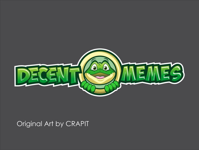
hello this my entry for this contest #decentmemeslogo hope you like it @acidyo thanks!
https://steemit.com/decentmemeslogo/@crapit/decentmemes-logo-contest
You are viewing a single comment's thread from:

hello this my entry for this contest #decentmemeslogo hope you like it @acidyo thanks!
https://steemit.com/decentmemeslogo/@crapit/decentmemes-logo-contest
I don't quite like what you did with the frog, I think it needs a bit more shading because you did the typography so well! The typography has this very classical cartoony look and I like it! Good job on the kerning so both sides stay at the same length. But yeah, because you did the fonts so well it feels like you should have gone that extra mile on that frog shading.
But overall- really good job mate!
thanks for your comment and suggestion @beercake I will do my best to improve my shading on my artworks. I really appreciate everything you said. :)
Please don't misunderstand me - I only said that you need to add shading to the frog is because you have shading and highlights on your text. Because of this diference the logo does not feel as uniform as it should. So right now you kinda have depth on the letters but the drawing looks kinda flat. So make it either everything is flat or everything has depth with shading. But since you did a really good job with shading on the letters - I suggest you add it on the frog as well.
thanks buddy im gonna work on my frog to make some improvements.
Hey buddy @beercake I apply what you said and I made some changes my frog looks better now big thanks to you. :)
Yes, now it looks finished!
Hey man, you did all the work. ;)
:)