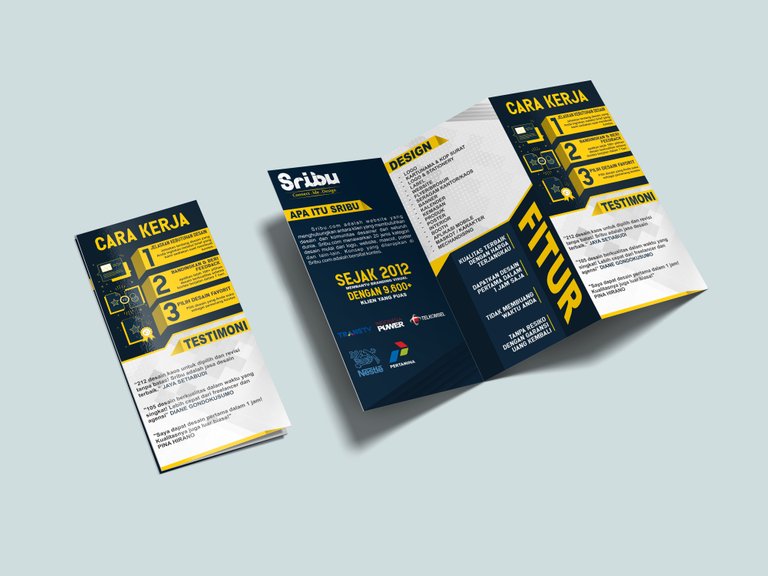
Talking about design issues, of course there are many of us that are related to looking for ideas, of course to get a good idea we must have many references, so that we can extend the imagination we have. therefore this is the brochure that I made yesterday in order to participate in an activity, hopefully enough to inspire you ...

In the design, I only use three basic colors and some relief colors, the basic colors are dark blue, yellow, and white. the purpose of the color selection is to give a simple impression and a sure rhythm in design, so that the brochure looks more attractive and harmonious.
The template from the brochure above also looks very interesting, because I made the tamplate more fariatively so it doesn't give a monotonous impression on the design.
I have brochured the brochure in a mockup form to make it easier for those who see to imagine the print out of the brochure design.
just for this article, do not forget to keep following other articles that I'm publicizing, thanks for your appreciation, if the ad input is posted in the comments field, i d'khadafi, see you again and peace.
Congratulations @al-khadafi! You have completed the following achievement on Steemit and have been rewarded with new badge(s) :
Click on the badge to view your Board of Honor.
If you no longer want to receive notifications, reply to this comment with the word
STOP