Continuing with more types...
From fun to futuristic, here are three approaches to the letter F.

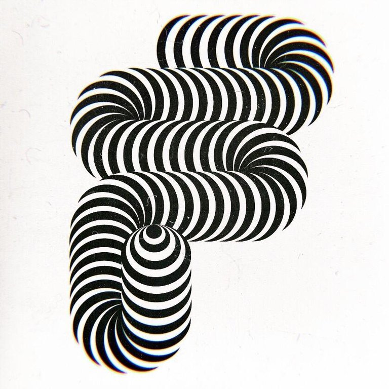
So first we have the fun one of course, because it's always better to start with the fun part. The main idea here was to create the illusion of volume and movement through repetition and high contrast.
When it comes to typography, it's always important to keep in mind what makes a letter legible, doesn't matter how experimental it may be, certain elements and dispositions can communicate enough.

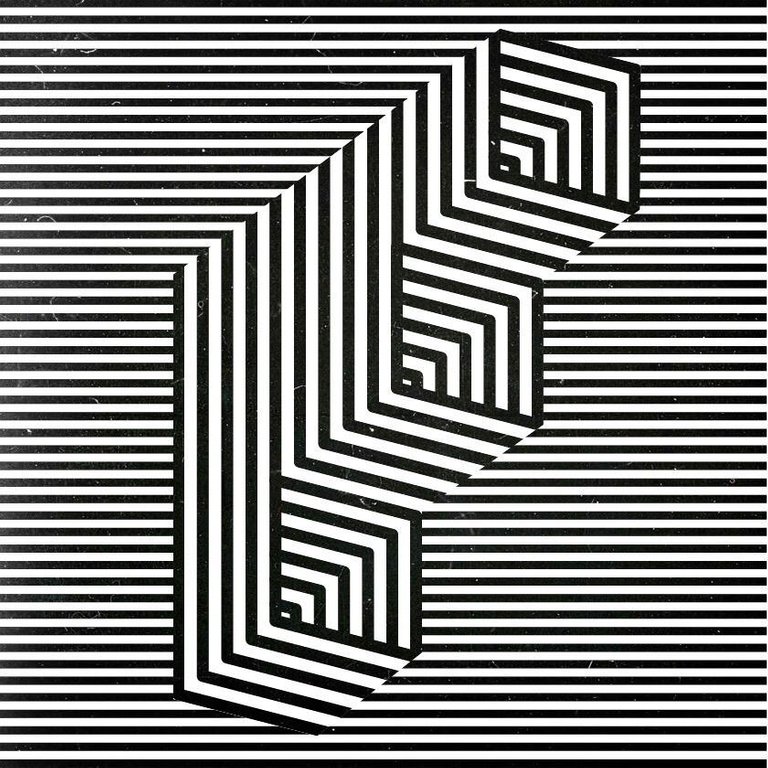
As I have probably shared before, lines are one of my favorite visual resources, which takes me to the next one: F with a more classical approach, with many lines to add a touch of depth and constructiveness.


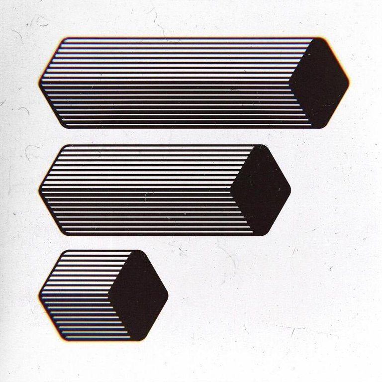
Finally, a more minimal type with horizontal bars floating on the white space, using lines as well but communicating a slightly different feeling, inspired by the aesthetics of retro-futurism..


These are the freestyle explorations around the letter F.
See you soon with more types, lines and shapes!
Thanks for reading! ☺︎

These are really cool, @andrea432 ! Very creative and very well designed :D I can see the letter F in new lights now :D
Wow many thanks for your words @veryspider! :'D so glad you liked them.. I used to give letters for granted before learning typography, but then I saw their true beauty and realized that they can be a very fun topic too :D You definitely encouraged me to make some more <3
These are so cool, love the second one.
Posted using Partiko Android
Many thanks @solar! :D I must say.. it's one of my favorites too :p
Very cool designs all of them, if i have to choose i ll prefer the second version:)
Thank you @georgeboya! glad you resonated with that one :D
You are very welcome, will you make all the letters as a font?
:D yeah kind of.. I'll be doing the whole alphabet and eventually come up with a font, but for the font I'd like the letters to be clean and simple (for legibility purposes)... so these are like very experimental sketches just to study the anatomy of type..
I see.. It sounds like a lot of work, but even with a small collection of letters you can create simple texts for maybe a cool poster:)
Oh @georgeboya :o that's a great idea! I honestly didn't think of it... but now that you say it... I could work on a poster :D Thank you! Really appreciate your feedback
You are very welcome and I am happy for helping😊😊
Posted using Partiko Android
This post was shared in the Curation Collective Discord community
community witness. Please consider using one of your witness votes on us here for curators, and upvoted and resteemed by the @c-squared community account after manual review.@c-squared runs a
Thanks @c-squared! ♥︎
Congratulations @andrea432! You have completed the following achievement on the Steem blockchain and have been rewarded with new badge(s) :
Click here to view your Board
If you no longer want to receive notifications, reply to this comment with the word
STOPTo support your work, I also upvoted your post!
Do not miss the last post from @steemitboard:
Peace, Abundance, and Liberty Network (PALnet) Discord Channel. It's a completely public and open space to all members of the Steemit community who voluntarily choose to be there.Congratulations! This post has been upvoted from the communal account, @minnowsupport, by Andrea432 from the Minnow Support Project. It's a witness project run by aggroed, ausbitbank, teamsteem, someguy123, neoxian, followbtcnews, and netuoso. The goal is to help Steemit grow by supporting Minnows. Please find us at the
If you would like to delegate to the Minnow Support Project you can do so by clicking on the following links: 50SP, 100SP, 250SP, 500SP, 1000SP, 5000SP.
Be sure to leave at least 50SP undelegated on your account.