Hey guys,
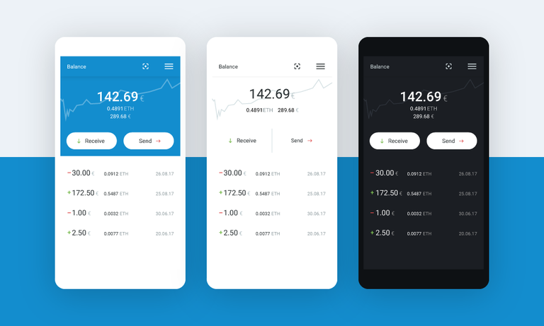
these are my 3 color variants for Pillar mobile crypto wallet (v0.1).

Blue (default)
White (minimalistic)
Dark (for night owls)
Any feedback will be appreciated :)
Andrej Cibík @andrejcibik
Web design | Web development | Logo design

great, wanted to include a black version to my feedback forenergy saving purposes/night owl but you thought about that already! prepare to win this ;D
Im aiming for 3rd prize :) Im sure 2nd and 1st is for teams only.
TheAlchemist_/status/907854595287855106 If you have a Twitter, vote here for your fav. theme - https://twitter.com/
Nice work.
Though i would made some few fixes :D
Headers could be slightly darker than main color.
In the section where you show spent or received amount. I would add differentiation lines(one line slightly darker) which would highlight and make it even more easy to focus on particular item.
Good luck ˆˆ
Thank you for the feedback. I will think about it.
the black one
Good 😊
may using a thicker or vibrant stroke at the chart line to make it more visible?
If you tap on it, its is pure white :)
But this feature wont be in first version.
Clear and readable, well done. I personally like the blue one the most
Me too, but dark one won it the polling :) But we will make more themes to choose from for sure.