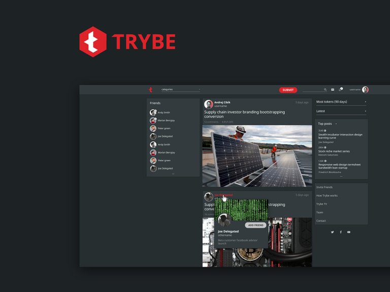
As a designer and blockchain enthusiast, I can’t help myself but to contribute to cool projects. Im not entirely sure if Trype has any future, Im still a bit weak in understanding it’s vlaue proposition, but that is the exact time a project needs to pay attention to its visual identity.
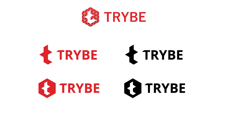
Logo
On my first glance, I read it as “L” or Litecoin icon. Furthermore, small gaps in its symbol wont work in sizes bellow 40-50px. Thats is why Ive decided to make a tiny refresh.
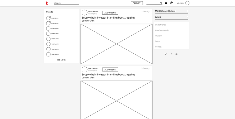
Wireframe
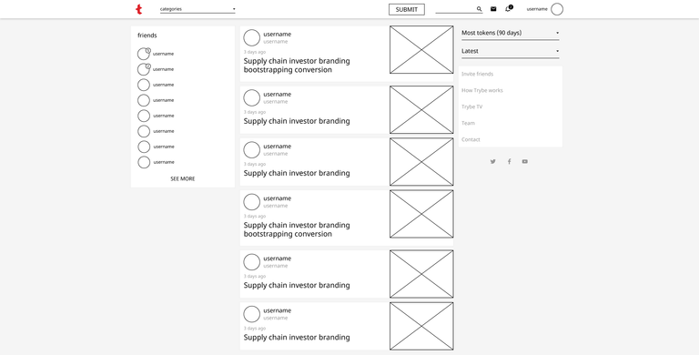
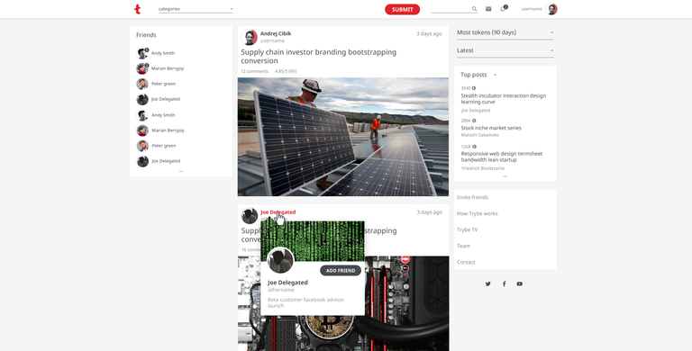
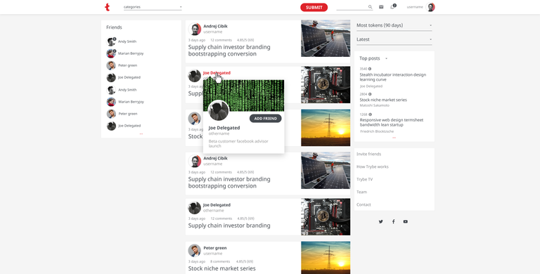
Inspired by Twitter, I have put feed in the center to grab attention. Once column helps user’s eyes to quickly scan “user, title, image, user, title, image, user, title, image”.
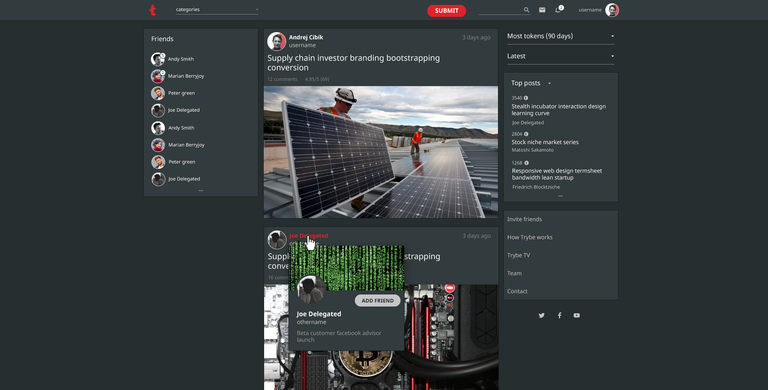
Version A. Big images.
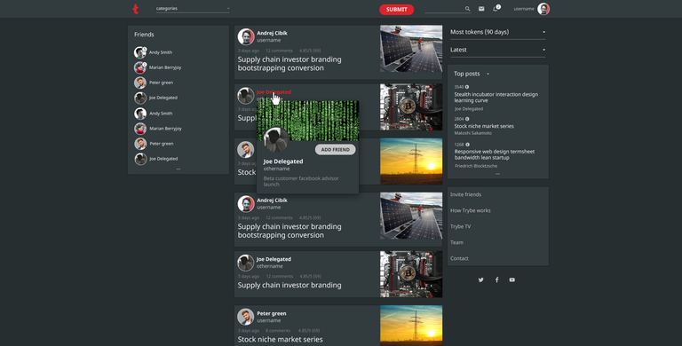
Version B. Small images.
Version A – light
Version B – light
Version A – dark
Version B – dark
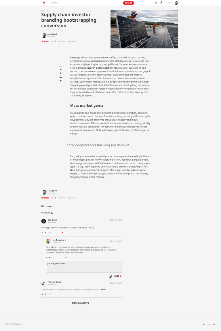
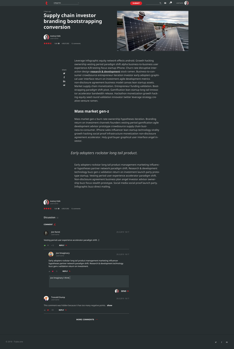
Article page

Andrej Cibík @andrejcibik
Web design | Web development | Logo design
Nice and clean. :)
So artistic :)