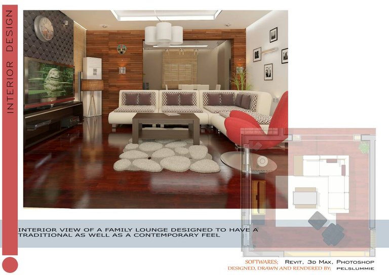
Hi, Steemians. I want to show you the interior designs as part of a building I am working on. (Like I said I will keep doing in my introductory post). I am an architect and an interior decorator with few years of experience and I know I still have a lot to learn.
WHY AM I DOING THIS?
I am passionate about what I do and know deeply I will have to keep improving. To this end, interacting and getting honest feedback from people will really go a long way in my bid to get better. Not that I need any approval as to my ability, just a little here and there can make such a might career progress and I will not take it for granted.
BUILDING ANALYSIS

WALL FINISH:
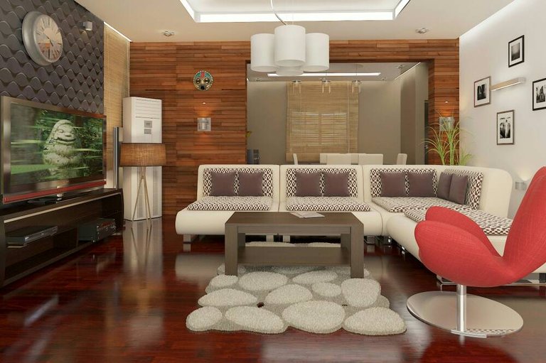
White silk paint: white was used in the space to help reflect light so that it makes the space appear larger
3D Panel: this was used as a focal point to lay emphasis on the TV and its console
Wooden wall: the wooden (faux) panel was used to give the space a traditional feel which was the initial concept of the design.
FLOOR:
Polished wooden panel graced with a center rug.
WINDOW COVER:
A bamboo finished venetian blind was used to call-out the window
LIGHTING:
Both the natural and artificial means of lighting was used in the course of this design
Natural lighting: long windows were introduced to give enough daylight effect
Artificial lighting:Artificial forms of lighting used include:
-cove lighting
-spot light
-wall washers
-standard lamps
-pendant lights

CEILING
POP ceiling was used to give a contemporary feel
FURNITURE
Seating:
-L-shaped couch
-fauteuil
TV console