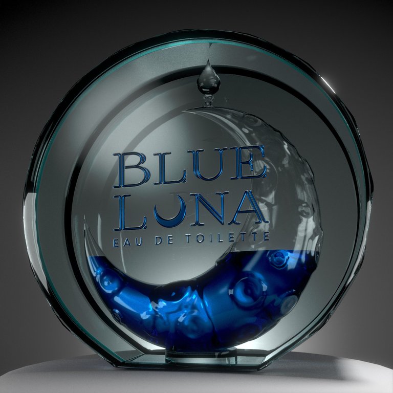
I'm back! With new old stuff! Blue Luna Eau De Toilette, final logo and packaging from my logo design course some while back. It was simple enough, and came out beautifully when it was all done. The 3D model wasn't necessary for the class, but I figured it was easier to build the entire product than to leave any room for debate or misinterpretation as to the logo's merits against a purely hypothetical product. Like a candy wrapper or a coffee tin would stir up a 15 minute conversation about the merits of the design vs the product vs the consumer, such is a design education environment. My idea let me be both very minimalist with the logo and yet very 'extra' with the product, and build a tight correlation throughout.
Also, I don't think I'll ever get over the French, here. 'Ew, da toilet' is how I read it (loud and nasally) in my head, and it almost never fails to make me chuckle a bit. But probably hurts the 'brand' a little.
