A Unique Interior Design Project
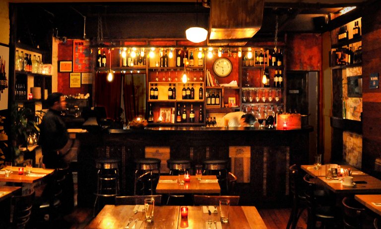
When i first started my company a few years ago, one of our first projects was to design the interior of a restaurant and wine bar in the East Village of Manhattan called Paprika. The neighborhood is historic in New York and it’s the home to some great restaurants and bars with a lot of character.
Optimizing the Design
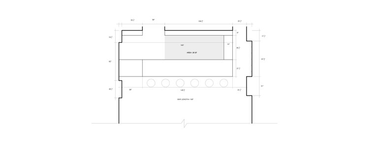
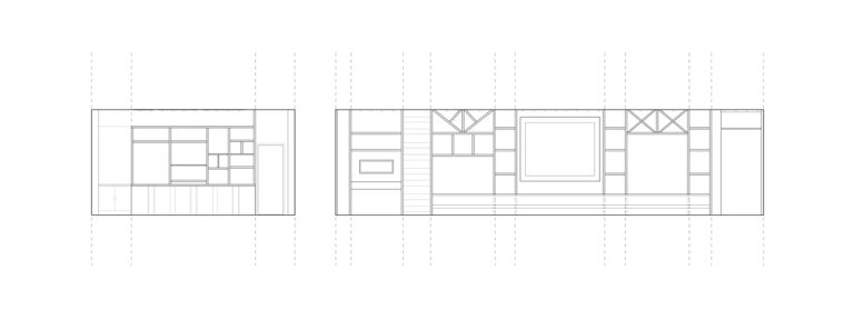
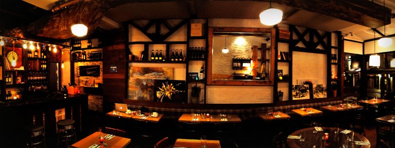
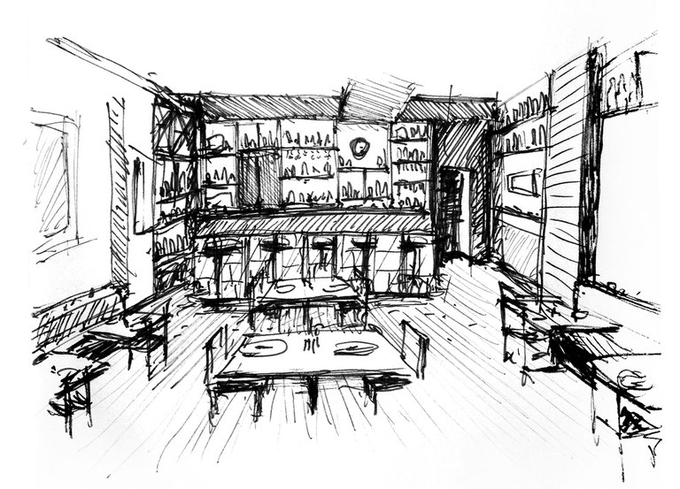
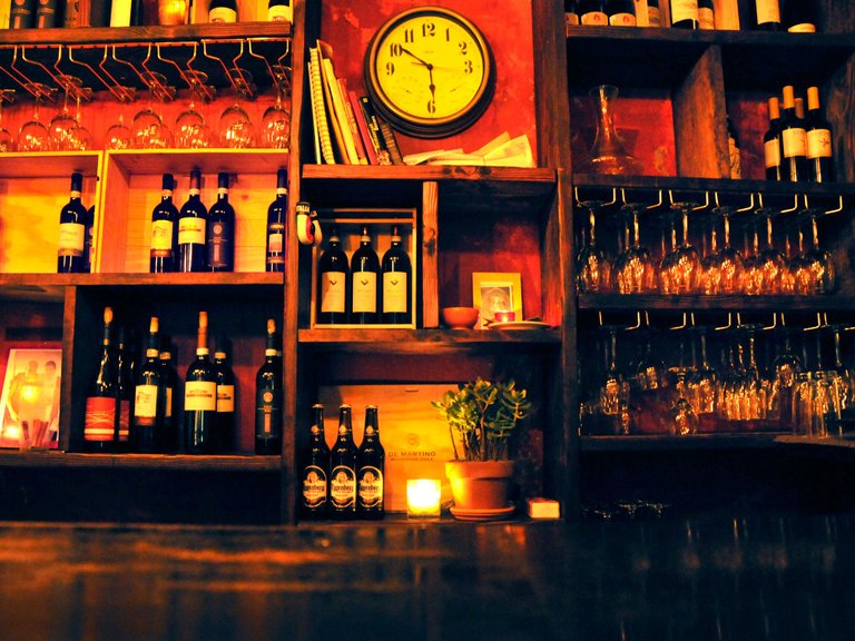
We explored many floor plan layouts to optimize the dining and drinking experience. There is a maximum occupancy that we had to keep in mind, but more importantly we were looking to find the best layout for the use of the space for customers. We ended up designing wooden wall bookshelves to store wine bottles and other items like cigar boxes. The back wall, which divides the kitchen with the rest of the restaurant became a feature - a large custom-built bar and wine library.
Creating the Atmosphere
The restaurant owner wanted the space to feel like a cozy, but cool and artistic speakeasy meets quality restaurant. We looked at a lot of other restaurants as inspiration and collected numerous ideas for how to create the feeling that we were looking for. I would sit in the restaurant sketching and photoshopping ideas that we were coming up with so we could envision what it might look like.
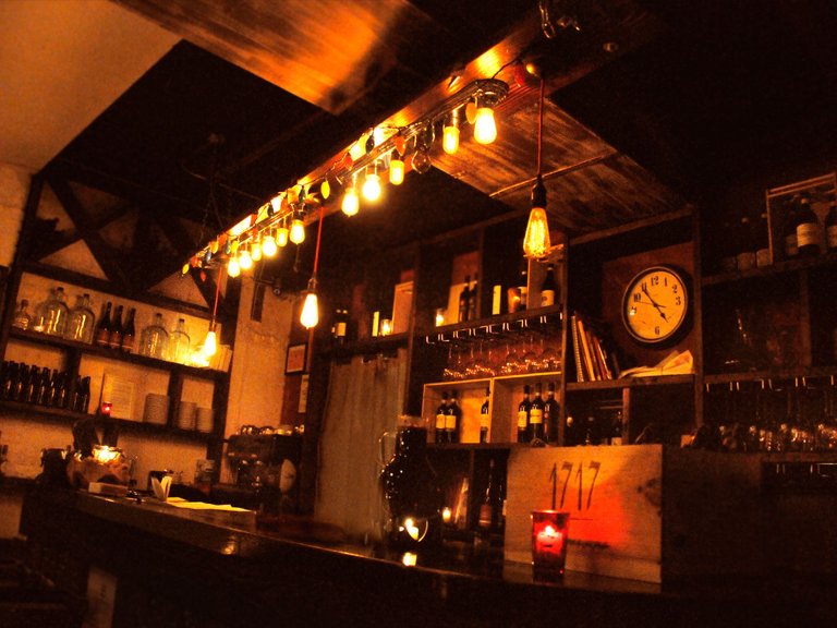
Sitting Inside My Design
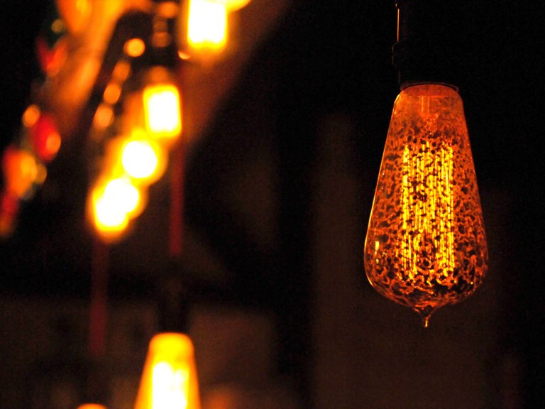
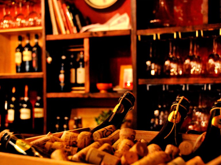
The result is a lot of vintage lighting, warm colors, rustic fixtures, worn down painted walls and wood framing. All decoration and furniture was custom built according to the designs including the bar, which is made from old wooden wine cases and corks from Italy.
It was really amazing to see the space come to life, especially seeing what it looked like before - a boring white box with bright lights. The restaurant has since closed because the owner opened a bigger restaurant, but visiting was always a pleasure. Sitting inside something that I helped bring to life while sipping some wine and chatting with the owner was always a lot of fun.
Ciao for now, Steemians.
- Weston (aka @design-guy)

Watching your photos "cozy" was the first word that I thought =D excellent work. That's the kind of design I have in mind for my personal space.
Thanks so much @kouloumos it was really about getting dim, warm light and then materials that were also more warm and dark also.
Omg I love beavis and butthead.
Do you have T.P. for my bunghole? I would hate for my bungholio to get polio.
I would have to agree cozy is a nice description, the use of wood, the small space, and the warm yellow lighting all do it for me . Not as sure about the back wall, with white and black feels a little Tudor to me, which bring back memories of a pretty poor pub we used to drink in - but it may mean something to someone else, which I guess is the essence of design, invoking feelings.
Thanks for the comment @harveyword you're definitely right thay the wood framing with white back has some more Northern European style to it in general, but this photo is showing it before it was filled in with wine bottles, plants and things like clocks and boxes and hanging art. You almost couldn't see the white wall at all after that.
very cool, reminds me remotely of the best wine/lounge place around here called The Bottle Room / peace
Nice! @clumsysilverdad where is that?
Suburban Green Bay, not much fancy here, but you can see fireplace on lower right, photo is near entrance where there is a small live performance area. I was in alphabet city in N.Y. years ago, some nice bars, and prob the best bloody marys i've had / peace
http://nebula.wsimg.com/b4eba09028124c38b8994349e2799590?AccessKeyId=578BA098A3B27F3534ED&disposition=0&alloworigin=1
It looks gorgeous! I could sit in there for hours, just sipping wine and enjoying the ambience. Well, I probably couldn't afford it, but other than that... :-)
Wow, that is an amazing project! If it was closer, this could well be one of my favorite restaurants!