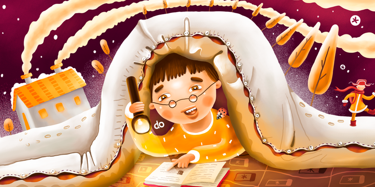
Once I've got really interesting order. I had to design a logotype and two complex illustrations for the children's internet bookstore. Which name is Bookashki. This is a play of English book and russian bookashki which literally means small and cute insects.
Logotype
It was a time when I've just started my freelance career and I had accepted each and every order I got. Even if there was a graphic design task like creating a logo I would accept that. Later I've tried to avoid that because my main focus was illustration and I am sure if you focus on one thing you could polish it and do your best in that field of creativity but other skills would stay undeveloped.
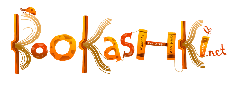
I've just checked the files creation date and won't believe I've worked on that project 8 years ago! So here comes the logo. Since they've used it only on the header of the website and never planned to use it smaller I went into details and created this book themed writings.

Small company of two cute women. They were just beginning to run their business and had absolute faith in my professional abilities. It was accepted without any corrections.
Draw time!
After the logo has been done the fun started. They just told me draw what you want. You're a boss. Okay... I've searched one of my inspiration places these days: Shutterstock and found I would like to draw some kids reading. I thought summer would be day and winter is night time and there would be a kid reading under the blanket. Another benefit to be an illustrator is you can use any of the stock images as an inspiration without buying them actually.

Summer Header illustration
Those days I had big and fat notebook looking as a book with old yellow sheets and I was drawing pencil sketches first. So here I've got some scans.
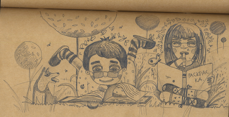

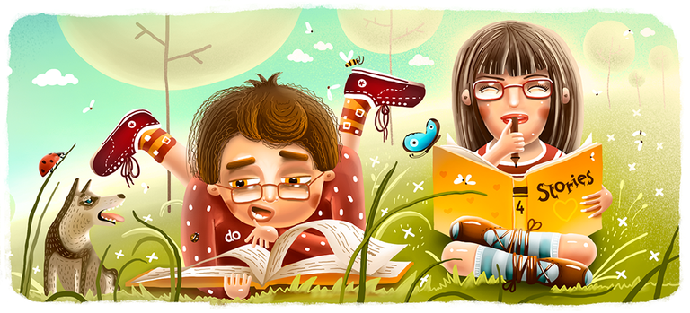
Applied it to the site header layout, approved with the client and started to color it. I've counted 85 layers on this final. I remember those times. I was really afraid to draw and to spoil something. Creating more and more layers just in case to get back...

Done English version for portfolio to look cooler and Russian for the store.

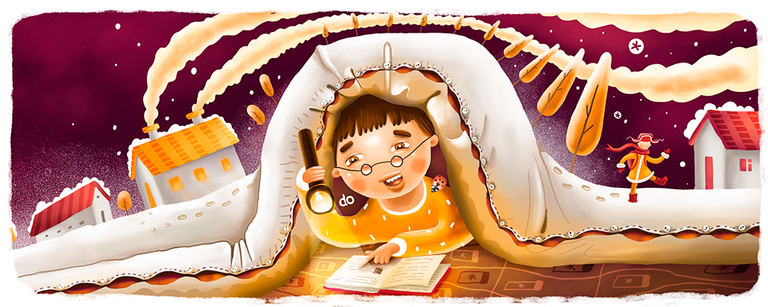
Winter Header illustration
Then started the second one. Made rough sketch and without showing it to anybody tried to color it.
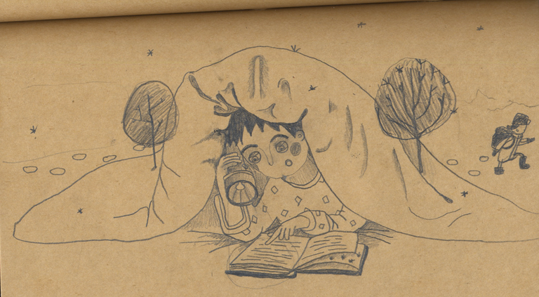

But then decided to stop. Got a feeling of going in wrong direction and tried another sketch. I really want it to look polished.
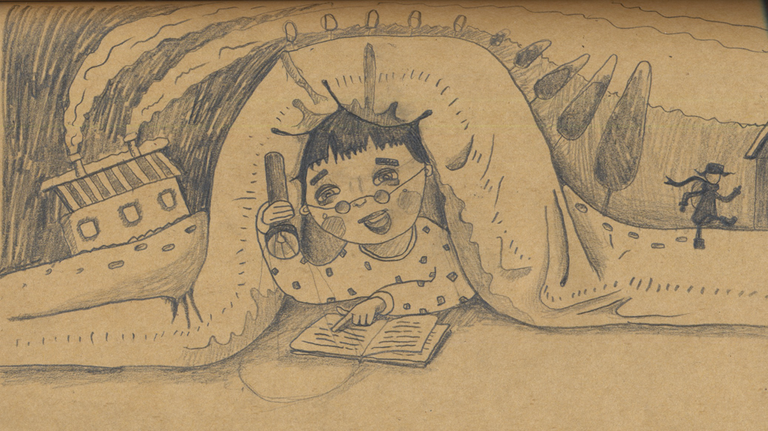
Okay this one I've liked much more. There is a famous Russian story about small boy who was only 6 years old but had strong will to start education and once in cold winter time he went school. His name was Filippok (like me). So this small character is pointing to that story. It is also my case. I've started the school when I was 6. Usually in Russia kids start at 7.

Same here: Russian for the client and English for my awesome portfolio. By the way, I can see they've removed that illustrations from the site now but still using my logo thankfully.

So, how was it? Interesting or not? Even if it's boring please let me know. By supporting this post you're inspiring me to create new cool stuff. Thank you so much for your attention!


Wonderful
waaa
You have so much inspiration to design.
everything looks beautiful and attractive.
I salute and marvel at what you have done.
success
Thanks a lot!
Yes
amazing your idea.
how it can be thought of by you??
hmmm
It's so nice to see some of your earlier work. The sketches are brilliant but you've definitely polished your style over the years! Wonder what you would create if you had to do this now. I like the winter header because I LOVE to curl under the blankets when it's cold and read. Plus, when I was a child I often had to sneak a torch into my room after the lights were out to finish books. So I can really relate to that one :)
Yeah, me too! There is some magic using torch under the blanket :) Haha! When I was writing this post I was fighting myself to redraw all this from scratch :)
Gorgeous work! I love the winter tale illustration of little Filippok.
Thank you, Marieta! How is your instagram story? Have they gave the account back to you?
Nope, I think I might not be getting it back ever. At least no one can delete my account here :) And I created a new Instagram.
Excellent.
Awesome...Real inspiration
They are so amazing your portraits and drawings. But I want to now also what do you think about my portrait: https://steemit.com/contest/@samotion26/portrait-1-or-bonus-tutorial.
Thanks. I think it's just a trace function but not something you can call work or portrait...
It was interesting to see for me the design process. Thank you for sharing! :)
Amazing work! Beautiful.
Hy! I am a bot and I find your post valuable for the art community! Thanks for great post! I follow you!
I love this one too ! :-)
Wowww ..wonderfull I like your design so much,
Iam interested in your talent
hallo,im a new user who still keep learning,,
im come from indonesia,,,
I need your vote
@alzaidi
I can give you a flag if you don't mind?
I really like your Illustration, there's some much details to see in just one Header, so colourful. It's totally NOT boring at all... I'm going to go explore your other works.
I congratulate you, you are excellent.