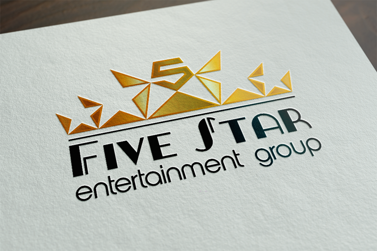
After (during more likely) having done both the Steemporium & Steemstreams logo, I had another job already lined up (wish it was always this easy). @Rest100 and @mrviquez are heading up a new project on the blockchain, and they were in search of a professional logo. So @Rest100 contacted me on Discord. Due to things still being set up at the time, I was asked to hold this post under wraps till everything was ready. Which it now is.
The project in this case is Five Star Entertainment Group.
The Brief
The logo obviously needed to portray the five stars from the name. They represent the highest rated level, 5/5, a sign that Five Star Entertainment group provides the highest level of service. It also needed to represent Five Star being a company on the blockchain. Apart from that, it just needed to look top notch instead something put together from stock art.
Concepts | Initial thoughts put on paper
While still working on the Steemporium logo and waiting for some feedback, I took the opportunity to do some sketches, let my thoughts flow about what I thought the logo might go and look like.
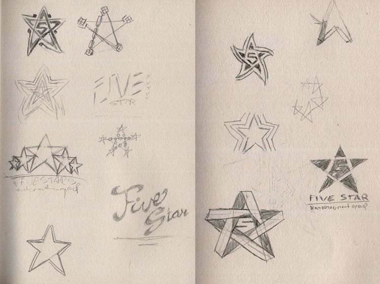
Usually, depending, I show these to the client, so they can see where I'm heading and so they can shoot down thoughts that might work for me, but not for them and thus, save me some work.
In this case though, I had some clear ideas I really wanted to show in a slightly further developed state. And that for me, actually turned them into unsuitable logo's. The general idea for each of the following 3 logo's was to combine 5 stars into one. It just didn't work, even though the sketches clicked for me. I'll explain why each failed for me.
NOT want him to choose any of them. Then I showed him the 5 star Free Crown logo (the one that ended up being chosen) and told him to choose that one. He had NO qualms whatsoever to do that. He loved it. But since he's not alone in this project, some cross checking had to be done. So, having said that, here are the 3 cannon fodder logo's I was fully willing to sacrifice in order to get the Free Crown design chosen.But before I do that, I want to tell about how I chose a rather bold tactic when presenting all the logo's to @Rest100. I told him I was going to show him 3 logos and then I told him I did
Cannon Fodder | The Failures

Atomic Star
This one is just way to boring, had not much to do with blockchain technology and fails in regard to portraying 5 star service.
There's 5 pieces of star, but the relation to generally accepted display of 5 stars for greatness is lost.
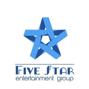
Atomic Ribbon
I liked this one a lot in the sketch phase. But in the actual design it falls flat on it's face. There's just 1 star, and there is no representation of the block-chain at all.
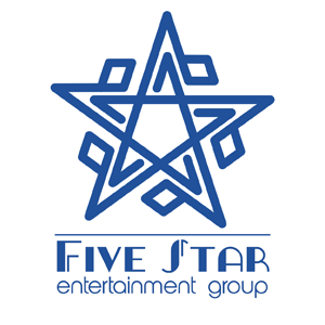
Atomic Blockchain
This one had more potential. It's a single star, formed of 5 'stars' each ending in a block representing the blockchain part. Unfortunately, it also looked like David's star or a Menorah. Not that there's anything wrong with that, but it did NOT fit the needs for this logo.
Inspiration | The Winning Idea
Apparently, I had to get these 3 out of my system, before moving on to the final design. I already had it in the sketches. There's only one with 5 stars and it looked boring initially, which is why I went on with the other ones first. But when I started digitally exploring it, the winning idea hit me full force. I was not going to do 5 stars.
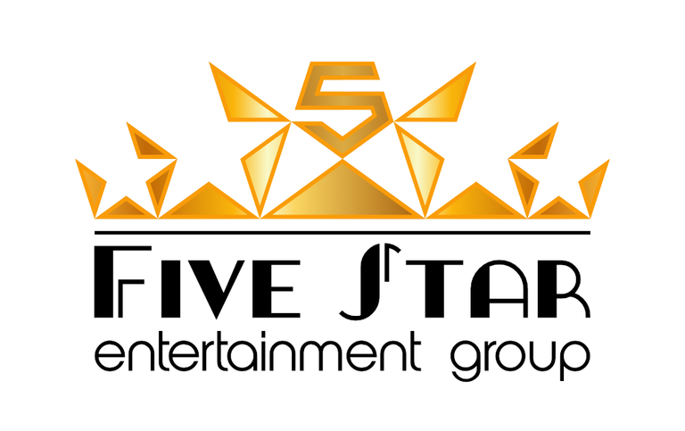
I was going to lay down blocks from the BLOCKCHAIN (the triangles), the negative space between them forming FIVE STARS and the entire logo itself forming a CROWN. Because next to 5 star service and blockchain tech, I wanted the logo to portray them as the best of the best, KING of the hill. The 5 in the centre is an emphasize on the Five from the name and functions as a jewel in the crown. It will also allow them to use it without text and it will still lead to the Five Star name.
All that brought together and The Free Crown design was born. I had some other variations to this, dubbed Half Crown (top right) and Full Crown (bottom right). But both of those made the stars more obvious, more in your face. And I loved the cleverness and subtlety of the Free Crown design.
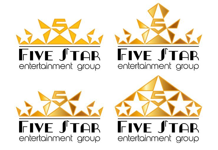
They chose the one I loved most, the Free Crown edition. In my opinion, they chose the best. I think in the end, the story that makes up the thoughts behind a logo are what makes it a winner.

Thanks for reading.
Full STEEM ahead my fellow Steemians

Thanks for making us the dopest logo!!!!!!
Anytime man. Thanks for having the faith in me for delivering. It's been a real pleasure developing this one !
Thanks for sharing this. Very nice work.
Thank you for hooking up with my brother. You asked the best! And he delivered the best!
Very nice artwork bro! I am proud of you!
Thanks man, Pretty proud of this one myself to be honest. Couldn't wait to post it, so I'm really glad I got the go ahead
This is an incredible logo.
And you're right. The story matters a lot. I love it.
I wish I could give you more support but I just started today, so maybe later :).
Also, thank you for describing your thought process and thinking. It is very helpful for other designers (and I'm hoping to share things like that and promote posts like these in my channel).
Thank you. I truly think the story behind the logo is what makes it. I sharethe thought process and design process so as to inspire others. Thank you for your support
Awesome! Great designs, as always.
Thanks man, I do my best :)
I would love to see a simplified version. This one will be hard to use in some aplications.
Are you in our Steemit Designers FB group?
I am not. Do tell me about it and why it would be hard tonussen in some applications
Its very detailed. Scale it down to 2-3 cm. Is it still readable? Are details distinguishable?
Agree! Nice logo but could be simplified :)
Very good logo, man!
Thanks man !
Looking slick @eqko, really clean and interesting logo.
I was afraid of long comments too, but now I carry a sword with me to hack them into pieces.
Thanks man :)
Hacking comments to pieces with that pocketknife you call 'sword' will take a while I'm sure :)
Ok, it's not a sword, I was being modest...
haha that's insane man. Love it.
I'll just sit back, take my PAW breakfast and watch you go to town on those long comments.
looks familiar?
Exceptionally pleasant work of art brother! I am glad for you!
Thank you, much appreciated
i really love those art work keep it up
I will. Thank you 😊
Great post friend
thx friend
Wow.. youre so good..
Thanks !
That looks incredible!
thx buddy :)
I'm new in steemit. afraid of long comments. the post you share is very good thank you for sharing. success always ya friend!
@eqko.
Don't be afraid, there's no reason to be.
good post
Really interesting look at your creative process. Cool logo to :)
Glad you liked it.
Wow, never really knew that much effort went into something like that.
Yeah not much people do, which is why people tend to underestimate the costs of logo work. But I can't complain.
Brilliant job
This is so good, bro! the draw are so good!
I'm really like this art work. Very Good!!!
very good work. you have a lot of creativity
thanks for sharing.
I invite you to follow me and see my publications
That is a great logo.
Nice designs. upvote
you got some really great designs.
keep up the good works
LOVE It im trying to make a LOGO for myself my youtube channel im new to this and ima try to be this good hehe@!!@@!!
really a masterpiece of logo design that is very extraordinary and attract friends
I like this :)
Grat job! Resteemed
It's really a fantastic logo. Congratulations @eqko
Thanks @clio 😊
Peace, Abundance, and Liberty Network (PALnet) Discord Channel. It's a completely public and open space to all members of the Steemit community who voluntarily choose to be there.Congratulations! This post has been upvoted from the communal account, @minnowsupport, by eqko from the Minnow Support Project. It's a witness project run by aggroed, ausbitbank, teamsteem, theprophet0, someguy123, neoxian, followbtcnews/crimsonclad, and netuoso. The goal is to help Steemit grow by supporting Minnows and creating a social network. Please find us in the
I like it :) very cool logo :)
Thanks for the dope logo fam 💪🏼
Your welcome man. Glad you love it 😉
OMG, this is subtle but genious. The way the lines create the stars. I didn't see them at first. But once I realized it was mind blowing. And also the the lines create a hidden triangle is awesome. You are so thoughtful with your design!
Thanks man. It's another case of negative space, like I showed you the other day.
Yeah, I remember :)