I doubt many around Steemit would argue there's a tech with more disruptive potential than blockchain, yet I think it’s undeniably having a gangly adolescence. Coming of age will require crypto to embrace the compelling business case for UX and be part of a new “third wave” of projects that put user needs first.
That’s why I was especially excited to make a contribution when SmartCash, recently one of the top 100 cryptocurrencies in the world, sought my help with marketing and design for a new privacy-themed cryptocurrency they were calling Bitcoin Confidential.
No market research had been done yet, so I tackled it myself via a community survey. Within just a couple days, I had some findings.
Key findings of my market research
- The “killer app” for crypto users was ease-of-use. Surprising!
- Users were already happy with the privacy offered by existing coins.
- Even fairly sophisticated crypto users know little about privacy. Depressing!
- Users were much more interested in ease-of-use and rewards.
- The Bitcoin Confidential name was unpopular, with only 27% approval.
- Watch my full findings presentation here

These initial findings led me to prototype a marketing website and brand positioning that was very different from any other cryptocurrency I can think of.
Forming a friendlier brand
First, I proposed a friendly nickname: Coco for short, with Bitcoin Confidential as the full name. This allows the brand to keep the name recognition and trust of Bitcoin, but with an everyday-use nickname that’s both easier to say and friendlier.
Educating about practical benefits
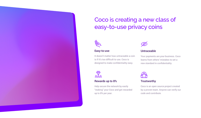
Second, when thinking about positioning and explaining the value prop, I paired features that my early research found users wanted––namely rewards and ease-of-use––with the untraceable transactions that were Coco’s main technical advantage.
(If you’re wondering––and I know you product nerds are––I used a lean product management technique called an Importance-Satisfaction Analysis to identify which features were most exciting to the target customer.)
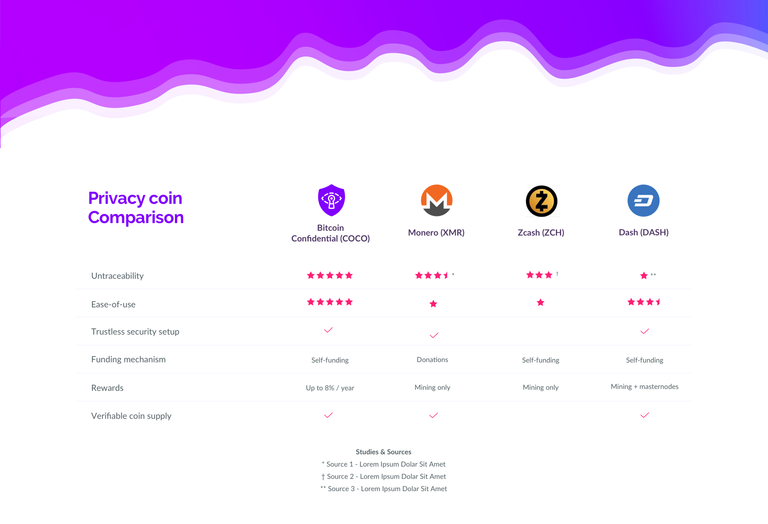
I also found that even sophisticated users don’t understand privacy coins. This led me to focus on subtly educating the user. Comparison charts, citations of studies, and further reading all the way down the page help with this.

And because I wanted the coin to “cross the chasm” from enthusiasts and visionaries to pragmatists, I made sure the marketing copy focused on practical benefits to the user, not just raw features or specs. Some technical language is still necessary, but I kept it in the context of what the tech could do for you rather than assuming––as many crypto projects do––that, say, “DPOS 3.0 cold-staking” is self-evidently desirable to all right-thinking people.
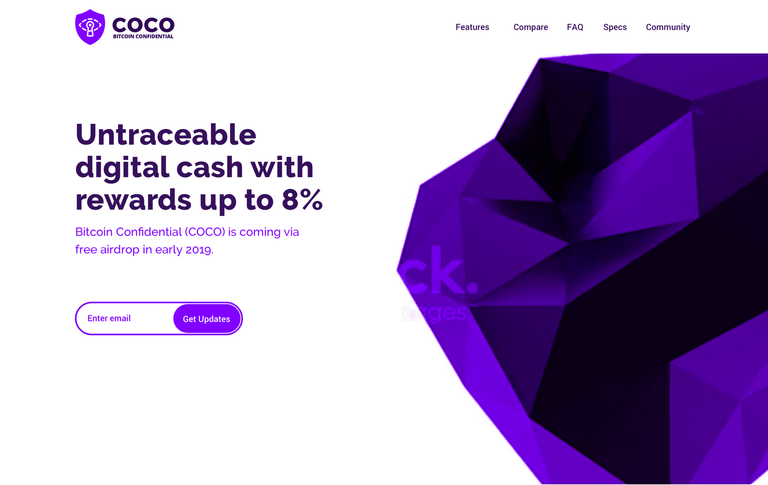
This is also reflected in my decision to refer to it as “untraceable digital cash” instead of cryptocurrency. Everyone gets cash, and that can’t be said of crypto-anything at this point.

Bright and friendly aesthetic
Thirdly, I deliberately chose a design aesthetic that blended bright, modern colors and white space with the dark, shadowy imagery chosen by many privacy coins.
Dark, of course implies secrecy and confidentiality. Think Darkcoin, a popular 2014 project led by crypto-anarchist Cody Wilson that promised untraceable transactions for the dark web. The problem is that dark, shadowy, and hard to understand crypto jargon can be scary instead of trustworthy for non-enthusiasts.
If you want to move beyond early adopters to the mainstream market, you need to appear both friendly and trustworthy for the most confidential transactions, which is what I targeted here.
The fluorescent purple is a nod to Virgin America, a brand I love. But if you overlay that color on a video of a morphing, black geometric object in the hero area, I think you get a feeling of high tech confidentiality that’s friendly instead of scary.
Conclusions
I think this project is a good example of how just a few hours of user research can help crypto go mainstream. That much research was enough to validate features and generate enough empathy that technical features became secondary in the design to the ways the product adds practical value to users.
Here’s to better UX and mass adoption for crypto! Get these UX best practices right and we’ll be well on our way to realizing blockchain’s promise of a more free and inclusive financial system.

Congratulations @ianp! You have completed the following achievement on the Steem blockchain and have been rewarded with new badge(s) :
Click here to view your Board of Honor
If you no longer want to receive notifications, reply to this comment with the word
STOPDo not miss the last post from @steemitboard:
Congratulations @ianp! You received a personal award!
You can view your badges on your Steem Board and compare to others on the Steem Ranking
Vote for @Steemitboard as a witness to get one more award and increased upvotes!