Hi everybody, I will share with you the creative process in the development of a logo design, in this occasion for a contest supported by @steem-bounty.
The first idea a got it wasn't really original, I just copied the shape of steemit logo (which is a letter S) and used it as a background for my main tool, this beautiful letter B building with upvoting icons, lovely :-)
the first equation was something like this:
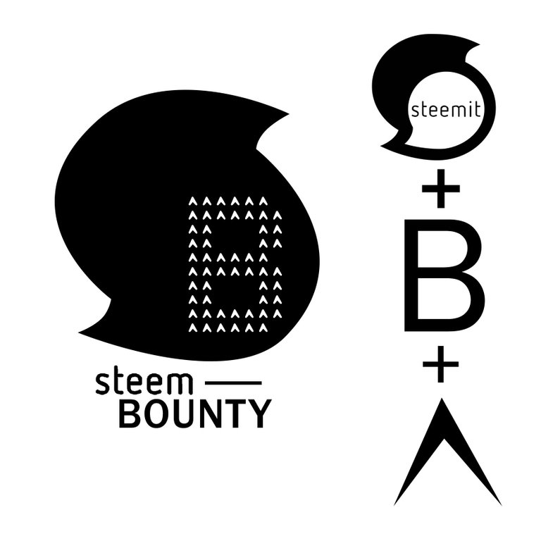
whit the next result:
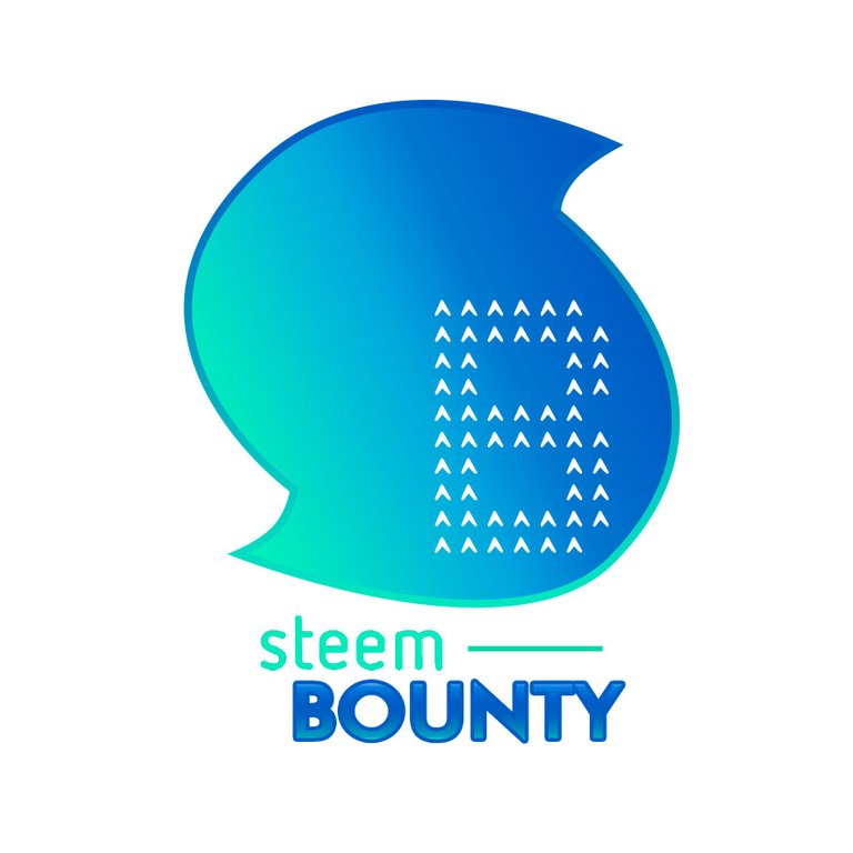
obviously, somebody noticed my mistake and then a new two idea came to help, the post stamp
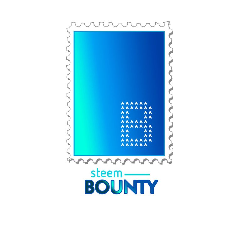
and the sphere
but originally, what people suggested me to do, was to take the steem logo shape and use it as base keeping the letter be in contrast, so I did it, and this is what we got
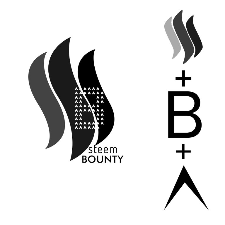
so technically we passed from here

to here:
I personally like it, I think blue is amazing for branding, is the colour of trust and confidence, is always fresh and everybody loves it, but the waves make me think on fire and I can't stop wondering how would be to try with a different scale of tonos, so let's see
I'll call it Steem-Bounty on fire :-D
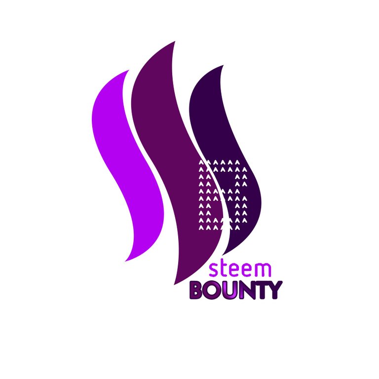
purple is not bad either, but gree is my favourite colour, so I had to try it
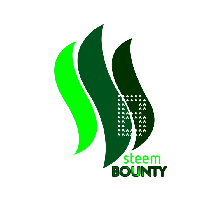
so that's the story with this design, the first suggestion, to conclude it here is the negative of the logo
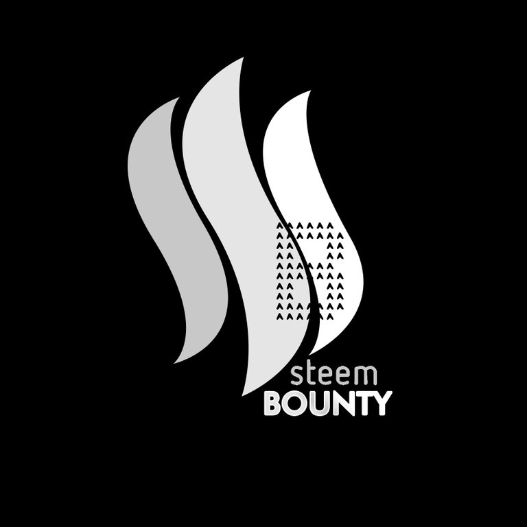
GREAT! Now, the second idea was inspired by coins, what limitate me a bit for picking colours
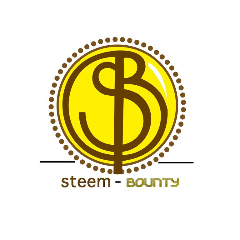
and the process
I can not make a coin red or purple, well I can (nothing is impossible in the world of design) but it would be maybe too weird, so in the black and white version, you can see how would look as a silver coin and in the original is the golden coin.
Continuing with round designs, I brought this another idea
based on Fibonacci principles
somehow reminds me of the joy we get when we write over sand with a stick, as you can see this is a one-stroke design where the letters S & B merge becoming one.
Considering different colour I tried with green
cherry
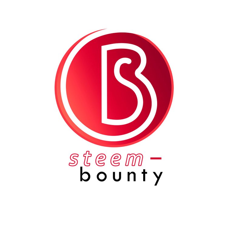
and indigo
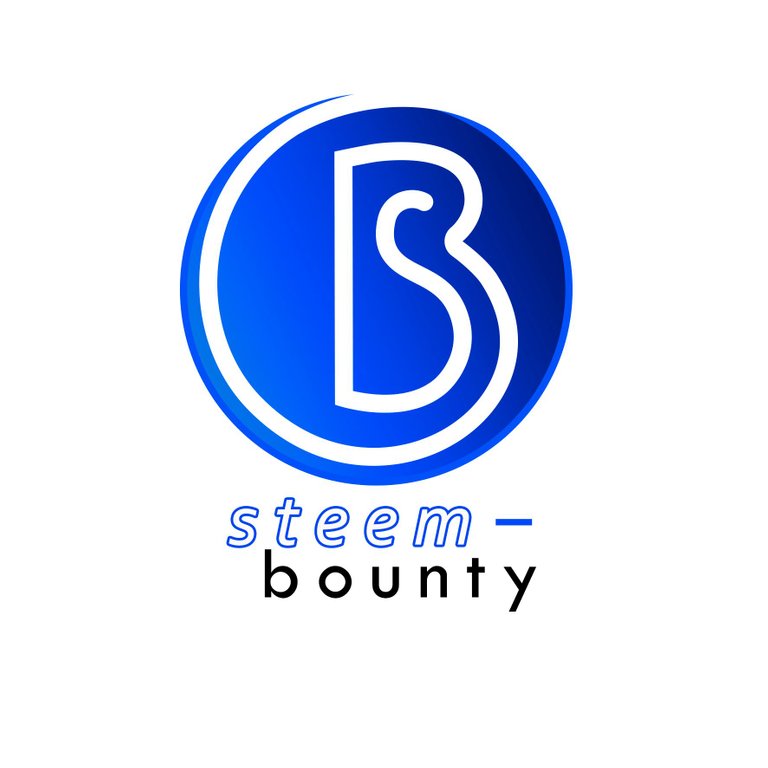
here the negative version of this logo
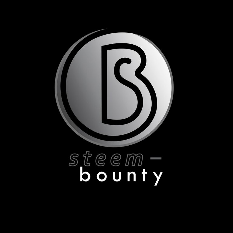
The last three options are not so elaborate, I apologize for it, but I am a little bit short of time, anyway, two of them are inspired by the upvoting icon
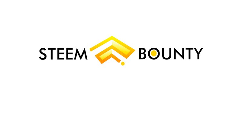
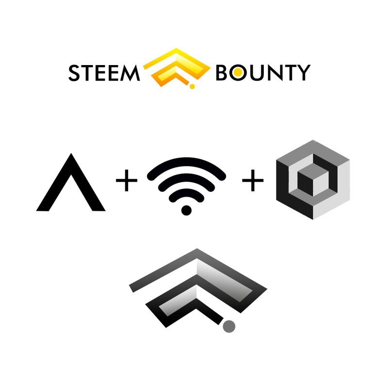
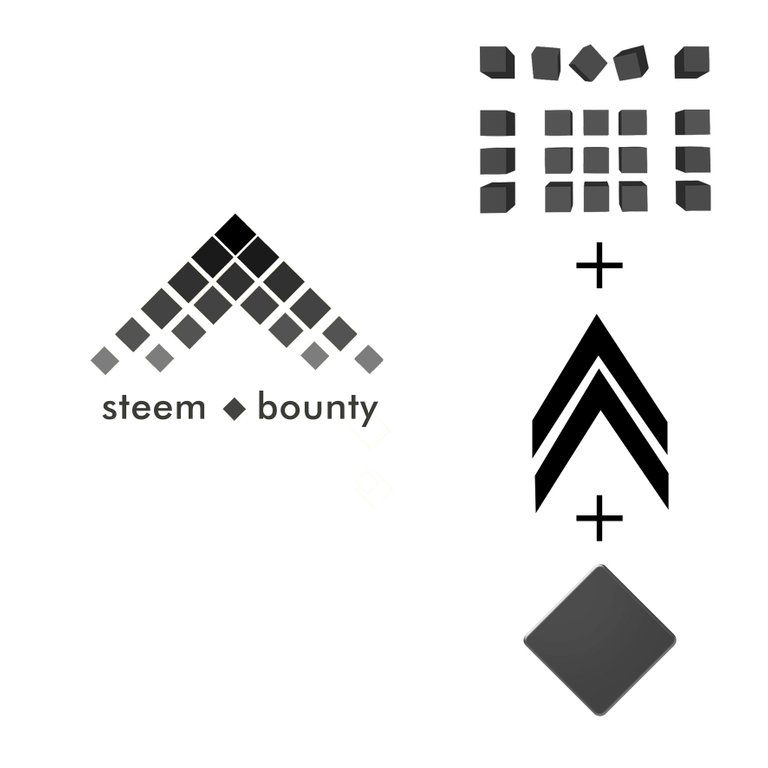
and also the blockchain structure, but, I presented as a group of boxes or cubes that are conected for invisible lines, it is more like a magnetic field that gets week on the edges, try to mix this elements forced me to twisted and realize that the diamond shape (from poker) was a good ingredient in the combination
I didn't explore more colours for these ones, somehow I believe they must be yellow
And finally, the last design is the poorest one acording to me, the idea is good, but it wasn't proper developed, I know I could do more, but there is no more time
I have no idea what my chances are for winning this contest, but I feel happy to participate, it was a lot of fun be able do what I love again, at least for a while, I am quite open to criticism an all kind of opinion, thank you for passing by, please don't forget upvote and follow.
See you soon
Hi, I just followed you :-)
Follow back and we can help each other succeed! @hatu