Welcome guys!
This is my 2nd and final part of design a logo from start to finish. If you guys were keeping up with my blog, a few days ago I released a few steemit logos. Those logos were based on this design, and now I'm going to go through the full process of how you can create this logo, and possibly be inspired to create your own works using the thought process and techniques I've used here.
Designing gets fun when you finally know what you're going to create.
If any of you guys that are following my content, and are new to designing. I hope that you will benefit from this guide. Creating this content was extremely fun, and took many hours to put together.
Important Note:
For this tutorial, you'll need a copy of Adobe Illustrator. You can get around with some vector editing programs though, like inkscape. Photoshop, sure. Just use shapes on your layers instead. But important note, this guide was written assuming you have illustrator.
CREATING THE LOGO
This is a continuation of my design breif and drafting tutorial and my how to draft a contract. If you were following along, you know what we're designing. If not.
Let's have a brief recap: We're designing a logomark for a company who has developed a technology that will revolutionize the way coding is done. It uses Tag based code like > and < to program.
So let’s get to it.
Open up illustrator.
Oh I saw what you did there. You opened up photoshop didn’t you? We’re making a logo, not photoshopping a pimple off. Come on now.
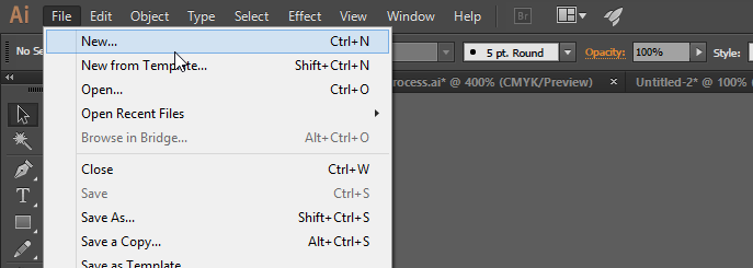
Create a new document under File > New..
If you really want to feel like a hipster, press ctrl+n, if you want to be an even bigger hipster, press cmd + n
Document settings should pop up now. You can name the document what ever you want. We want width and height of the artboard to be 500×500. This should be your default settings.
Hit OK.

Now is a good time to save. Ctrl + S will be your best friend. Every 5 or 10 minutes, save your file.
Get in the habit of this.
Alright. So we got a blank artboard now. If you don’t know what artboard is, it’s the canvas we’re working in now.
So first thing we’re going to do is prepare our shapes.
Look to the right side of illustrator, you should have a bunch of windows there by default.
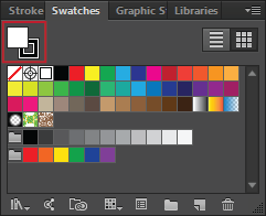
Look for swatches. If you can, ensure it’s visible by going to Window > Swatches
Once you do, click on the Stroke. That’s the small hollow box. If you’re wondering what that is, it’s the stroke. Any paths we create will have a stroke based on the color selected in this palette.
We then need to click on the white square with a red line going through it. This makes sure that no colors will be added to the stroke of our paths.
Now, click on the fill box, right above the stroke. That’s the box filled with a color, and right now, it should be filled with white. Choose a dark grey, or black.
The reason why we choose black is based on a old saying that I follow. “If it doesn’t look good in black and white, it won’t look good in color”. A design has to look good in black, then we may use color
The next thing we’re going to need is called the pathfinder panel. It’s not accessible immediately by default. So we’re going to have to bring it out. We can do this easily by going to Window > Pathfinder
Shift + Ctrl + F9 or Cmd + 9 will bring it up too.
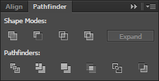
By default it should also come with the alignment panel. We’ll also need this.
Now, I’ll give you a simple explanation for what this is.
Unlike Photoshop, everything in Illustrator is vector based. That means, everything is based in math rather than pixels. We use the pathfinder to manipulate and control these the paths.
Now, look to the left of illustrator. Go ahead and grab the Rectangle Shape tool. Hitting M will bring it up.
Now click and drag while holding down shift to make a square shape. It doesn’t have to be huge, but big enough to work with.
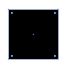
Now draw another smaller square. Use the swatch panel to change this square a grey. Now, make a selection using the selection tool. V will change your cursor to it.
Draw a selection around both of your squares.
Then, Click on the bigger rectangle. You should notice that the bigger square has a thicker blue selection around it.
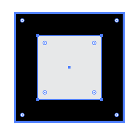
Click the Horizontal Align Center, and the horizontal align to center. This will align whatever objects you have selected to the object that’s highlighted in blue.

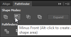
Awesome. We have the two shapes aligned. Now click the pathfinder tab. With the two shapes still selected.
Click on Minus front. That’s the small grey square on top of the white one.
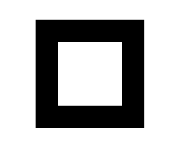
Now our rectangle should be hollow. That’s great, because we’re going to be using this for most of the composition.
We’re going to need a duplicate of this shape. You can copy and paste or **Click, then hold Alt to drag a copy of the shape out. **
Set this copy to the side for later.
Now, grab the line tool, or use \ to bring it up. Click on one corner of the square, and while holding shift, drag it down to the opposite side of the square.
Now we should have a path that divide our square diagonally. Make sure that it’s even and centered.
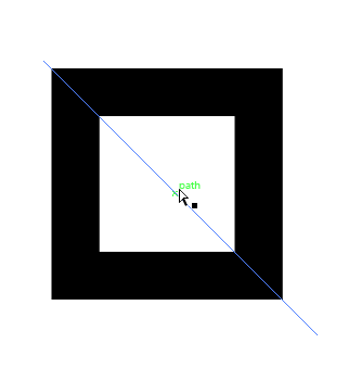
If you move your mouse off this line, it’ll seem like it’s invisible. That’s because it’s a path without a stroke. Don’t worry about this, just mouse over the center to find it again if you lose it.
Now, with our selection tool, let’s make a selection around all of the objects.
With the square selected and the line that goes through it selected, bring up your pathfinder panel again. This time, we’re going to Divide.
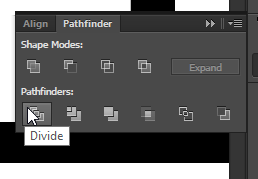
When we make a selection around groups of intersecting and overlaying paths, divide will break the shape up everywhere those shapes overlap and intersect.
What we should have now is a group of all the objects. When I say group, I mean that when you click anywhere on the square, the whole group of objects are selected.
We’ll need to ungroup everything to make it easier to work with these shapes.
Right click on the square while it’s selected, and click Ungroup.
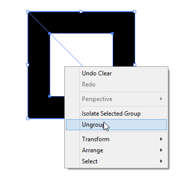
Now all the objects are ungrouped, and we can move them around with our selected tool.
Let’s get rid of the line path we made earlier, just to clean our canvas. We’re done with that guy.
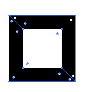
Now, let’s select both pieces with the selection tool, and move our cursor to the outside area of the box. Our cursor should turn into a rotation tool.

Let’s rotate the shape now, while holding shift. Our Square should now be a diamond.
Let’s go ahead and rotate the shapes so we have an X shape.
Make sure that the points are aligned together. This is going to be the main shape our logo is going to follow.
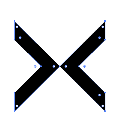
Now, let’s go ahead and grab the hollow square from before. This is going to be another main piece to our logo. Rotate box so it’s a diamond.
Now, we’re going to fit this square over the X we made.We need to make sure that the Edges of this X fit perfectly inside the box.
Grab a corner of the diamond, and fit it over our X while holding shift. Ensure that its on the front of the object by Right Click > Arrange > Send to front or Ctrl + Shift +]
The desired result is this.
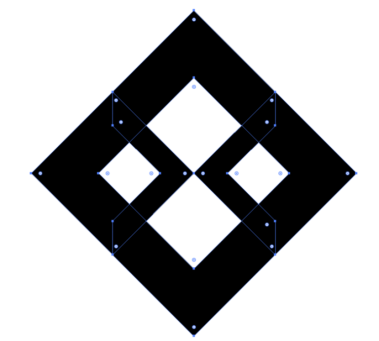
If you’ve gotten this far. I want to congratulate you, you’ve gotten passed the most difficult part of this design.
Remember to take a break. Stretch out your legs, stretch your arms out. Try to do this every hour for at least 2-5 minutes. Keep yourself refreshed. When you’re done with that, come on back buddy, we’ll finish this up.
Welcome back.
Let’s continue.
Let’s now color the X grey, so we can make sure it pops out to us when we make sure everything is looking alright.
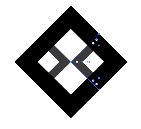
Now, it’s time to make the small sections that surround the corners of the diamond.
Let’s draw a single rectangle. Make sure it’s thick. Hah, that's what she said!

Now copy this rectangle. Duplicate it using Alt+Click and drag. Now rotate it so that its down.

Now line them up together. Like so. These will fit our corners.
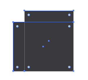
Now, let’s group these two shapes together to make sure that they’ll be easier to work with when we put them together. Ctrl + G will do this too.
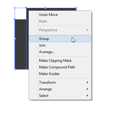
With that taken care of, we can now start fit the cross sections to the main logo.
We want to rotate this group of rectangles in this angle. And notice how this hangs down past the top of our diamond. We’re lining up the inside edge with the outside edge of diamond.
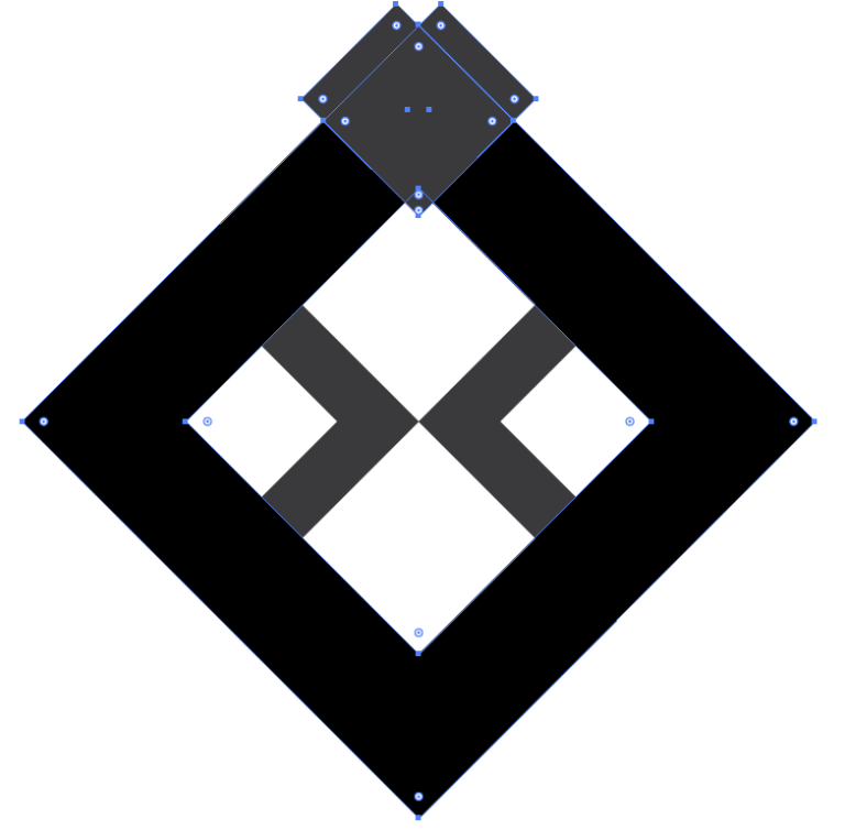
Here’s a closer view of what I’m talking about.
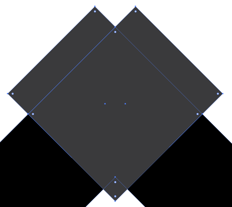
We’re looking for uniform alignment. All the blue lines need to match up. Makes sure you take note of that.
Copy the this shape and do the same for each of the edges of our diamond.
Here’s what you should have now.

Looks familiar now right? Not bad man. Not bad at all. However, we’re not done just yet, and a really challenging part is coming up.
We need to finish up the centerpiece of the logo.
Now there’s no easy way to do this, so I’ll show you a picture. I made a square, and sized it in a way, that the space between all the inner parts of the logo are equal width. The square will appear in front of everything. We need to move it to the back of all the objects.
Right Click > Arrange > Send to Backward or Ctrl + Shift +[
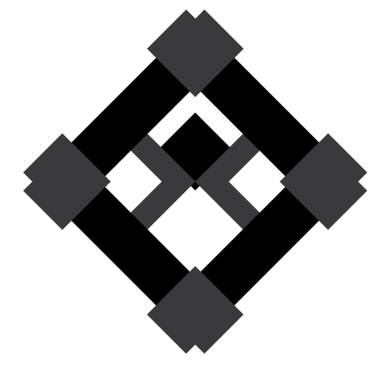
Notice the black square in the diamond, it’s offset just slightly, so that the width of is uniform. We’re going to make duplicate of this square and move it so the bottom of the diamond is uniform in spacing.
Line up the second square like this.
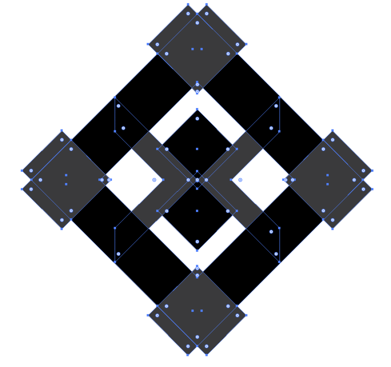
Now, we need to check the consistency of the shape. We need to make sure that everything is aligned perfectly. A very excellent way of doing this is by viewing our logo in Outline mode.
Navigate the menu to View > Outline. Or Ctrl + Y.
We should see everything in black lines. Use When you click on a line, the corresponding shape will be selected and you’ll be able to move it.
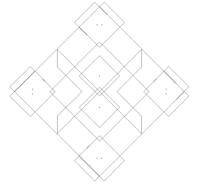
Everything is aligned pretty well. This is what you should always strive for in all of your compositions. Alignment, and uniformity.
If you made it this far, I’d love to shake your hand and congratulate you. You are absolutely capable of being a graphics designer.
At this point, it’s all about the colors.
To return back to normal view. Navigate the menu View > Preview CPU
Welcome back.
By now, you should be comfortable enough to know how to change the colors of all the objects.
For colors, I used 82ad9a for the green and c7c7a8 for the beige.
Feel free to use whatever color scheme you’d like to use.
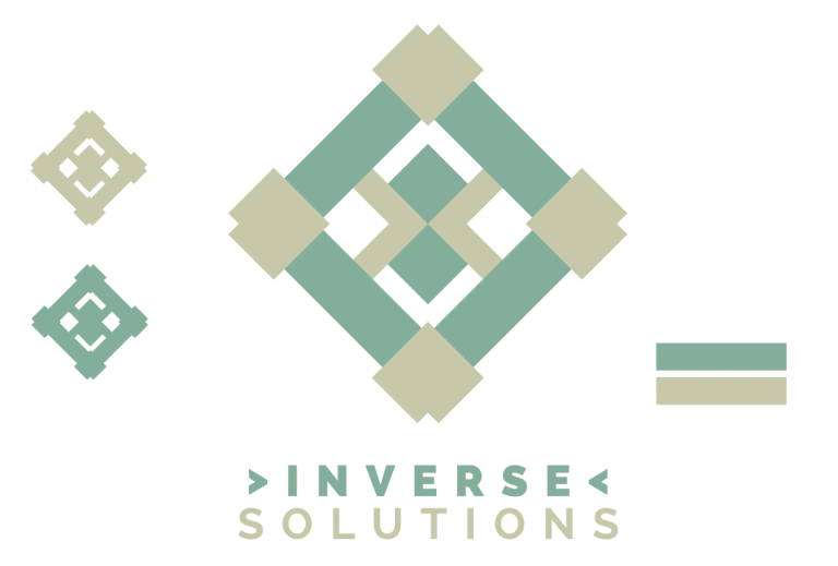
CONCLUDING OUR DESIGN PROJECT
At this point, the project is completed. And we’re ready to do final steps to our. Mr.Chris is extremely happy what we came up with, and is eager to continue with his plans. He requests a few sizes of the project in images. Of course, we’ll also need to provide the source file for this logo.
Navigate the menu File > Save As
Name your document, save it as an .ai
To make images in illustrator, all you have to do is resize your image so it fits the art board.
Navigate menu, File> Export
Pick the name, and select the format you’d like. .Pngs are a really good select. 300ppi
With that, Chris sends the remaining amount of payment, and we send the files to him.
CONCLUSION
Wow, I can’t believe we made it this far. And let me tell you, it’s been a very long time writing this. If you’re reading this, I’d like to extend a big thank you for reading my content.
We’ve tackled a design project, under perfect situation circumstances. We went over what to do when things are not perfect. We got to know our Client, established a healthy business relationship with him. We drafted a contract. Defined terms, and learned what is most important and why it’s important we use contracts.
We created a design brief based on questions we asked our client. We created a brainmap chart on our ideas and how we would tackle each aspect of the design. We drafted multiple logos. And designed one.
If this is something you want to do for a living, I’ll give you a warning now. It’ll be hard. It’s going to be rough. Being a freelance designer means that most of the work will be psychological. Dealing with clients.
But it’s possible. You can do this. Whenever you deal with outlandish circumstances, soul crushing deadlines, difficult and idiotic clients. You have to pick up your head, and present yourself like a true professional.
So good luck. Good luck to you, I wish you the very best from the bottom of my heart. Keep at it, look at some books, take that class. Look at some videos. Read some of my other articles.
Now guys, I'm always on about how thankful I am that steemit has embraced me so strongly. I really do mean that. Without steemit my content would have never reached the light of day. I want to really thank you guys for keeping me going, and encouraging me to keep putting up content.
If you guys love what I'm doing, bringing meaningful guides to the steemit platform, please show me some support. Check out my other content I have a lot of content just like this and plenty of big contributions available for download.
I appreciate the detailed instructions and information. How much does illustrator cost?
Adobe Illustrator seems to be cool for logo design!
Yes it is fantastic and easy to use IMO
This is a very detailed explanation, I enjoyed the journey! Although I'm more a photoshop user only
Thanks! Photoshop to me, is one half of a mirror. I use it to make crazy stuff, bring different things together, but not for my logo designs. I find that for the logo designs, having them done as a vector is sort of a standard, and it's easier to work with for me. Appreciate you!
Great work, very nice designs
After a few of disastrous misadventures this totally became my habit too :) But on the side note - there are a lot of solutions for autosaving in AI.
Like for example Astute's Autosaviour plugin (it's free) -
https://astutegraphics.com/software/autosaviourfree/
This is great @malicered. Saving this for future use. Thanks! :D
It's great to see some detailed and interesting design content here. Have you tried Figma yet @malicred? Their vector system is different than illustrator and took a bit of getting used to, but I absolutely love it now!! Maybe I'll have to do a post on it :P
Great info post :)