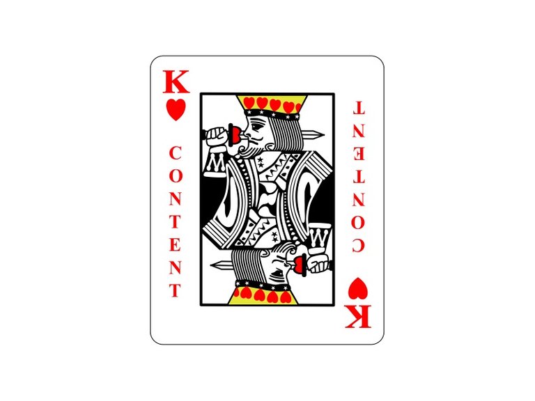
You have probably heard the old adage that content is king, well today's design is a visualization of that adage.
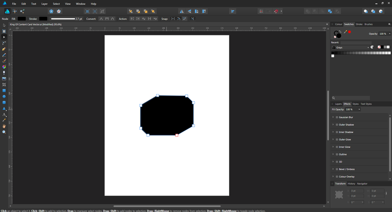
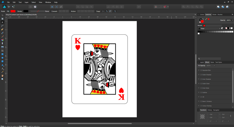
The first step in this design was to draw the shape of the King's body, which needs to be horizontally symmetrical since the bottom of a traditional playing card is a mirror image of the top.
From a design perspective this also worked in my favor, since once the top of the card is drawn, I can just copy and reflect it to create the bottom portion of the design, nice!
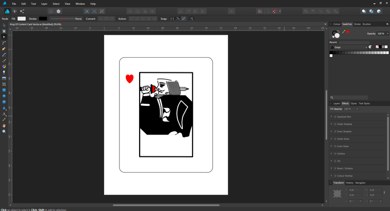
Next I drew the King's facial details and sword-wielding arm. Since my design is going to be the King of Hearts, I used a heart shape to form the hilt of the King's sword.
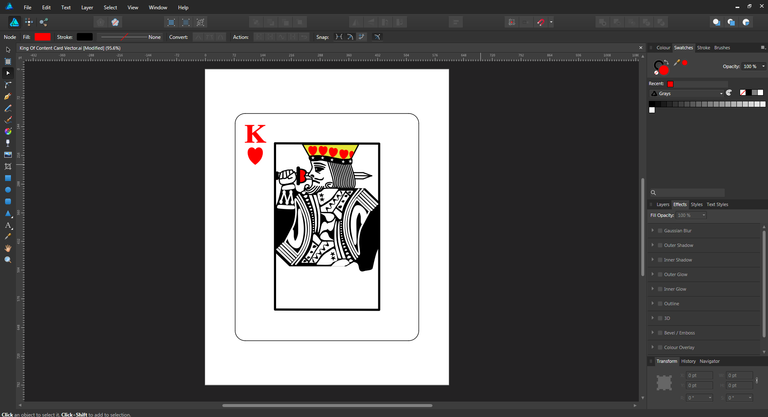
After the King's crown is added, I applied some detail to the robes, again making sure that the center line of the design was respected to maintain horizontal symmetry.
Finally the top portion of the design was reflected horizontally to create the bottom portion of the design. Hope you like it!
If you have any suggestions for what I should draw next, please let me know in the comments below!