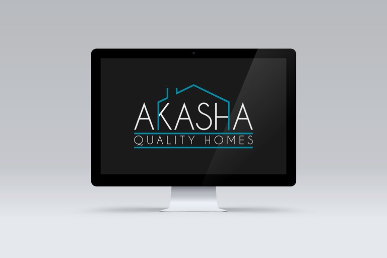
Here is my logo entry for @athome's logo design contest. The contest challenges designers to create a simple modern and minimalistic logo design for a new construction company.
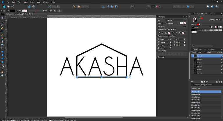
This logo was created in vector format using Affinity Designer. I decided to create a house outline utilizing the parrallel edges of the letters "K" and "H":
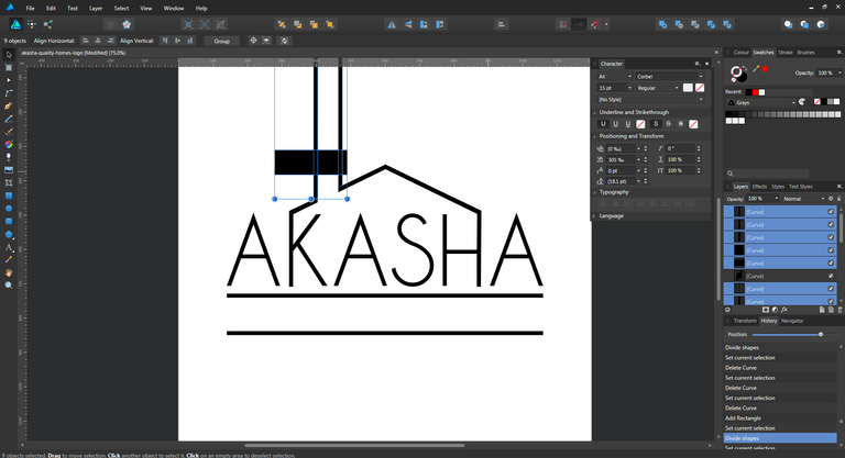
Next I added a chimney outline to the roof and merged the shapes to create a continual path on both sides of the building.
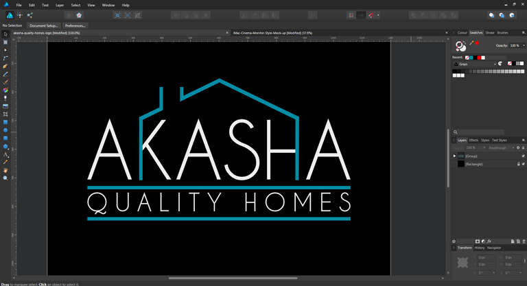
Next I added colored fills and the tagline text to finish the logo off, before placing the logo over an optional contrasting background to make the design pop.
Logo Files
Download .afdesign file
Download .eps file
Download .pdf file
Download .psd file
Download .svg file
haha nice! very creative! :D
Thanks @leslierevales, glad you like it :)
yes indeed :) you're always welcome :)