Let's get some work done
So, earlier this week @GuiltyParties asked me if I could do some design-work for @Tibfox and @Hivecreators for the Hive Meetup communities that are going to be merged. When talking to Tibfox, I can see he is very passionate about Hive and just a humble guy in general. When GP told me he has given a green light to Tibfox to put me to work, I wanted to make something 'nice' and more of this time for the Meetup communities as I honestly think that it has a lot of potential to onboard people who are curious what the meetup is all about.
Brainstorm session
At first, I had to gather some information about why and how they needed me, so I could index what needs to be done. So a logo and a banner was something that needed to be done for sure, so I started combining colors and making up colors that I thought would look great and invoke a bit of curiosity, raises interest, and just has a playful look and feel. After all, Meetups are fun and interesting, and people who are curious about meeting other people should definitely attend one.
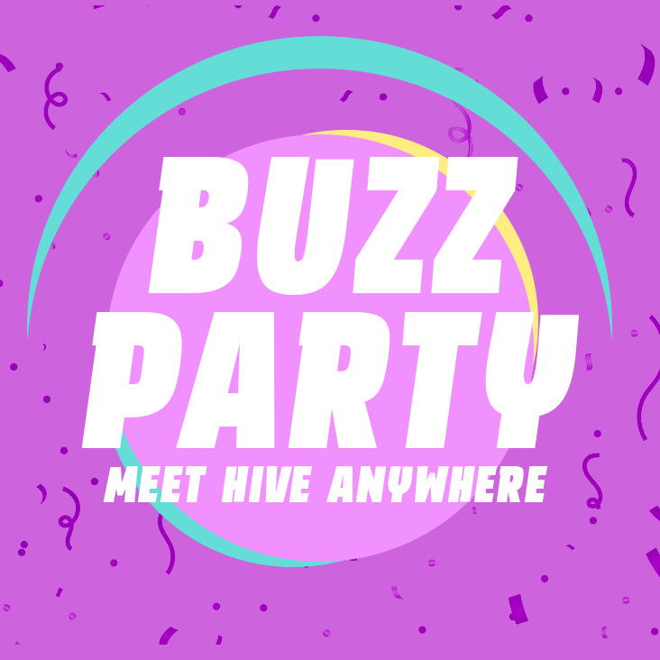
So, after sketching and making a first-round design of the logo, Tibfox had to let it sink in, but in the end he loved it, just a few more tweaks and we were smooth sailing. The only thing that had me bugged was the name "HiveUp" and how it could correlate with Meetups. So, we did a small brainstorm session together to come up with a better name that would bring the life to the... party! Somehow, I really like the word "Buzz" when it comes down to thinking about people gathering around, and having some fun. When you think about it, these people gathering should make quite some buzz, so here's what we came up with: Buzz Party - Meet Hive Anywhere.

Color Pallette

Designs
Logo

Logo Thumb

Banner

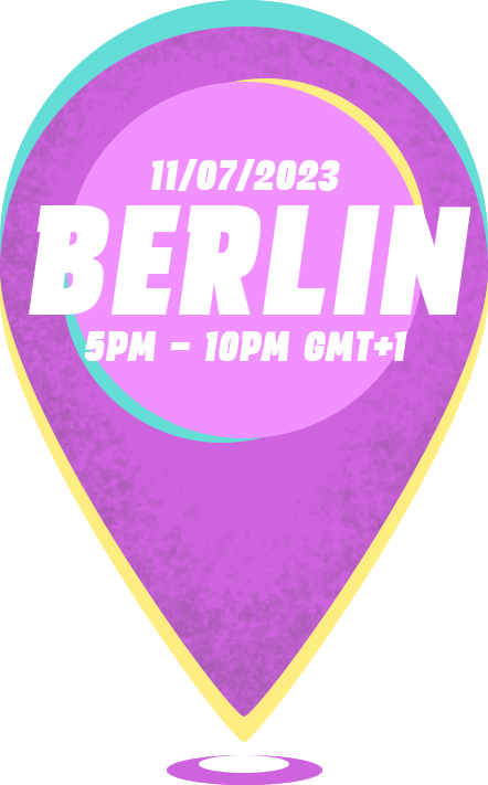
Pin (sample)

Web design idea
@Enrique89 has asked me if I could come up with an idea that would serve as an improvement for the current website. I will work on that tomorrow, or after the weekend. But I do have something in my mind that would hopefully look like something people wanna use outside of Hive as well. I should really get back into Front-end development as well, but for now, I don't have the time to get fully back into ReactJS.
So, with that in mind, I will be making more assets that could go well with the website and the introduction/merge post that I will share when done.
Cheers,
Ruben
Thank you for such an incredible collab brother! I am looking forward to all the buzz parties we are going to support with this project :)
Anytime man, love working with you Tib! Same! Let's bring in some spice 😎
Brother, I need some ReactJs lol. Please do get back into it. Honestly though, the colors look good. I like "Buzz Party" as well. +1
Thanks man! Yeah, I should check it out again when I have a bit more time to focus on it.
Great designs, man! Looks like you did a better job than Twitter's new logo. I'm confident you'll do a great job with the website too. Good luck!
Haha, thanks Incublus! Yeah, wtf happened there? Promotion for Space-X?
Yeah I think they are preparing something like that 😂 Some Elon shit
I love the colour tone and the pin, for obvious reasons 😊
However Buzz Party makes me think of Dbuzz immediately....
There are many things that make big buzz here on Hive - in microblogging dbuzz form, with hivebuzz badges or now with big buzz parties :D
😎 tyty!
Yeah, Hive, bees, gathering, a lot of buzz, and it's fun and exciting; which makes it a party, and voila: Buzz Party / Buzz Parties
Mi amigo tus prototipos de logo todos están muy originales sencillos pero originales, estás contratado
¡Muchas gracias amigo! Te agradezco que le eches un vistazo y me digas que te gusta. (Google Translate)
The new logo and banner for the Hive Meetup communities look great! I love the playful colors and the overall vibe. The name "Buzz Party" is also very fitting, and it definitely makes me want to attend a meetup.
We missed this one 🫣 Like always Ruben, fantastic work and great color choices. Very eye catching design. Overall it gives a very possive and happy vibes.