You can afford "secondary" ads placements if you have enough traffic. But as traffic goes down, you will probably wants to improve ads revenue by better placement. But often, best ad placement does not rhyme with good looking website...
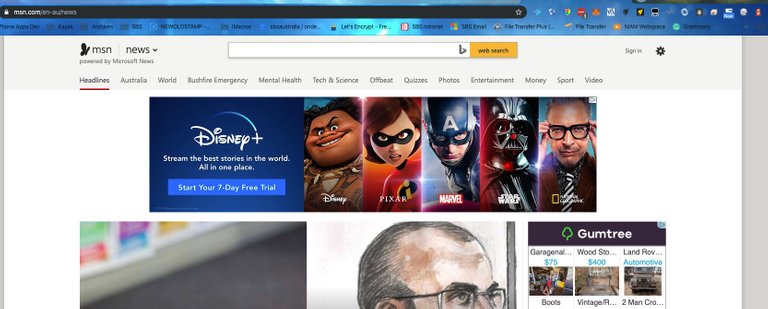
But also don't like a banner at the topmost. I rather have one right after the website's header like here:

Yeah below the header is a huge improvement. It's still ugly. But, nowhere near as bad and at least tolerable. The ads are just going to keep pushing people away from Steemit to other front-ends at the end of the day though. Unless they do a better job at integrating them into the design.