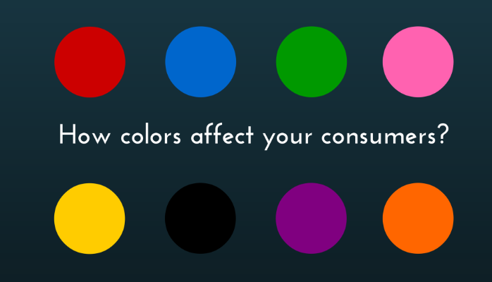
Thinking about designing your website, making a banner, newsletter or some other promotional / call to action material? It doesn't matter which color you like, or which color you find soothing, it is about which color will make an impression on the audience you are addressing to and what are you trying to achieve. So think wisely about it, or consult with us.
Every market is different. Colors that are used in India, or Europe will not work and affect the same way consumers in North America. It is the matter of perception, lifestyle, and economic opportunities.

In this article we’ll be focusing on the most popular colours that affect consumers.
YELLOW – According to psychology, yellow is the colour of jealousy. But when it comes to selling or promotion, yellow reflects optimism, youth and often attracts attention to window shoppers.
RED – Colour of joy and passion, also colour of emergency. For example, ER and Hospitals are often using red colour on their vehicles, first aid kits and when they want to point out something dangerous. But if you have something to sell and you want to offer SALE or Discount, red is the right colour for you because it stands for energy, creates the feeling that is something urgent and in demand. We encounter red often in clearance sales.
BLUE – Trustworthy. This colour stands for Security and trust. Big corporations, banks and businesses are using this colour to attract consumers and create a feeling of trust and seriousness.
PURPLE – Soothing and calming. Purple is often considered to be female colour, but for consumers and shoppers it creates calmness and sometimes relates to health because most cosmetic brands are using this colour to promote beauty and anti-ageing products.
PINK – Barbie effect. This colour applies to women and romance. Often seen as feminine and gentle, that is why most products for young girls and women are labeled with this colour.
ORANGE – Aggressiveness. The most appealing colour that awakens call to action and making immediate decisions. Often used in newsletters through buttons like SUBSCRIBE, BUY or SELL
GREEN – Nature and organic. Green colour connects with nature and organic products. That is why this colour is mostly used to promote Healthy lifestyle products, nature, active tourism. Also green associates with wealth and is the colour that is easy for the eyes to process and affects the consumer in a relaxing way.
BLACK – Mystery and power. Black stands for elegant and sleek. If you have a luxurious product that is high in price, then the black is the right colour for you to use to market the product to convey its beauty, quality, usefulness, necessity over a high price.
Colours can affect your buyers and differentiate them if used properly. Right combination of colours is the best way in marketing certain product or creating a call to action.
If you are uncertain which colour to use, and which colour combination to create on your website, marketing material or promotion, I will be more than happy to assist.
Just get back to me by email [email protected]
Nice post.
Follow me at @alexKARKI