No matter what kind of content you generate in Steemit, you should support your written content with relevant images.
Using relevant images will make your content easier to digest, more beneficial for the readers and this will help you get more upvotes!
If you’d like to enrich your content with supporting banners; however, you lack design skills just like me; you can benefit from several tools. Probably you already tried some tools and got some (good or bad) results. I would like to share my experience and the tools I tested.
Step 1 - Find a high quality image related to your content
There are several websites that you can download high resolution images for free. I use these websites: Pixabay , Stocksnap , Negativespace , Gratisography , Unsplash . You can find a beautiful picture related to your blog post from one of these websites.

We’ll start designing the banner with this image
Step 2 - Think of a text and CTA for your banner
Your banner should give a message to the reader. Text or CTA (call to action) is not a must have, sometimes the image itself give idea about your content. But sometime you should include text in order to highlight the idea.
Also, if you’d like reader to take some action, reader should know this. What do you expect from your audience? Downloading your ebook? Registering to your webinar? Subscribing to your email list? Ordering a product? Visit another post in your blog? You should emphasize this expectation with a clear, strong sentence. Ideally on a button with clearly visible color (Red, Green, Blue colors used often). These buttons are called “Call to actions” (CTA). Call to actions generally asks you to “Try Now!”, “Download Now!”, “Buy Now!” etc.
Step 3 - Start designing
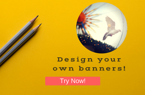
I tried several tools for designing banners; such as, Pablo , Adobe Spark , Pixlr , Canva . I liked Canva most among these. I've created the banner below with Canva. I've added these elements:
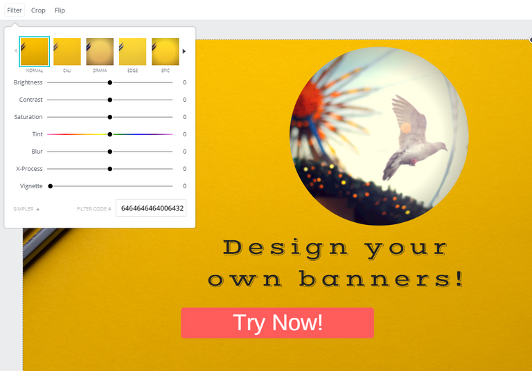
Filter
CTA
Text
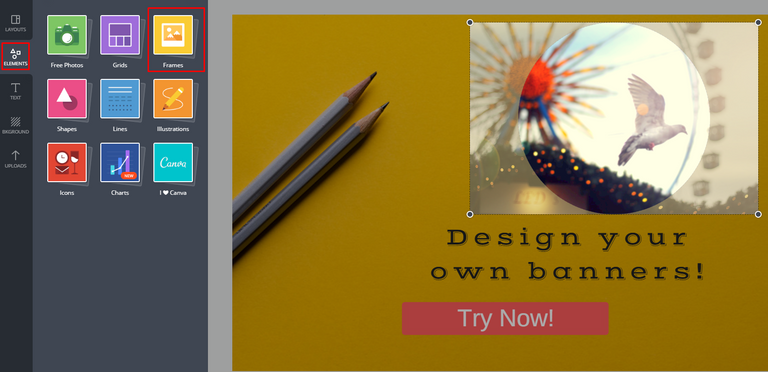
Frame

On the filter section you can find not only various filter options but also you can play with the colors and resolution.

CTA is simple, all you need to do is to drag and drop a rectangle shape, give a color, enter a text.

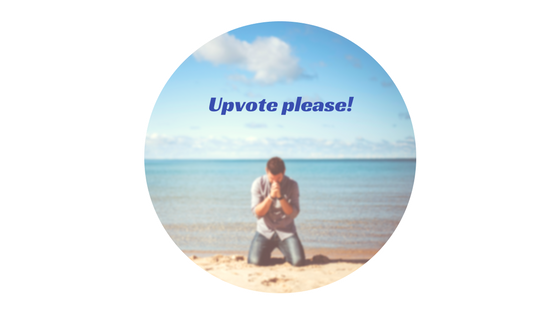
The frame I used in the example is not relevant to the banner but I just wanted to demonstrate the feature. You can use various frame options in your banners. Below banner was also prepared with a Canva Frame :)
You can see nice examples of Canva made banners on @vovidi

Nice post
Follow me and Check out my post here
thanks :)
Your Post Has Been Featured on @Resteemable!
Feature any Steemit post using resteemit.com!
How It Works:
1. Take Any Steemit URL
2. Erase
https://3. Type
reGet Featured Instantly � Featured Posts are voted every 2.4hrs
Join the Curation Team Here | Vote Resteemable for Witness