
Divi is a WordPress Theme created by Elegant Themes (ET) that comes packed with features that help businesses streamline their website workflows and effortlessly produce vibrant and engaging websites.
By using a few of the techniques I’ve outlined below, you can empower your staff or Marketing department to regularly deliver stunning content through your website.
My focus these days has been to bridge the gap between my client’s daily business operations and the website tools I weave together for them.
One of the biggest problems that presents itself after launching a new website is that the stakeholder tasked with maintaining the website is neither a marketing expert nor a website expert. So he/she has to learn how to use the website software (e.g., WordPress) and then learn how to create or edit content.
If you’ve been using WordPress for a while, you know just how clunky it can be and it requires flipping back and forth between the editor view and the live view. And that doesn’t even touch on the issue of producing high-quality content to put into the website.
The gap between business operations and maintaining a website has remained problematic for a number of reasons:
- Website technologies remained arcane and lacked modern software features
- Small and mid-sized businesses lacked the skillsets to properly use website technologies
- Marketing specialists tend to use a different set of technologies apart from their client’s website.
The consequence is obvious, businesses with sufficient resources hire web agencies to manage their website and they hire marketing agencies to design, schedule, and publish their marketing campaigns. Businesses without the financial capacity to outsource these services typically pay for a generic website and attempt to handle their marketing by using a mishmash of DIY marketing tactics.
I’ve been in that cycle and it feels super depressing and overwhelming because you know you need to do better for your business to succeed and you really don’t have a clear vision of what will actually work. If you’re looking for a little inspiration, check out this post by Kim Moutsos at the Content Marketing Institute.
On top of that, web development as an industry has a ton of baggage that can overshadow newer, more innovative technologies and strategies that are designed better and thus, more effective. By that I mean, every developer and agency has had to create their particular flavor of web development; which programming language, which database vendor, which design patterns, which software applications, which frameworks, which JavaScript libraries, and on and on.
By the time a client steps into the agency, hundreds of decisions have been finalized and turned into best-practices for that agency so that the managers, designers, and developers can consistently and reliably produce websites of a certain quality, on time and on budget. Because of this, businesses are sometimes unwittingly agreeing to take on a new workflow without fully understanding the consequences.
A good example is the “Newsletter Signup” form that most websites use on the Home page or a Sidebar. Almost without question, this feature is added because it can significantly increase conversion rates (if done correctly) and businesses are told they need it.
What these SMBs aren’t told is what to do with the Email addresses they collect or how to write super valuable newsletters. That’s up to them to figure out.
It turns out, not many SMBs have a strategy to regularly produce content and publish full-blown newsletters. On the flipside, modern Internet users won’t consume the kind of bland, text-heavy content found in most newsletters unless they are extremely motivated and committed to doing so.
The point I’m making here is that when a business identifies the need to build a website, they often don’t have the budget necessary to properly research and strategize every decision, so they say ‘Yes’ to whatever suggestions the agency comes up with.
In the case of the Newsletter Signup form, that business has just unknowingly agreed to implement a rudimentary marketing funnel that collects Email addresses (that sit idle in a List somewhere) in exchange for content that no one is writing. In that situation, the business fails to plan for their newfangled newsletter workflow, which results in warm prospects quickly turning cold.
And that’s part of the problem that entrenches the gap, businesses don’t invest into formalizing and documenting workflows to take advantage of their website software or how to produce content that goes into the website.
The good news is that modern website platforms are finally evolving to the point of providing features we’ve come to expect from office productivity software. If you use WordPress, adopting Divi can help your business more deeply integrate WordPress into your daily operations.
Divi Website Builder
I started using Divi in 2015 for all my clients’ websites and I haven’t looked back. I’ve tried a lot of WordPress Themes over the years and quite a few are really well-built and packed with great features that make it easy to build great looking web pages. However, what really sucked me into the Divi universe was the amazing customer support.
ET also recently launched a documentation portal with in-depth tutorials on every aspect of the theme from installation, to Module customization, to A/B split testing, and much more. On top of that, they also regularly publish video tutorials on YouTube that are exceptional in their creativity and depth.
In an attempt to keep track of the rapidly evolving Divi universe, I created a mind map of everything I’ve come across, although so much content is being released I’ve fallen behind keeping it fully up-to-date. You can interact with my Divi mind map here.
From the day I became a member, I had access to a community of passionate and smart developers who would either solve my problem outright or escalate the problem and get it resolved as quickly as possible. For SMBs that don’t have a dedicated website developer on staff the level of support that ET provides is like having a developer on-call.
Another huge reason to use Divi is that it is constantly being updated and improved. Since I started using Divi, there have literally been thousands of improvements made to the core and more are constantly being rolled out. Furthermore, ET recently announced that they would begin releasing ready-made templates that are free to use, which brings Divi up to speed with other website service providers (e.g., Squarespace or Weebly) that already provide dozens of gorgeous, mobile-ready templates.
Divi Structures Your Content Into Smaller, More Manageable Chunks
What I really wanted to touch on in this post are some key features under the hood that dramatically improve your ability to write or edit content for your website - to help you understand a better way of working with your website content.
The starting point for this discussion is the WordPress editor and the fact it really kinda sucks. In part, due to its limited functionality and, in part, due to the fact you can’t see what the finished content looks like live.
As you can see in Figure 1, there is a mess of content and shortcodes embedded together and it's impossible to tell what the result looks like without saving the Page and viewing the live version. For businesses attempting to regularly update their website, trying to teach an employee to take responsibility for the mess below is uninspiring in the least and problematic in the worst.
It takes considerable focus and attention to scan your way through the content in the WordPress editor and for long Pages, the process can be frustrating.
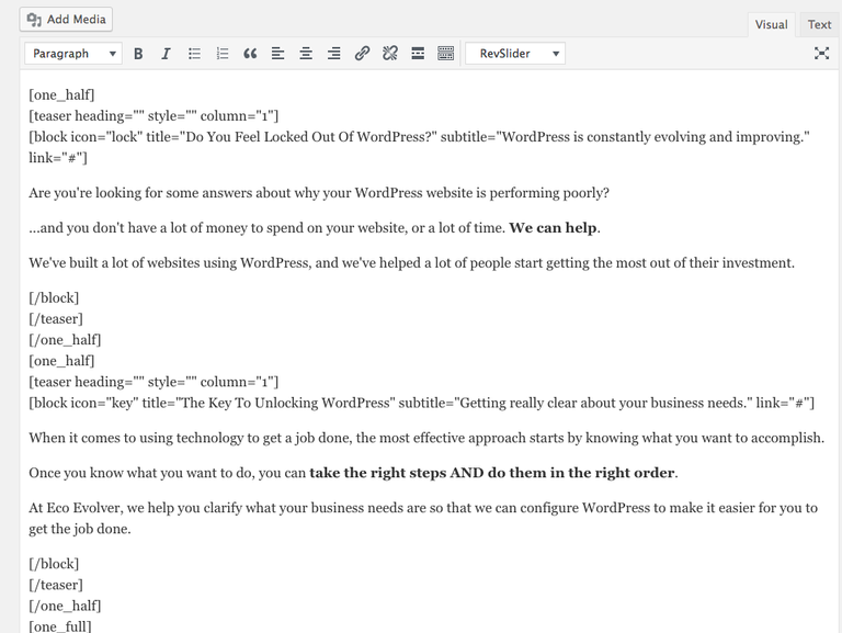
Figure 1. WordPress editor with both content and shortcodes.
If you want to change small portions of text, you have to scroll through all the content looking for the pieces you want to change while ignoring shortcodes and other objects. It’s no wonder SMBs have struggled to fully take advantage of WordPress.
Another thing to note is that the content conveys no visual signals regarding the purpose or function of the content. The marketing specific content is mixed with product and service information and contact information and so forth. It isn’t entirely clear what is what so you have to read it on the live view to make sense of it and flip back and forth while making changes. It’s just blech.
The first improvement that Divi can bring to your content workflow is to hide the programming code behind easy to use, drag and drop Modules. (See Figure 2).
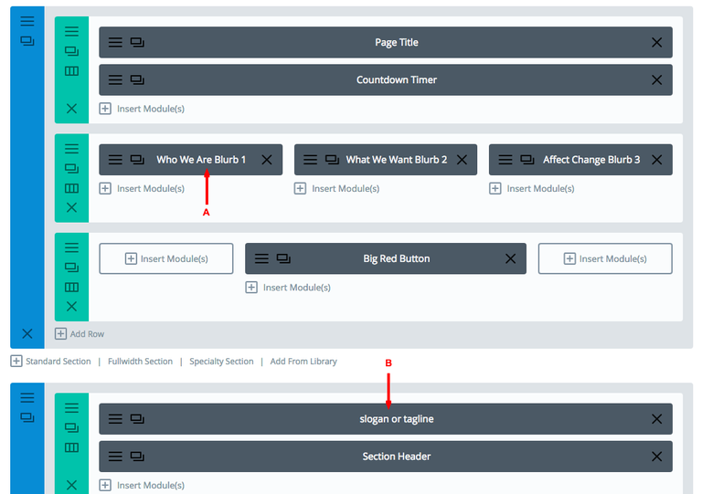
Figure 2. Divi Page Builder with Modules meaningfully labeled.
As you can see, the first thing you notice is that all the gobbledygook is gone and in its place are discrete units of content with meaningful names that anyone can understand. For an employee with little training, he/she can easily be tasked with editing your “Who We Are” blurb on the homepage (A) or updating your company's tagline (B).
Once your Divi website is built, you can easily print off pages from the Divi Page Builder and create an easy to follow instruction manual with all your content neatly organized and labeled for later reference. It is also a good idea to identify which content Modules or Layouts are stored in the Divi Library because library items are ideal for global information, branding messages, Call-to-Actions and are not typically accessible to Editors and Authors due to the sensitivity of those pieces.
A number of my clients have already remarked how easy it is to update their website and appreciate the look and feel that Divi provides.
Now, that hasn’t addressed the issue of not seeing the live result, however, the Divi Builder mode is just that, the builder mode, which is designed to make it easier to build the Page.
Divi also provides a Visual Builder mode which is a front-end view of the Page with mouse-sensitive controls and the ability to edit content directly on the Page. (See Figure 3). In the Visual Builder mode, you see EXACTLY what the final result looks like and you still have access to all the tools and options you would in the Page Builder mode.
Switching between the two modes is as simple as clicking a button and I’ve found that some people prefer the Page Builder and some prefer the Visual Builder, it really depends on the nature of the task.
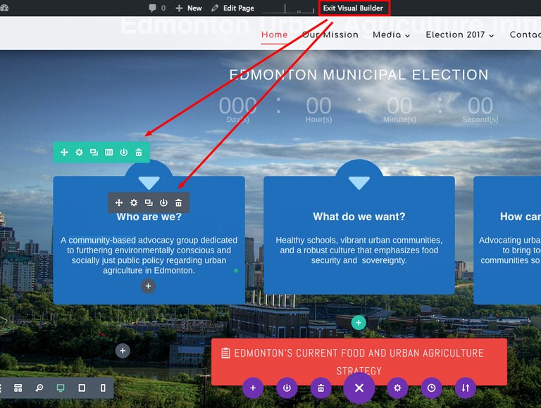
Figure 3. Visual Builder mode of the same Page as Figure 2.
Adopting Divi as your WordPress Theme also means that you’re adopting ET’s methodology of structuring Pages and Posts into discrete content objects called Modules, Rows, and Sections. For me, this structure has really helped my thinking around crafting content that comes alive on the page, a task which requires more clarity and precision in identifying the goal for a particular piece of content.
This is extremely helpful for businesses because it gets them to distill, refine, and hone their content into smaller, more consumable, more memorable chunks. A significant improvement over long, rambling text that very few people ever read.
Every word you use matters, every second of your visitors’ time is precious, so the way you begin to stand out is to create authentic and relevant content that engages (e.g., by using good design or animation) and encourages specific behaviors (e.g., through the use of a Call-to-Action).
Once you have built a particular piece of content (e.g., the Big Red Button), you can easily save that Module to the Divi Library and then reuse it over and over with the click of your mouse.
To take it one step further, Divi allows you to create Global Modules that are synchronized* across the entire website and immediately reflect changes you’ve made to them, regardless of where they are located. (see Figure 4).
*Note. Global Modules allow you to determine which settings are Global and which are Local. This precision allows you to add Global Modules that can take on page-specific settings like titles or content, but everything else is specified globally. When combined with properly configured and assigned User Roles (discussed below), first-time users will easily be able to start working on the website.
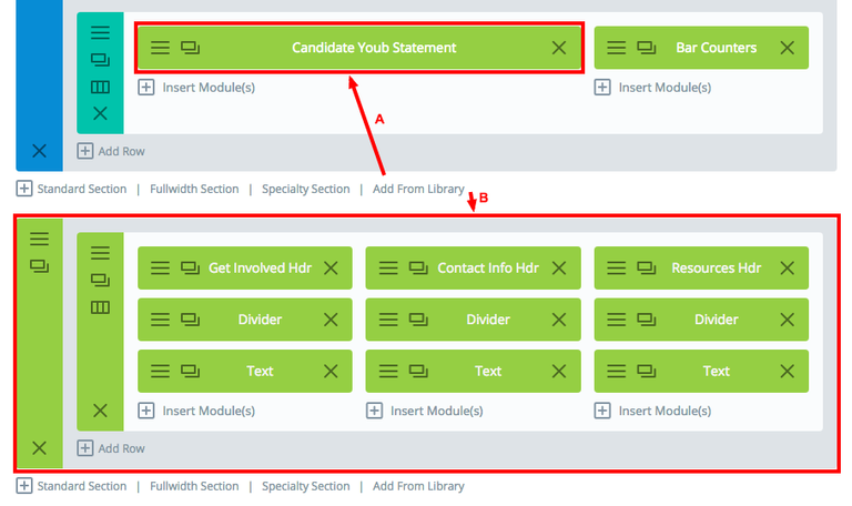
Figure 4. Global Modules (A) and Sections (B). These Global items can be added to any Page or Post, and are perfect for elements that are repeated across Pages like contact information or galleries.
Streamline the Workflow With Divi User Roles
One of the easiest ways to streamline your website workflow is to use the Divi Role Editor to Enable/Disable various Divi features for each WordPress User Role. By disabling non-essential features for Editors and Authors, you dramatically simplify the User Interface and reduce the number of decisions that they need to make.
In addition to improved usability, by limiting access to certain capabilities, you eliminate the possibility of accidental changes or deletions to the website that would’ve traditionally required the webmaster to repair. Now mistakes are micro-sized and easy to Undo, which helps alleviate the fear that one wrong mouse click might result in breaking something.
And now that Divi automatically saves your work in your browser, there is an Undo feature that helps you get back on track if a mistake is made. Divi feels like a mature SaaS-based product on par with the other leading platforms.
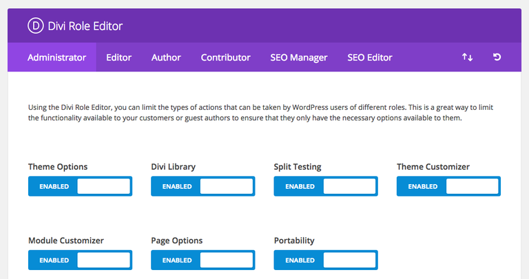
Figure 5. Divi Role Editor for Administrators. There is a tab for each WordPress User Role installed on your website.
You can see in Figure 6 that the WordPress Dashboard is not very pleasing to look at out-of-the-box for us Administrators. There are a number of solutions available that allow you to customize the WordPress Dashboard further, however, for this post, I wanted to keep things simple.
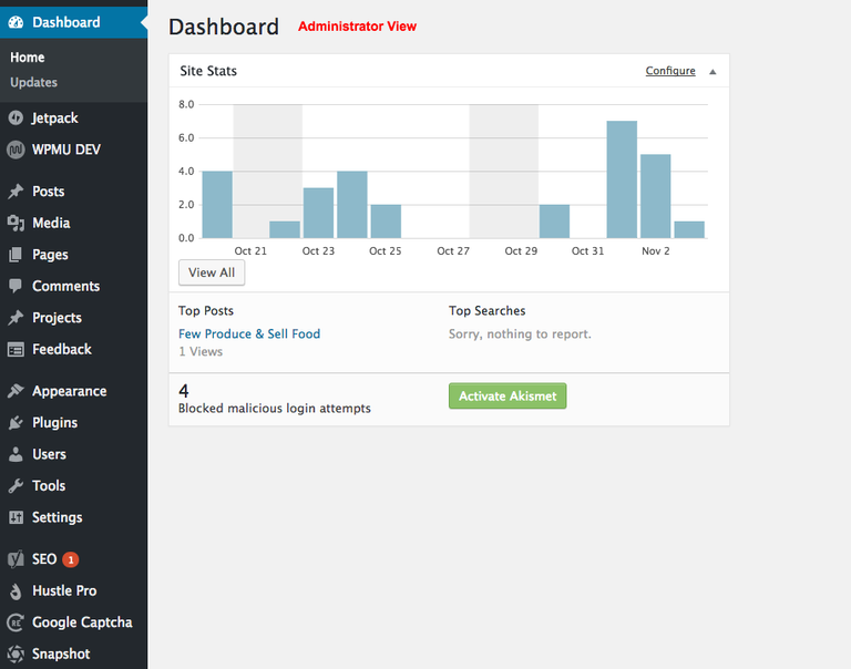
Figure 6. WordPress default Dashboard for Administrators.
If your task is simply to update your company’s “Who We Are” blurb, you just need to access the Pages sections. In Figure 7, you can see the menu has been stripped down considerably for Editors, which reduces the amount of noise/clutter they have to deal with after logging in.
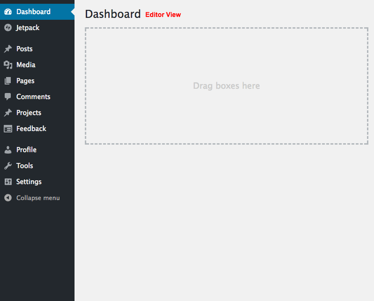
Figure 7. WordPress default Dashboard for Editors.
To continue the example, once you find the “Who We Are” blurb on the Home page, you access its settings through a modern dialogue box. See Figure 8. I disabled all the non-essential capabilities for Editors so that you could see how simple the task becomes when all extraneous options are removed from the UI.
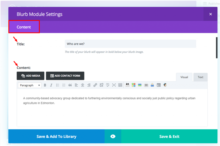
Figure 8. Divi Blurb Module Settings dialogue box for Editors. Only the Content tab is visible giving access to the Title and Content fields.
For those of you just getting started with Divi, I strongly encourage you to practice logging in as an Editor when you want to work on the text portions of your pages. When you give yourself access to the entire suite of tools that come with Divi, you will be tempted to “play” around with all the fancy stuff like Text Shadows, and Box Shadows, and Animations, etc.
Avoid that temptation as much as you can until you become familiar with Divi.
Otherwise, you will get distracted by trying to add cool effects and the end result is most likely going to be garish or gaudy or annoying. Remember, less is more and simplicity is elegance.
To see all the Settings for a Module, log in as an Administrator and check out the Design features available in each Divi Module. See Figure 9.
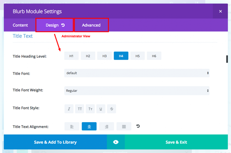
Figure 9. Divi Blurb Module Settings dialogue box for Administrators. All three tabs are visible; Content, Design, and Advanced giving access to all the Module settings.
ET has implemented dozens of CSS attributes into each Module’s Settings through the use of simple and intuitive controls that are a pleasure to use and when you are in the Visual Builder, you can see the changes in real-time.
Just remember to keep your content workflows (i.e., when you're writing or proofreading) separate from other tasks and you’ll notice a significant improvement in your productivity when interacting with your website.
For me, Divi has helped improve the way I approach writing content and building web pages because I’m learning to communicate my client's’ brand through a standardized collection of content Modules, which forces me to refine what is being said and to think about how that content looks across different device types.
More and more, Divi templates contain Modules and/or Sections optimized for Smartphone displays or Tablets because people spend more time on their Smartphones than their Desktop computers. By writing your website content into smaller chunks, it is much easier to build pages that look great on smaller devices.
Once your Divi templates are built (i.e., your website is live) and you begin editing content or writing blog posts, get into the habit of logging out as the Administrator and logging in as an Editor or Author. You’ll notice that your content workflow is a breeze to complete and you’ll soon want to start building your own Layouts and Pages.
In my next post, I’m going to explore using Google Docs to write your content and how to document a generic content workflow so that you can train others to further save time and effort.
*Post originally published at www.uplyft.ca