Well here we go...
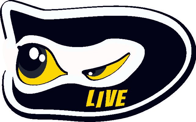
I really liked the idea of using the D as the mask, I also tried to have a little semblance to the old logo with the "triangle" eye. I had about 50 designs but really liked this one for it's simplicity and logo branding.
Thanks and I hope you guys like it!
You are viewing a single comment's thread from: