I actually like the graphic of number one combined with the font of number two. :) But only if the logo is meant to have something to do with ideas (and rockets). Since we're not given what these logos are for, it's hard to tell which might fit better, but just from a design standpoint, number one is better balanced and would have potentially multiple applications.
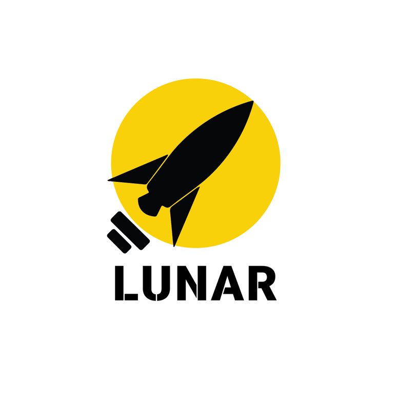
Some background information: I want to use the logo for a site that will be called lunarexpress. The intention is to give people cryptocurrency trading idea's.
The lightbulb is a reference to idea's and the rocket stands for going to the moon.

Voted for Vote for 2.
Voted for Vote for 1.
Voted for Vote for 1.
Voted for
I actually like the graphic of number one combined with the font of number two. :) But only if the logo is meant to have something to do with ideas (and rockets). Since we're not given what these logos are for, it's hard to tell which might fit better, but just from a design standpoint, number one is better balanced and would have potentially multiple applications.
It's for a site that will be called lunarexpress. The intention is to give people cryptocurrency trading idea's.
The lightbulb is a reference to idea's and the rocket stands for going to the moon.
Then it sounds like, based on your description, No. 1 is definitely the better logo, both in looks and function. :)
Thanks for the advice. Most people say that logo 1 is most professional looking and logo 2 is more of an eye catcher. I will try to combine them.
Voted for
Version 1 is professionaland subtle , version 2 is standing out
Voted for
The dark rocket make a more serious logo it could be fine on a T-shirt
Voted for Vote for 1.
The first one, with the colors of the second one. The second one appears to be a bomb or a landmine.
Or something totally different.
Lunar=Stellar? The logo seems to be copied from Stellar logo.
Some background information: I want to use the logo for a site that will be called lunarexpress. The intention is to give people cryptocurrency trading idea's.
The lightbulb is a reference to idea's and the rocket stands for going to the moon.
Stellar makes a new logo:
https://medium.com/stellar-development-foundation/announcing-the-new-stellar-logo-81eb4fafe1b0
Thanks for sharing.
Personally, i think the rocket is kind of cool. It's a reference to the crazy bull market.
Voted for Vote for 1.
Voted for Vote for 1.
Voted for Vote for 1.
Voted for Vote for 2.
Voted for Vote for 1.
Voted for Vote for 2.
With the rocket of v1 :)
Voted for Vote for 1.
Voted for
Voted for
Thanks for contributing to the dPoll content.
You have been upvoted from our community curation account (@dpoll.curation) in courtesy of This Guy... @bluerobo.
Come, join our community at dPoll discord server.
If you want to support dPoll curation, you can also delegate some steem power. Quick steem connect links to delegate:
50SP | 100SP | 250SP | 500SP
Voted for Vote for 2.
Voted for Vote for 1.
Voted for Vote for 1.
better by miles
Voted for
Voted for
Voted for
Voted for
Voted for
Voted for
version 2 reminds me of the booster bot logo lol
Voted for
Voted for
Voted for
Voted for
Voted for
Voted for
Voted for
Voted for
Voted for
Voted for
Voted for
Voted for
Voted for
Voted for
Voted for
Voted for
Voted for
I like the white color contrast inside the bulb.
Voted for
Voted for
Voted for
Voted for
Voted for
Voted for