Merry (belated) Christmas Steemians!
In this occasion I want to share with you an illustration I made for the "DESIGN A CHARACTER CONTEST" created by @w0olf. The premise is to create a character (duh) under certain given conditions. Taking this into account, this week we had to create a character with a specific shape.

Everything was going smoothly, I had the opportunity to make a character that I was happy with. But... As I am a terrible person, I got confused with the final date to post the character and I thought I had time until Sunday.
But hey, I gave it some thought and I still decided to show you what I did (and how I did it).
First off, I use a program called *SAI Paint Tool. It's a Japanese software that isn’t the fanciest tool or anything like that, but it makes the drawing process super simple. Honestly, I feel very comfortable using it ... although I should learn to use other programs.
Regardless, I think these tricks could work in any software.
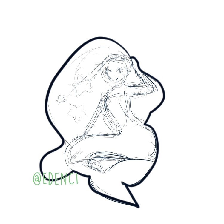
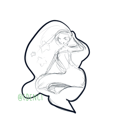
To begin this process, I made a quick sketch of what I thought could go inside the shape. I could not see anything other than a mermaid, so this part went by quickly.
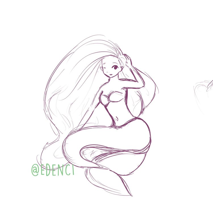
From that quick sketch I made… another sketch. In this case, still a very simple one, but less terrible.
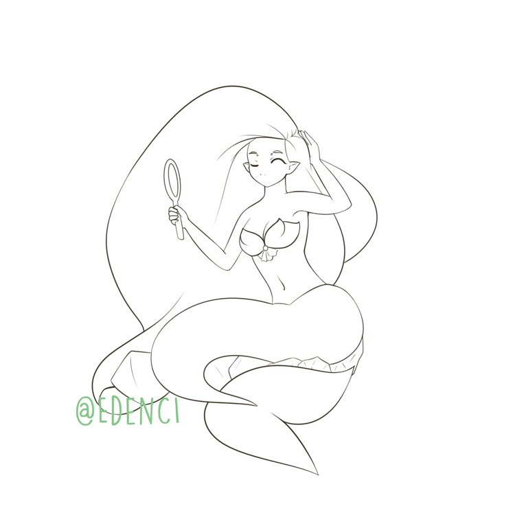
Then comes the most boring part: The lineart. The process is a bit tedious and slow because I want each line to be in the position that I consider correct. In addition, Paint Tool SAI requires that you close all of these lines very well if you want to use the automatic selection tool to make the coloring easier.
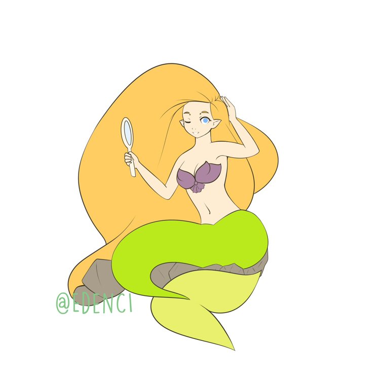
Then I chose the base colors. Honestly, I never know what I’m doing in this part, I just choose the colors that I like and hope for the best. Sometimes I look for palettes in the Adobe Color Wheel, although not always.
Then I add some gradients and details that I think could help. In this case, I added some lines to the top and tried to give it a pearly effect. I wanted to keep the hair without much detail because I thought it was part of the charm. I added scales and gradients to the tail.
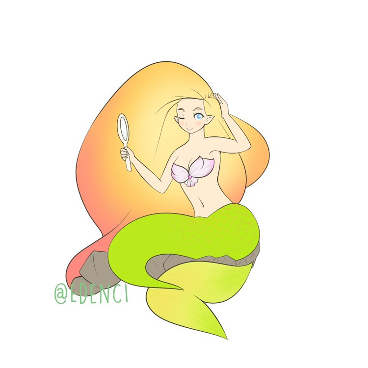
From here, I began the shading process. The multiply effect is especially useful in this part. For me, shadowing is fun because it gives another level of depth to the illustration.

The rest is simple. I adjusted the colors of the lineart a little.

Then I added an overlay to unify the color palette a bit.

And done!
¡Thanks for checking out this process! I'm gonna post more this week... I also hope I stop failing in contests.
¡Steem on!
@OriginalWorks
The @OriginalWorks bot has determined this post by @edenci to be original material and upvoted it!
To call @OriginalWorks, simply reply to any post with @originalworks or !originalworks in your message!
Great entry, it's a pity you missed the deadline.
Maybe this week? :) Deadline is Friday again.
Haha I know! I'm gonna try to post this week, although I'm not sure if I'll have the time to finish on time. But I'm eager to participate again!
I'm in love with the palet of colors you picked... Nice job!
Thank you!