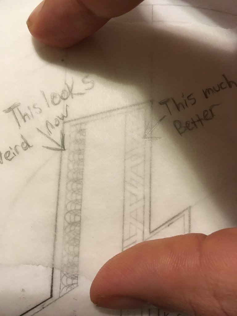
So I had to scrap the first idea I had with the filigree along the the left edge of the "L" because it was starting to look weird in relation t the other details I was stating to add. Also I was thinking that if I ever wanted the designs to transfer and look good on an actual coin I would have to minimize the super fine line work a bit and favor thicker banding.

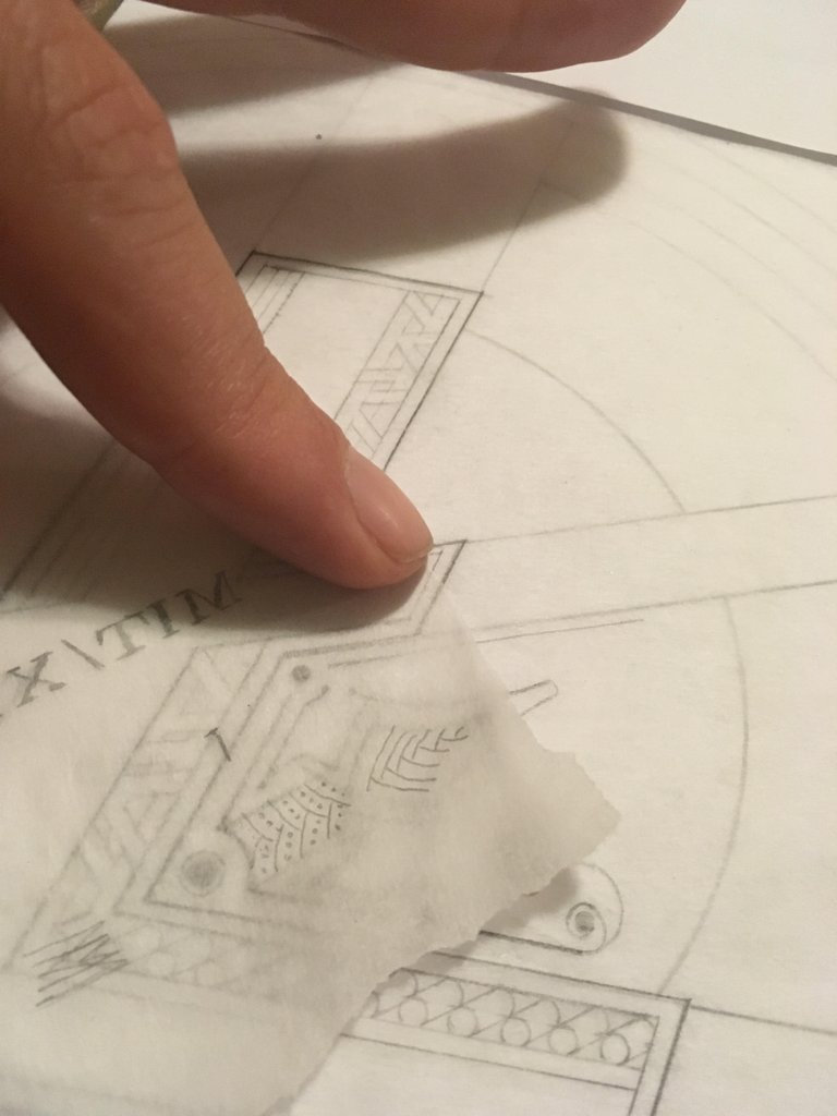
Here is one of the ways I play with ideas is by using a scrap piece of trace paper to put on top. If it jives I slide it underneath the main sheet and trace a nice version of it in there.

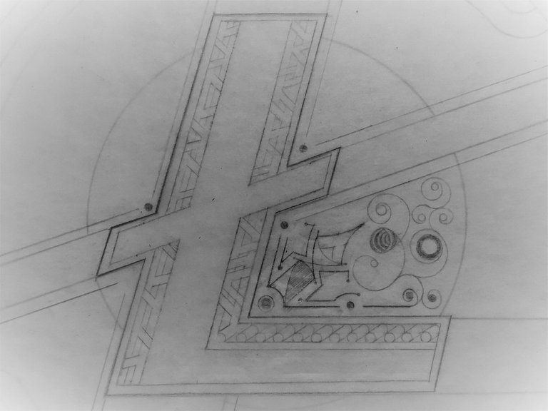
I thought I liked this idea you see here (above) and when I actually put it in for real i hated it. So I began to manipulate it until I thought it made visual sense to me. The image below is where it stands now. I didn't want to go too long between these Coin art posts because it keeps me motivated.

I also wanted to point out that this is the pencil rendering phase. Which is only about 1/3 of the way done and looks a bit sketchy. I still have to add the words MIT/11X & scrypt in banners along the edges. I was thinking about adding a python in there somewhere but I'm not sure yet.
I am going to ink this in and crisp it up on a piece of vellum when the pencil part is done. This will be the real fun part for me because it will take a quarter of the time it takes to make the pencil version for obvious reasons. Thanks for looking. Thanks for reading.
Good job!