Directly or not, it appear that I draw too much dogs. Not very embarassing, but my shop need maybe other things, it's not about dog's lover. Looks like I need human-like drawings. I HATE drawing human, just for saying.
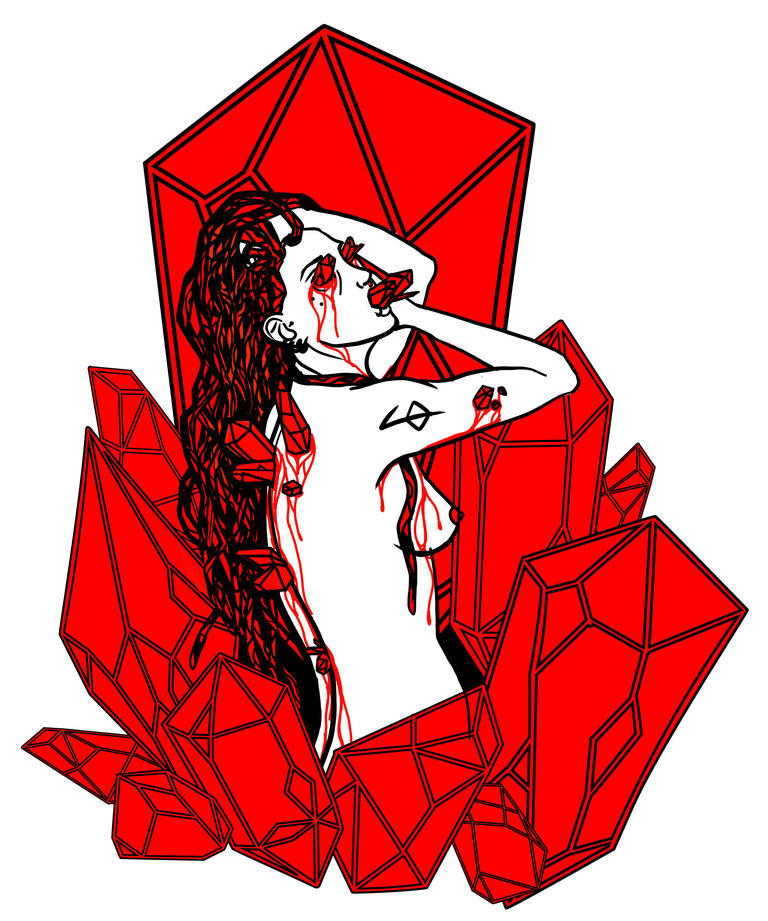
So, for the context ;
I do screen-printing, and consequently need to adapt what I draw. For exemple, at this time, I only do 2 colors prints (3 if you count the t-shirt color). I make no gradient, no shadows, no enlightening... You also need to keep in mind how it will rendering when you'll print. Isn't the details too small ? (in this case, not, but I do several engraving-like drawings). How the ink will react on shirt ? Etc.
The distinguable trait of my shop are macabre/horror/underground. But it's not sufficient, so I add some features that I will explain in a future post. But I choose to use principally 3 colors : the black of the shirt, and white and red ink.
There we go.
I love pin-up posture, therefore I tried a more desespered one. I quickly do a sketch of what I have in mind (you don't have any idea of the number of nice art piece I forget cause I was too lazy for starting them).
I used Krita (very nice open source drawing software, give it a look !), except for the crystals (Illustrator).
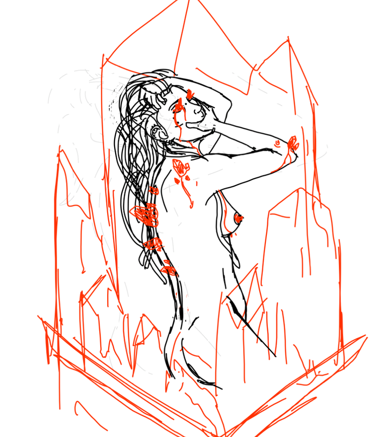
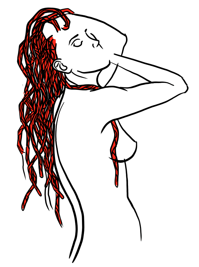
I hate how rough my sketch is, and the position was ok for me so I started lining partially.
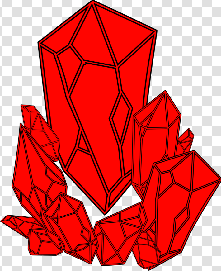
Next, I did the crystals with Illustrator. Red background and black lining.
Quick ajustements, and it's finished !

I will post pictures of the printed t-shirt the next time.
Congratulations @strandedlifeshop! You received a personal award!
You can view your badges on your Steem Board and compare to others on the Steem Ranking
Vote for @Steemitboard as a witness to get one more award and increased upvotes!