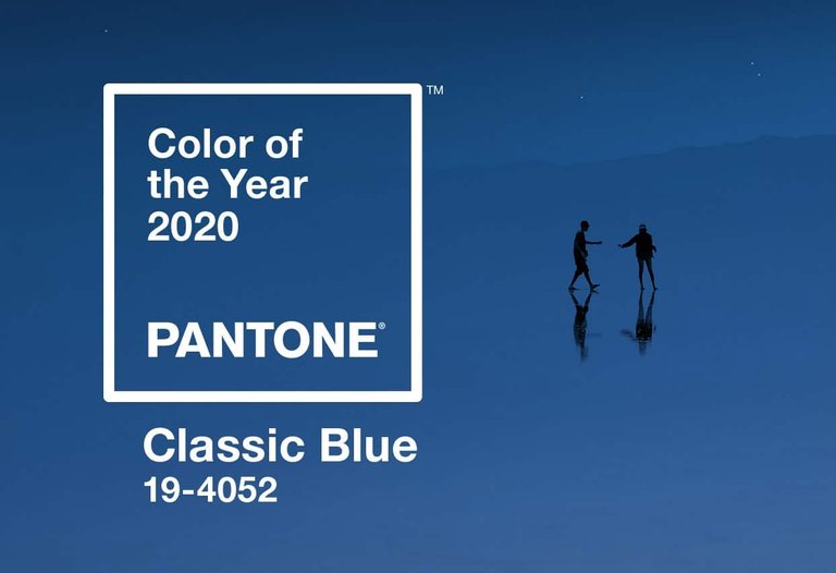
As we move into a new decade, the Pantone Color of the Year 2020 ushers us with a calmer Classic Blue 19-4052.
After two decades, we find Pantone returning to the classic colors and finding solace in a hue familiar to most eyes. Looking back, this isn’t Pantone’s first time to consider a shade of blue on its list. The very first Pantone color was Cerulean Pantone 15-4020 back in 2000. And since then, the word found itself into everyone’s vocabulary (remember Miranda Priestly’s monologue?). Since then, they began to release different colors for each year, redefining colors and its cultural significance in a length of time. This isn’t the only instance Pantone chose a shade of blue. They gave us Aqua Sky in 2003, Blue Turquoise in 2005, and Serenity in 2016. And last year, we got Living Coral Pantone 16-1546, a pink-orange hue that references our dying coral reefs and symbolizes our community efforts to save them.
Despite the complexities of the previous years, Classic Blue differs largely from the other shades of blue. And Pantone’s reasons for choosing classic blue as the color of the year for 2020 is more than just mere familiarity.
The Pantone Impact
“The core business standards, the color institute, which is trend forecasting, color consulting, and licensing... we look at that as a virtuous circle of mutual support” - Ron Potesky, Vice President of Pantone

With today’s generation, Pantone has become a consistent, reliable reference to color vocabulary and the cultural impact of colors. Most often the ‘Color of the Year’ announcement has become an awaited event not only among advertisers and artists, but also students, hobbyists, and digital marketers. Pantone colors often see heightened recognition with various products from cell phone cases, to pens and markers, to movies, and of course, clothing and apparel.
What they started in 2000, was far from their initial purpose. Founded in 1956, Pantone wasn’t necessarily a known figure for colors then. When Lawrence Herbert bought the company in 1962, he had a vision of making color identification easier for designers and ad agencies. By 1963, he launched the first Pantone Matching System (PMS) with 10 colors, assigning a number to each color, making them more objectively identifiable.
The ‘Color of the Year’ is undoubtedly a marketing effort from the company to push colors and its significance into the spotlight while at the same time bringing their name into the game. Pantone wasn’t the first one to make a color matching system, but they are now the most well-known. For the year 2020, Pantone asks us to look back and think about the past with its Classic Blue.
Everything In Blue Through Time
Blue, even Classic Blue, has commonly been used across all forms of art. Emily Brontë’s classic poem “The Bluebell” uses imagery with colors like purple heath, green robes, and of course the bluebell flower. The protagonist, upon seeing the bluebell, experiences melancholia because of reminiscence but ultimately finds that she must learn from her painful past rather than dwell on it. The poem is an introspective take on the bluebell flower. Though the flower itself ranges in color, the association of blue exists in Brontë’s poem.
Modern music also finds itself expressing thoughts through the blue. Paul McCartney’s ‘Bluebird’ makes use of the color blue. Possibly a personal letter to Linda McCartney, Bluebird conjures the image of the flight of the bluebird to express the peace of mind Paul finds from the love of his wife. He begins the song with ‘Late at night, when the wind is still’, painting a serene picture for the two lovers.
Recent music hasn’t lost the references to the classic blue. Florence and the Machine’s album ‘How Big, How Blue, How Beautiful’ talks about depression and personal struggles. The title song itself describes three things: the sky, the sea, and her thoughts. Making use of the power of threes, Florence describes her current state of mind with the blueness of the sky and the sea and how powerful her emotions felt once she ‘opened the door’ to check out the view. Lana Del Rey’s ‘Terrence Loves You’ makes a reference to Lana ‘having the blues’. Like her other lyrical compositions, Lana often evokes sadness and introspection through the color blue, a thought often invoked by the older generation. The association of blueness and melancholia is often prevalent until now. But closer inspection sees that color blue expresses individual freedom, peace, and thoughtful introspection.
Perspectives on the Color of the Year 2020
“There are many different blues in the Pantone system, but this particular shade really gave us that feeling of confidence and stability,” - Leatrice Eiseman, Executive Director

Different reactions arose upon the announcement of Classic Blue for Pantone. Most are positive about Pantone’s efforts to instill a culture of peace and introspection on our current society. However, some thought Pantone played it a little safe. Classic Blue calls would encompass various historical symbols since the dawn of art. It has been used in various ethnic, mythological, and religious cultures that are already identifiable. To use such a historical color seems confusing and safe for a dynamic, rapidly-evolving society. But some pointed out the importance of the juxtaposed words. “Classic” reminds us of a grounded, factual human history, while “Blue” embodies the very process of thought provocation.
However, the fact remains that Pantone’s Color of the Year brings about mainstream trends that will soon see shelves plastered with Classic Blue ad nauseum. It is difficult to pinpoint one specific color to make a cultural message for each year. But Pantone’s efforts nevertheless were appreciated. And the calls for inspection didn’t fall on deaf ears.
For Classic Blue
Classic Blue is a peaceful, elegant hue for modern society. And soon enough we will see the impact of this Pantone Color of the Year 2020 right in our local shops and venues. There are many ways to blue can be interpreted, but peace and calmness would always stand the test of time for Classic Blue.
More blogs to come! Check out our other pages for more advertising trends and digital marketing information.
Source
Plagiarism is the copying & pasting of others' work without giving credit to the original author or artist. Plagiarized posts are considered fraud and violate the intellectual property rights of the original creator.
Fraud is discouraged by the community and may result in the account being Blacklisted.
If you believe this comment is in error, please contact us in #appeals in Discord.
Hi! I am a robot. I just upvoted you! I found similar content that readers might be interested in:
https://www.business2community.com/marketing/heres-what-you-need-to-know-regarding-pantone-color-of-the-year-2020-02344005