Floor planning, the very foundation of a building plan. You can remove almost every plan in the building plan but not the floor plan.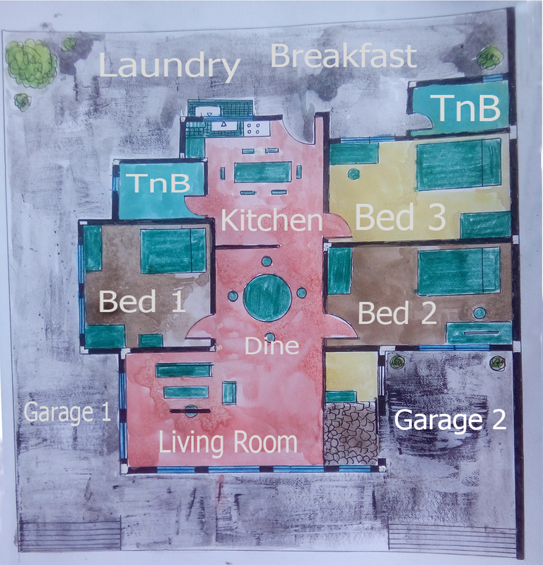
Floor plan is indeed the most important plan in building a structure. Big or small, commercial or just informal, a floor plan is necessary to make the building itself.
Today, I'll be discussing some core basics of making a floor plan. Having a formal training to do this activity isn't a must. Everyone should look at it and try it. I hope this post can help you personally.
From Rough to House
First thing to do when you are about to make a house is to do some measurements of the lot you are working to. A good floor plan has no dead space or wasted area. Every area should be accessible and practical technically and culturally.
Yes, culture comes in as well when doing floor plans, thus in the west designs, the first thing that you will see when you come in the house is the kitchen since most westerners are workaholic. Most of them have two to three day jobs that they almost don't stay at home. They usually just go home, do some food, eat and go up to their bed rooms to sleep.
That concept of a western house doesn't apply to all of them but most of them are.
Meanwhile in Asia, the first area you will see after the front door is the living room. The theory behind it is, Asians shows their social and financial standing through the living room itself. Yes, the design is more approached with having guests to come inside the house in mind, thus that will make you think that Asians are more self conscious socially in the community than westerners. But I do love both worlds, westerners and Asians. Both their differences are beautiful so no racism here please.
Process
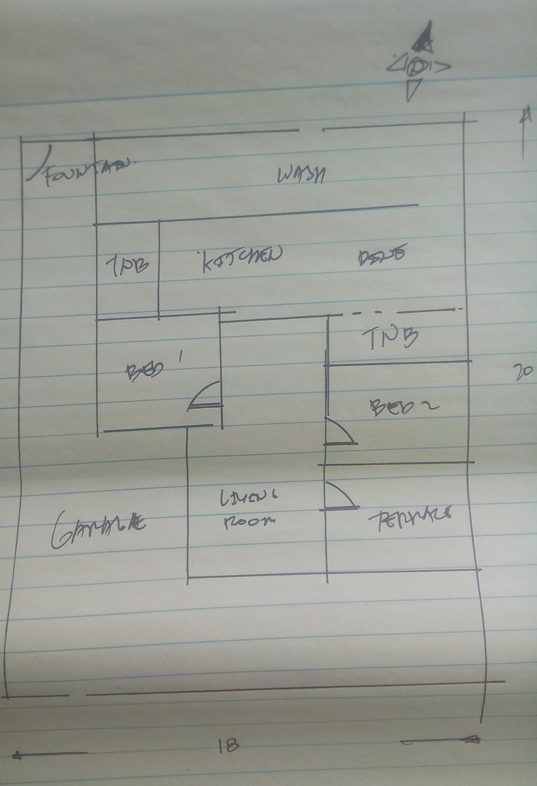
First I decided to make the Asian concept. I drew a quick sketch in a sheet of pad paper.
I then made the rough sketch with pencil in a piece of letter sized vellum board.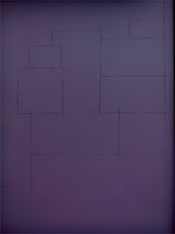
I then started to ink from the fire wall. Most building codes(varies per country) requires floor plans to have a fire wall if the said plan cannot cope up with the two meter allowance around the structure.
Fire walls should be two meters taller than the building and should have no openings like windows or doors. It should be just a wall bigger than the house.
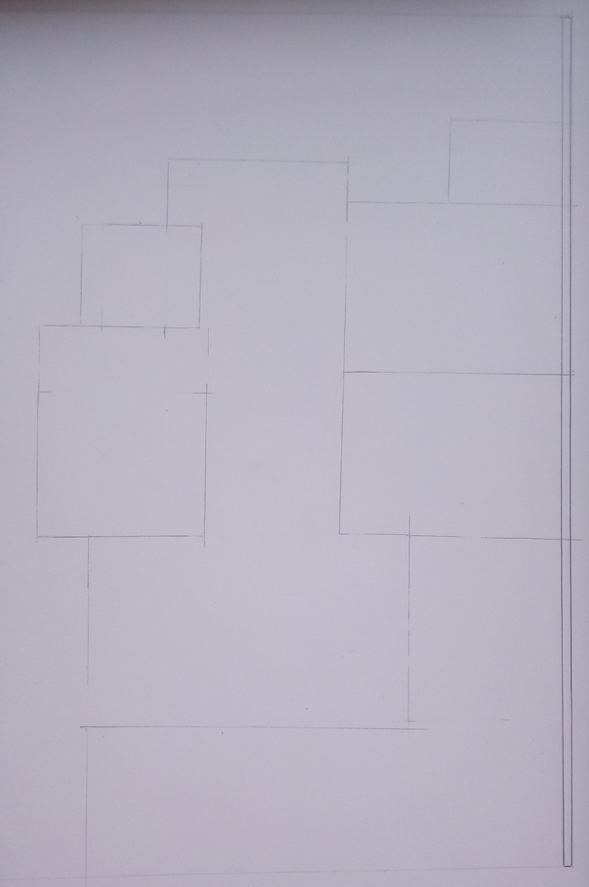
I then inked the inner walls and drew a door.
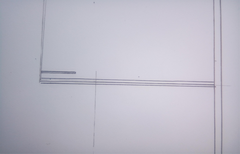
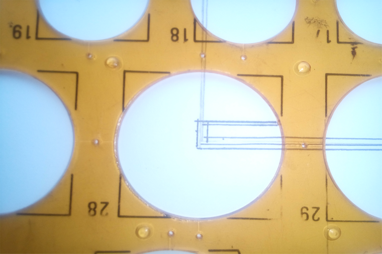
Here, I'm using a circle template to do the door motion line. Have you ever wondered why does professional stencil tools like circle templates have small holes on it.?
Look at the picture below, right on the circle. There are four small dot sized holes around the circle. Those holes have two purposes: One is to be used in determining the mid point of the circle; second is for the template to not stick to the paper or any flat surface. The holes act as an air escape so it doesn't stick to anything flat.
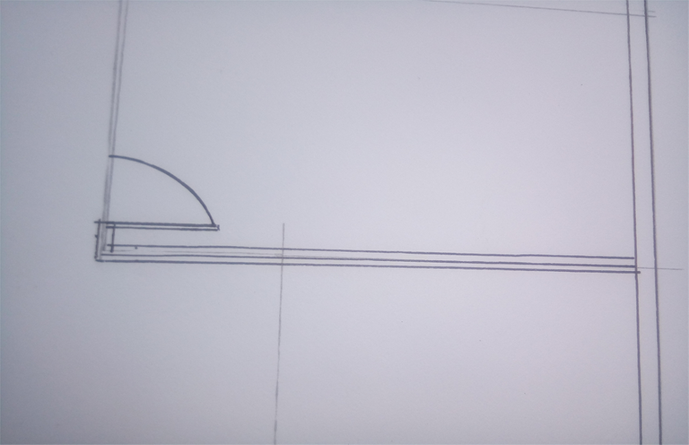 Here, I used another type of door, a sliding door. Unlike the usual door, sliding doors can be presented with no motion lines.
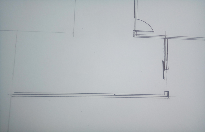
I then started inking the other rooms.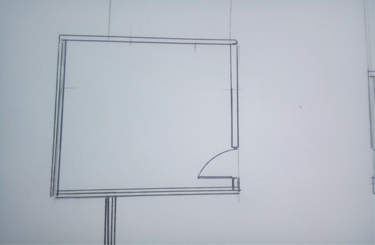
This one will be the TnB. TnB means toilet and bath.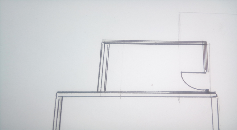
Here is another bedroom.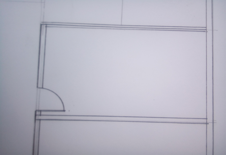
And another TnB.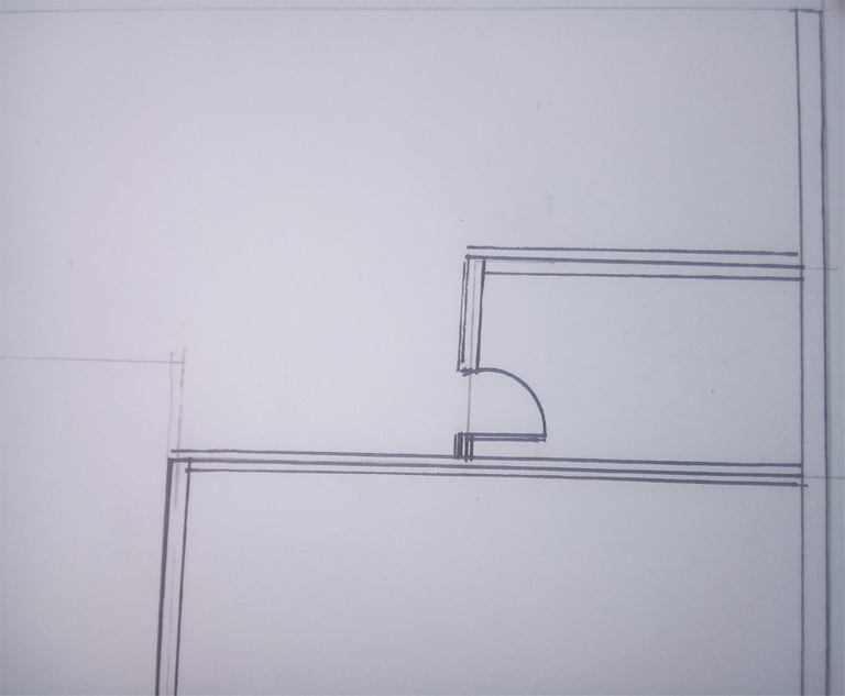
Here is the back door which also will be the kitchen.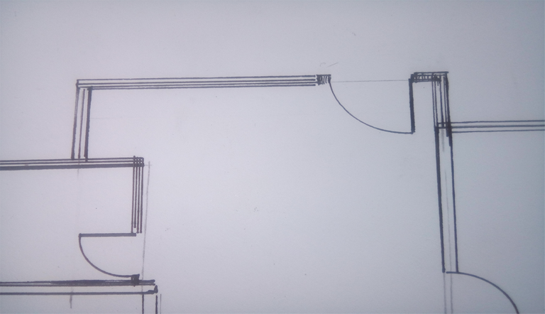
There, the first inking process is done.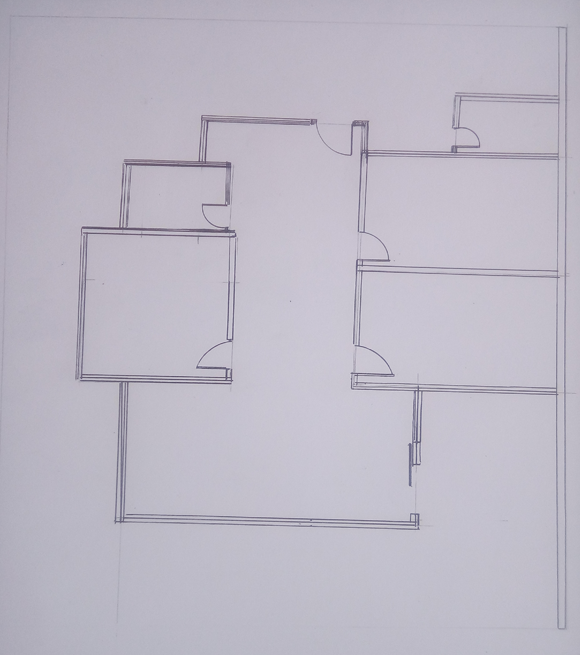
Now I marked out the walls for windows. The none blacked parts in the walls will be the windows and the columns.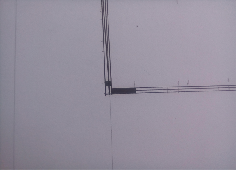
The columns are the poles above the foundation, they make the walls stand firm.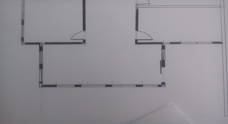
There, the columns in the drawing shouldn't have those lines between them so you can distinguish the windows from the columns.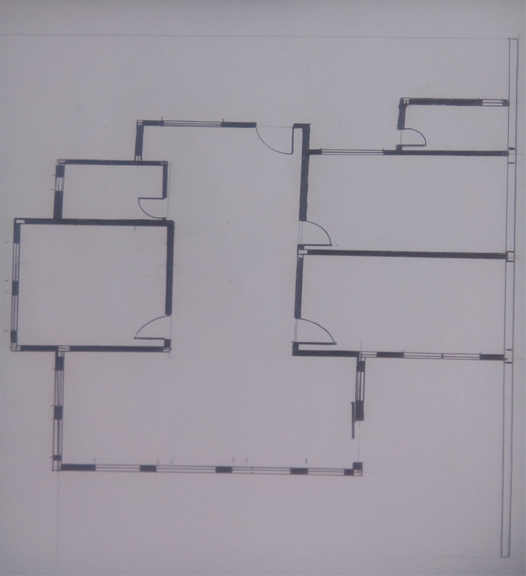
Done inking.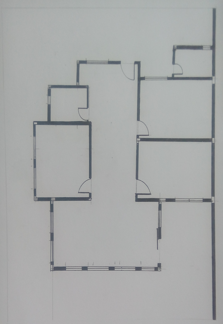
Now, I'm adding more details. I already erased the lines inside the columns with liquid eraser. I took a picture of the plate when I erased those line but i can't find it, sorry. :p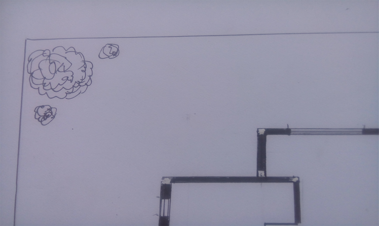
Here will be your lavatory or wash basin.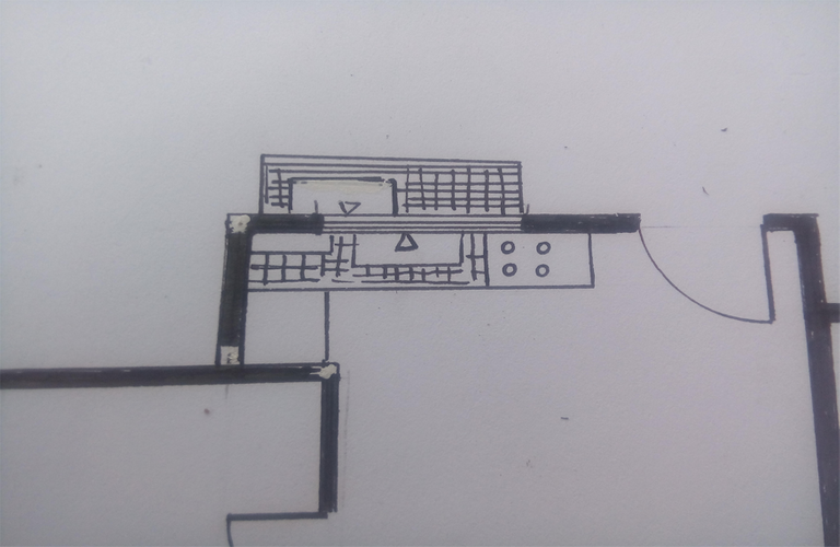
I added some tables and chairs.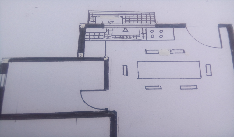
Some beds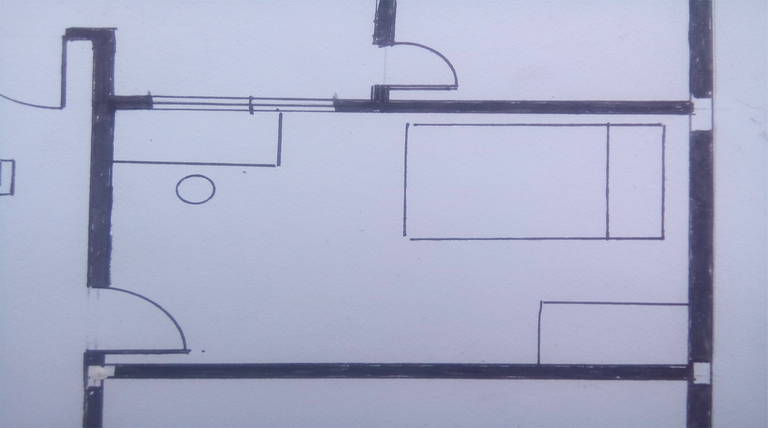
And made this part of the entrance as a shoe rack area, it can also be used as a powder room.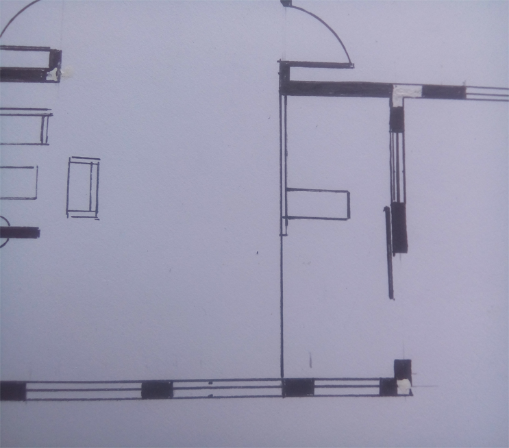
Another thing that you should keep in mind when putting in your windows is the lighting, some designs tend to have really large window cause of the objective of wanting to achieve natural lighting. Well, that kind of planning depends per location. If the location you are building into rains all year long, putting big windows for lighting is not smart.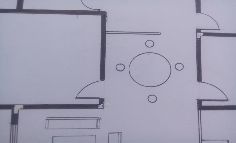
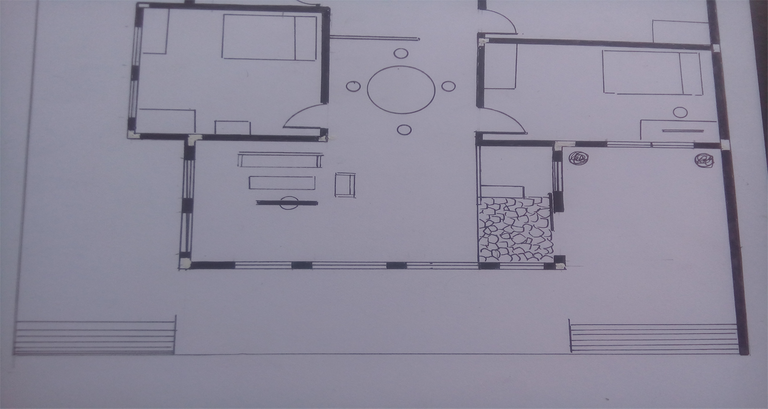
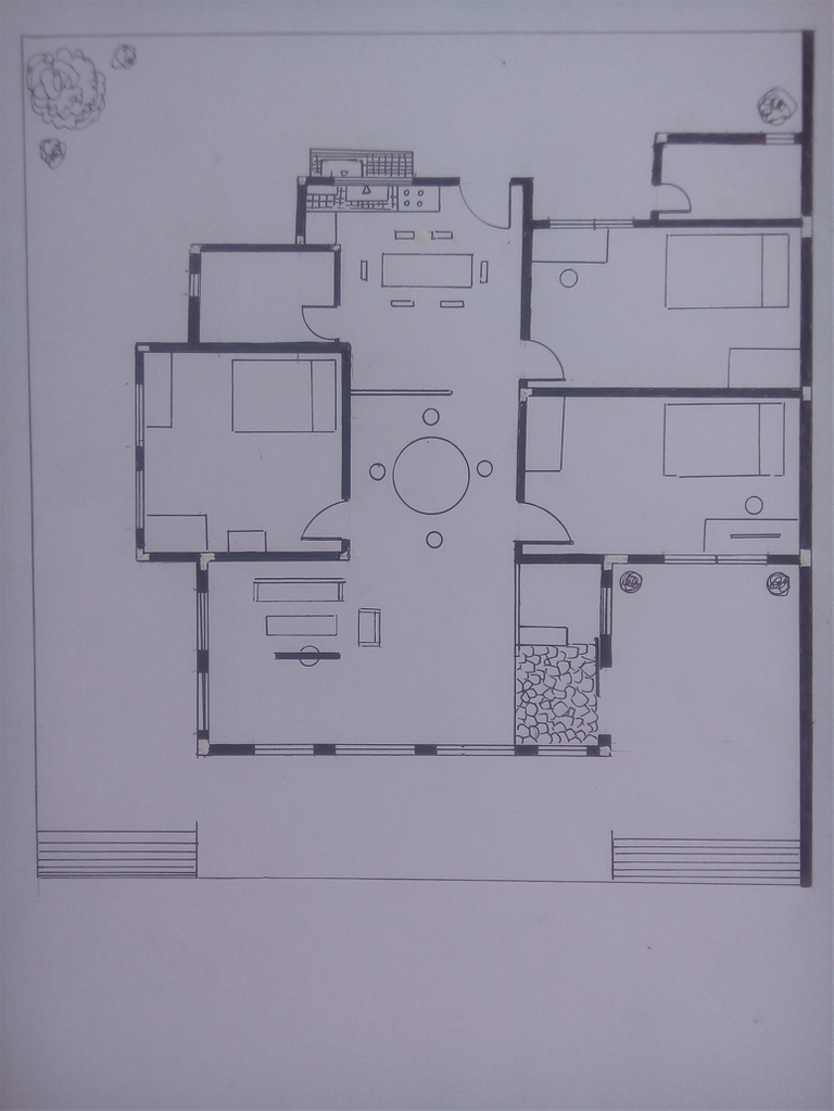
For fun, I colored the plate.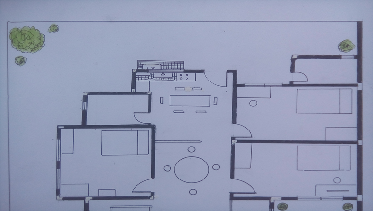
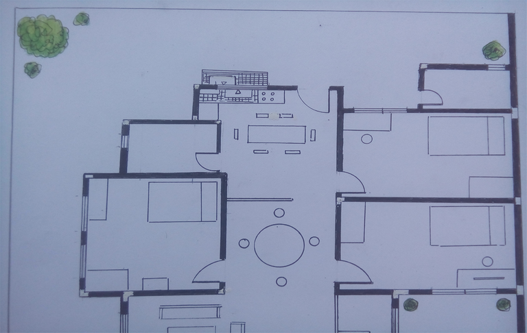
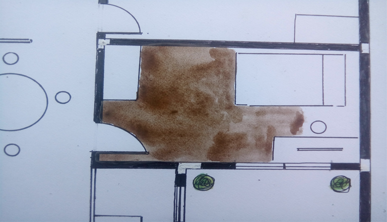
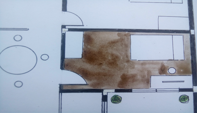
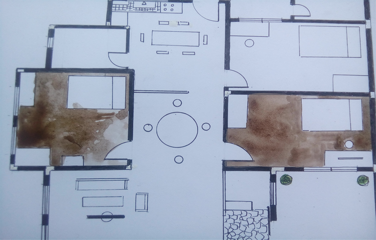
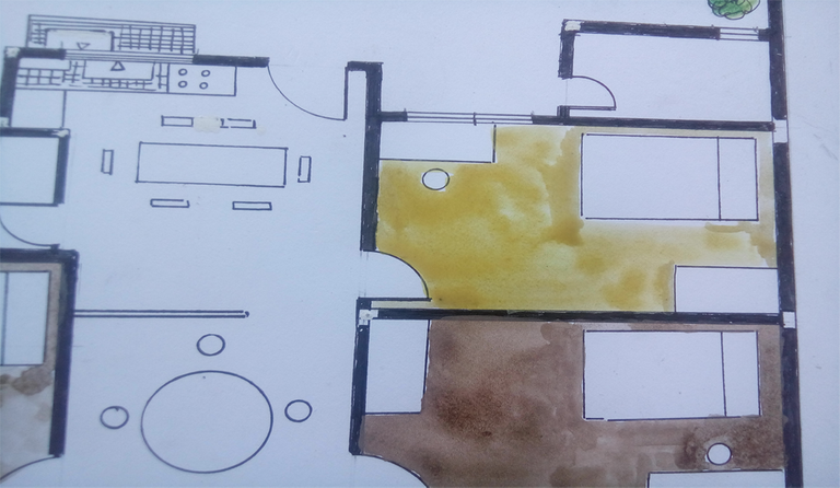
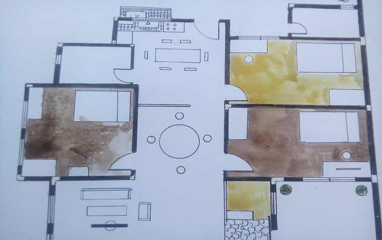
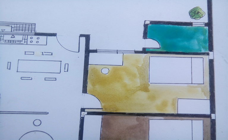
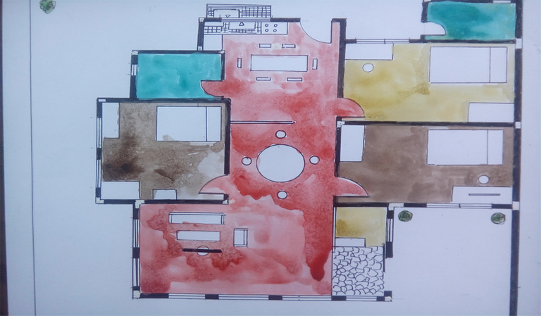
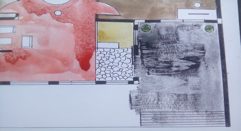
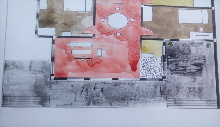
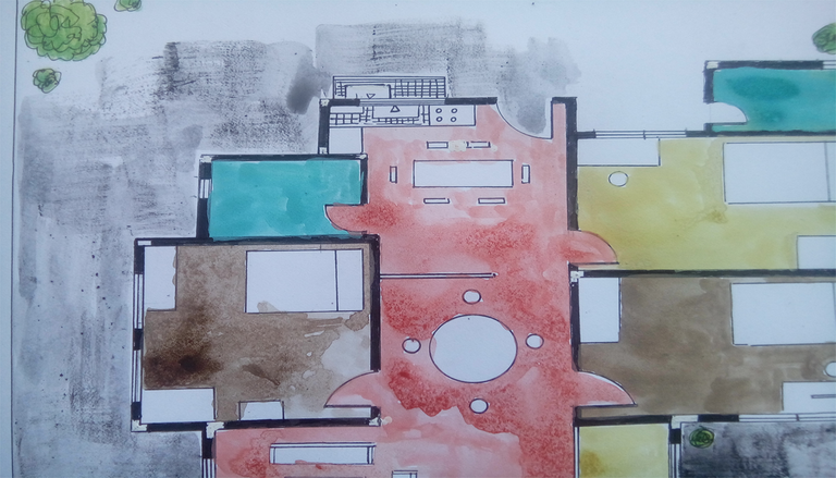
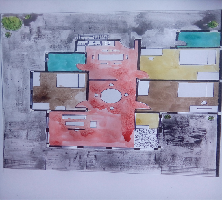
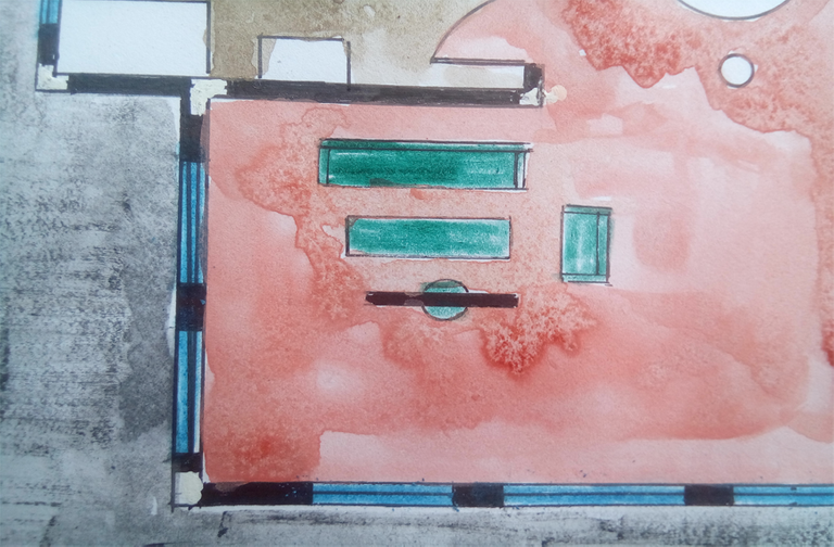
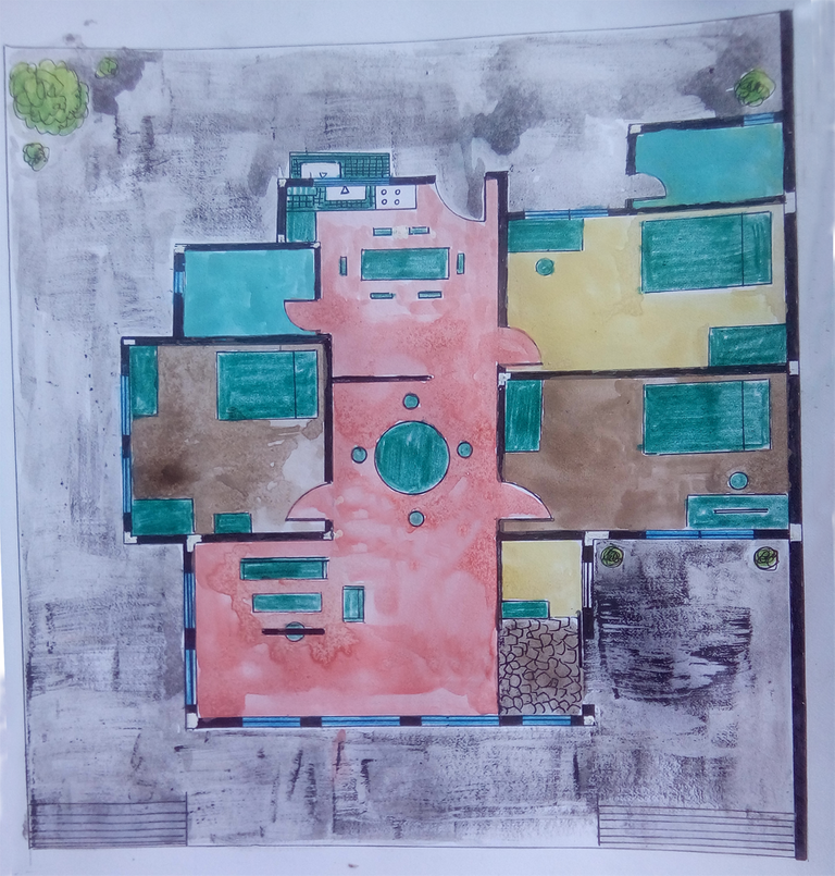
Done! 
Thank you for dropping by, have a nice day.
colorful! good outlook on the asian and western perspective of designing.Who thought you that? experience?
thank you sir, my professor told that to us in one of his classes.
This is a good post, i can see the effort you put into this, hope someone votes for it.Nice post, followed,resteemed and upvoted.
man that is some very detailed sketch you got there! i love how you make it come alive by coloring it! keep it up bro!
man that is some very detailed sketch you got there! i love how you make it come alive by coloring it! keep it up bro!
I guess youre using the main site sir..hehehe
Like the steps you showed!
thank you sir
LOL, this post you showed me is interesting LOL.
Interesting, now I saw an architecture post. Steemit has a lot of talents. Ive read it, the fire wall standards vary from place to place but most of them are 7 feet in height, so youre statement with 2 meters is right. Ill resteem this one. good post, good psot
steem has bugg? I have problem psoting.
yes sir, Im using steemkr now, I find it easier, other people use busy.org. Anyway, thank you for dropping by, appreciated.
this post is already 10 hours? Where is OCD and Curie?