In the 80's and 90's, the box artwork for video games was far more important than it is today. We didn't have the Internet to look up reviews, nor were video game magazines completely widespread, so the box artwork and screenshots on the back is usually all we had to go off when making our purchase decisions.
Today I'll be picking out my top 5 favorite pieces of NES box artwork. To make it a bit more interesting, this list will only include third-party games, so no Mario or Zelda titles will show up here.
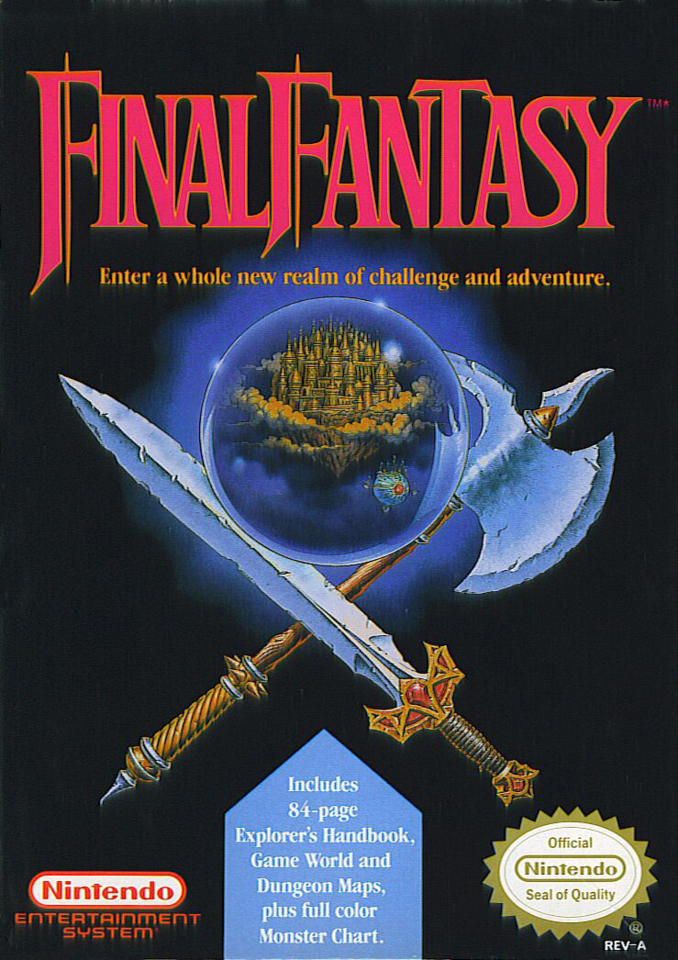
#5 Final Fantasy
Image: MobyGames
OK, I'll let this one slide. Technically, it was published by Nintendo. However, it was of course developed by Square and has been their flagship title ever since. The boxart for the NES game was simple, bold and perfectly conveyed the sense of adventure that the game inside would provide anyone who picked it up. I still vividly remember walking out of Walmart in 1990 with my copy of Final Fantasy; I think it was the first game I ever bought with my own money rather than getting as a gift.
#4 Double Dragon II
Image: Pinterest
This artwork is striking, with its pencil-sketch look and intense depiction of the game's action. I love that while not an exact duplicate, it mimics the arcade game's sideart very closely.
#3 Wizards and Warriors
Image: Pinterest
While not as recognizable as its sequel, in which the box featured pretty boy Fabio on the cover, I adore the artwork for the original. The image has a great hand-painted look and while not very representative of the actual game (your character in the game wears a suit of armor), the cover artwork is appropriately dark and foreboding. The unnecessary black border around the image does bring this down a peg though.
#2 Gradius
Image: Pinterest
A different Konami title takes first place, and this was a hard decision, but I have to put Gradius at #2. The tiny Vic Viper heading towards a massive ship with lasers shooting towards us while breaking out of the frame is an iconic and powerful image. I have to dock it a bit for the big red sales blurb in the top left corner. Which leads us to...
#1 Castlevania
Image: Pinterest
To this day, this is my favorite piece of box art on the NES. The bold, dark-yet-colorful artwork depicts our hero Simon Belmont approaching Dracula's Castle. I love how the whip pops out of the artwork area and into the gray section, giving it a more 3D appearance. I'd love a poster-sized version of this artwork to hang on the wall of my game room.

Thanks for reading. As always, upvotes, resteems and comments are appreciated!
Cover Image: MobyGames


Yeah! The NES sure had some pretty nice detailed cover art that they dedicated a lot of time drawing them back in the day because they really had to make the boxart appealing for people to get curious and buy.
Video game artwork is in a class of it's own!